
DBScan Clustering in Python
Unsupervised Learning is a common approach for discovering patterns in datasets. The main algorithmic approach in Unsupervised Learning is Clustering, where the data is searched to discover groupings, or clusters, of data. Each of these clusters contain data points which have some set of characteristics in common with each other, and each cluster is distinct and different. There are many challenges with clustering which include trying to interpret the meaning of each cluster and how it is related to the domain in question, what is the “best” number of clusters to use or have, the shape of each cluster can be different (not like the nice clean examples we see in the text books), clusters can be overlapping with a data point belonging to many different clusters, and the difficulty with trying to decide which clustering algorithm to use.
The last point above about which clustering algorithm to use is similar to most problems in Data Science and Machine Learning. The simple answer is we just don’t know, and this is where the phases of “No free lunch” and “All models are wrong, but some models are model that others”, apply. This is where we need to apply the various algorithms to our data, and through a deep process of investigation the outputs, of each algorithm, need to be investigated to determine what algorithm, the parameters, etc work best for our dataset, specific problem being investigated and the domain. This involve the needs for lots of experiments and analysis. This work can take some/a lot of time to complete.
The k-Means clustering algorithm gets a lot of attention and focus for Clustering. It’s easy to understand what it does and to interpret the outputs. But it isn’t perfect and may not describe your data, as it can have different characteristics including shape, densities, sparseness, etc. k-Means focuses on a distance measure, while algorithms like DBScan can look at the relative densities of data. These two different approaches can produce by different results. Careful analysis of the data and the results/outcomes of these algorithms needs some care.
Let’s illustrate the use of DBScan (Density Based Spatial Clustering of Applications with Noise), using the scikit-learn Python package, for a “manufactured” dataset. This example will illustrate how this density based algorithm works (See my other blog post which compares different Clustering algorithms for this same dataset). DBSCAN is better suited for datasets that have disproportional cluster sizes (or densities), and whose data can be separated in a non-linear fashion.
There are two key parameters of DBScan:
- eps: The distance that specifies the neighborhoods. Two points are considered to be neighbors if the distance between them are less than or equal to eps.
- minPts: Minimum number of data points to define a cluster.
Based on these two parameters, points are classified as core point, border point, or outlier:
- Core point: A point is a core point if there are at least minPts number of points (including the point itself) in its surrounding area with radius eps.
- Border point: A point is a border point if it is reachable from a core point and there are less than minPts number of points within its surrounding area.
- Outlier: A point is an outlier if it is not a core point and not reachable from any core points.
The algorithm works by randomly selecting a starting point and it’s neighborhood area is determined using radius eps. If there are at least minPts number of points in the neighborhood, the point is marked as core point and a cluster formation starts. If not, the point is marked as noise. Once a cluster formation starts (let’s say cluster A), all the points within the neighborhood of initial point become a part of cluster A. If these new points are also core points, the points that are in the neighborhood of them are also added to cluster A. Next step is to randomly choose another point among the points that have not been visited in the previous steps. Then same procedure applies. This process finishes when all points are visited.
Let’s setup our data set and visualize it.
import numpy as np
import pandas as pd
import math
import matplotlib.pyplot as plt
import matplotlib

#initialize the random seed
np.random.seed(42) #it is the answer to everything!

#Create a function to create our data points in a circular format
#We will call this function below, to create our dataframe
def CreateDataPoints(r, n):
    return [(math.cos(2*math.pi/n*x)*r+np.random.normal(-30,30),math.sin(2*math.pi/n*x)*r+np.random.normal(-30,30)) for x in range(1,n+1)]

#Use the function to create different sets of data, each having a circular format
df=pd.DataFrame(CreateDataPoints(800,1500))  #500, 1000
df=df.append(CreateDataPoints(500,850))      #300, 700
df=df.append(CreateDataPoints(200,450))      #100, 300

# Adding noise to the dataset
df=df.append([(np.random.randint(-850,850),np.random.randint(-850,850)) for i in range(450)])

plt.figure(figsize=(8,8))
plt.scatter(df[0],df[1],s=15,color='olive')
plt.title('Dataset for DBScan Clustering',fontsize=16)
plt.xlabel('Feature-1',fontsize=12)
plt.ylabel('Feature-2',fontsize=12)
plt.show()

We can see the dataset we’ve just created has three distinct circular patterns of data. We also added some noisy data too, which can be see as the points between and outside of the circular patterns.
Let’s use the DBScan algorithm, using the default setting, to see what it discovers.
from sklearn.cluster import DBSCAN
#DBSCAN without any parameter optimization and see the results.
dbscan=DBSCAN()
dbscan.fit(df[[0,1]])

df['DBSCAN_labels']=dbscan.labels_

# Plotting resulting clusters
colors=['purple','red','blue','green']
plt.figure(figsize=(8,8))
plt.scatter(df[0],df[1],c=df['DBSCAN_labels'],cmap=matplotlib.colors.ListedColormap(colors),s=15)
plt.title('DBSCAN Clustering',fontsize=16)
plt.xlabel('Feature-1',fontsize=12)
plt.ylabel('Feature-2',fontsize=12)
plt.show()
#Not very useful !
#Everything belongs to one cluster.
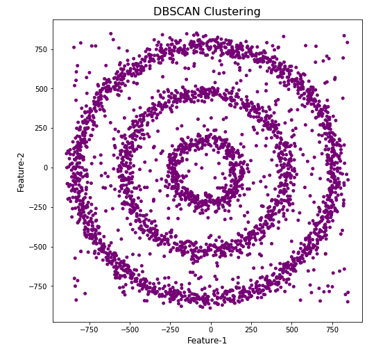
Everything is the one color! which means all data points below to the same cluster. This isn’t very useful and can at first seem like this algorithm doesn’t work for our dataset. But we know it should work given the visual representation of the data. The reason for this occurrence is because the value for epsilon is very small. We need to explore a better value for this. One approach is to use KNN (K-Nearest Neighbors) to calculate the k-distance for the data points and based on this graph we can determine a possible value for epsilon.
#Let's explore the data and work out a better setting
from sklearn.neighbors import NearestNeighbors
neigh = NearestNeighbors(n_neighbors=2)
nbrs = neigh.fit(df[[0,1]])
distances, indices = nbrs.kneighbors(df[[0,1]])

# Plotting K-distance Graph
distances = np.sort(distances, axis=0)
distances = distances[:,1]
plt.figure(figsize=(14,8))
plt.plot(distances)
plt.title('K-Distance - Check where it bends',fontsize=16)
plt.xlabel('Data Points - sorted by Distance',fontsize=12)
plt.ylabel('Epsilon',fontsize=12)
plt.show()
#Let’s plot our K-distance graph and find the value of epsilon

Look at the graph above we can see the main curvature is between 20 and 40. Taking 30 at the mid-point of this we can now use this value for epsilon. The value for the number of samples needs some experimentation to see what gives the best fit.
Let’s now run DBScan to see what we get now.
from sklearn.cluster import DBSCAN
dbscan_opt=DBSCAN(eps=30,min_samples=3)
dbscan_opt.fit(df[[0,1]])

df['DBSCAN_opt_labels']=dbscan_opt.labels_
df['DBSCAN_opt_labels'].value_counts()

# Plotting the resulting clusters
colors=['purple','red','blue','green', 'olive', 'pink', 'cyan', 'orange', 'brown' ]
plt.figure(figsize=(8,8))
plt.scatter(df[0],df[1],c=df['DBSCAN_opt_labels'],cmap=matplotlib.colors.ListedColormap(colors),s=15)
plt.title('DBScan Clustering',fontsize=18)
plt.xlabel('Feature-1',fontsize=12)
plt.ylabel('Feature-2',fontsize=12)
plt.show()

When we look at the dataframe we can see it create many different cluster, beyond the three that we might have been expecting. Most of these clusters contain small numbers of data points. These could be considered outliers and alternative view of this results is presented below, with this removed.
df['DBSCAN_opt_labels']=dbscan_opt.labels_
df['DBSCAN_opt_labels'].value_counts()

 0     1559
 2      898
 3      470
-1      282
 8        6
 5        5
 4        4
 10       4
 11       4
 6        3
 12       3
 1        3
 7        3
 9        3
 13       3
Name: DBSCAN_opt_labels, dtype: int64
The cluster labeled with -1 contains the outliers. Let’s clean this up a little.
df2 = df[df['DBSCAN_opt_labels'].isin([-1,0,2,3])]
df2['DBSCAN_opt_labels'].value_counts()
 0    1559
 2     898
 3     470
-1     282
Name: DBSCAN_opt_labels, dtype: int64

# Plotting the resulting clusters
colors=['purple','red','blue','green', 'olive', 'pink', 'cyan', 'orange']
plt.figure(figsize=(8,8))
plt.scatter(df2[0],df2[1],c=df2['DBSCAN_opt_labels'],cmap=matplotlib.colors.ListedColormap(colors),s=15)
plt.title('DBScan Clustering',fontsize=18)
plt.xlabel('Feature-1',fontsize=12)
plt.ylabel('Feature-2',fontsize=12)
plt.show()

See my other blog post which compares different Clustering algorithms for this same dataset.
