
ML
Combining NLP and Machine Learning for Document Classification
Text mining is a popular topic for exploring what text you have in documents etc. Text mining and NLP can help you discover different patterns in the text like uncovering certain words or phases which are commonly used, to identifying certain patterns and linkages between different texts/documents. Combining this work on Text mining you can use Word Clouds, time-series analysis, etc to discover other aspects and patterns in the text. Check out my previous blog posts (post 1, post 2) on performing Text Mining on documents (manifestos from some of the political parties from the last two national government elections in Ireland). These two posts gives you a simple indication of what is possible.
We can build upon these Text Mining examples to include other machine learning algorithms like those for Classification. With Classification we want to predict or label a record or document to have a particular value. With Classification this could involve labeling a document as being positive or negative (movie or book reviews), or determining if a document is for a particular domain such as Technology, Sports, Entertainment, etc
With Classification problems we typically have a case record containing many different feature/attributes. You will see many different examples of this. When we add in Text Mining we are adding new/additional features/attributes to the case record. These new features/attributes contain some characteristics of the Word (or Term) frequencies in the documents. This is a form of feature engineering, where we create new features/attributes based on our dataset.
Let’s work through an example of using Text Mining and Classification Algorithm to build a model for determining/labeling/classifying documents.
The Dataset: For this example I’ll use Move Review dataset from Cornell University. Download and unzip the file. This will create a set of directories with the reviews (as individual documents) listed under the ‘pos’ or ‘neg’ directory. This dataset contains approximately 2000 documents. Other datasets you could use include the Amazon Reviews or the Disaster Tweets.
The following is the Python code to perform NLP to prepare the data, build a classification model and test this model against a holdout dataset. First thing is to load the libraries NLP and some other basics.
import numpy as np
import re
import nltk
from sklearn.datasets import load_files
from nltk.corpus import stopwords
Load the dataset.
#This dataset will allow use to perform a type of Sentiment Analysis Classification
source_file_dir = r"/Users/brendan.tierney/Dropbox/4-Datasets/review_polarity/txt_sentoken"

#The load_files function automatically divides the dataset into data and target sets.
#load_files  will treat each folder inside the "txt_sentoken" folder as one category
#  and all the documents inside that folder will be assigned its corresponding category.
movie_data = load_files(source_file_dir)
X, y = movie_data.data, movie_data.target

#load_files  function loads the data from both "neg" and "pos" folders into the X variable,
#  while the target categories are stored in y
We can now use the typical NLP tasks on this data. This will clean the data and prepare it.
documents = []
documents = []

from nltk.stem import WordNetLemmatizer

stemmer = WordNetLemmatizer()

for sen in range(0, len(X)):
    # Remove all the special characters, numbers, punctuation
    document = re.sub(r'\W', ' ', str(X[sen]))

    # remove all single characters
    document = re.sub(r'\s+[a-zA-Z]\s+', ' ', document)

    # Remove single characters from the start of document with a space
    document = re.sub(r'\^[a-zA-Z]\s+', ' ', document)

    # Substituting multiple spaces with single space
    document = re.sub(r'\s+', ' ', document, flags=re.I)

    # Removing prefixed 'b'
    document = re.sub(r'^b\s+', '', document)

    # Converting to Lowercase
    document = document.lower()

    # Lemmatization
    document = document.split()

    document = [stemmer.lemmatize(word) for word in document]
    document = ' '.join(document)

    documents.append(document)
You can see we have removed all special characters, numbers, punctuation, single characters, spacing, special prefixes, converted all words to lower case and finally extracted the stemmed word.
Next we need to take these words and convert them into numbers, as the algorithms like to work with numbers rather then text. One particular approach is Bag of Words.
The first thing we need to decide on is the maximum number of words/features to include or use for later stages. As you can image when looking across lots and lots of documents you will have a very large number of words. Some of these are repeated words. What we are interested in are frequently occurring words, which means we can ignore low frequently occurring works. To do this we can set max_feature to a defined value. In our example we will set it to 1500, but in your problems/use cases you might need to experiment to determine what might be a better values.
Two other parameters we need to set include min_df and max_df. min_df sets the minimum number of documents to contain the word/feature. max_df specifies the percentage of documents where the words occur, for example if this is set to 0.7 this means the words should occur in a maximum of 70% of the documents.
from sklearn.feature_extraction.text import CountVectorizer
vectorizer = CountVectorizer(max_features=1500, min_df=5, max_df=0.7,stop_words=stopwords.words('english'))
X = vectorizer.fit_transform(documents).toarray()
The CountVectorizer in the above code also remove Stop Words for the English language. These words are generally basic words that do not convey any meaning. You can easily add to this list and adjust it to suit your needs and to reflect word usage and meaning for your particular domain.
The bag of words approach works fine for converting text to numbers. However, it has one drawback. It assigns a score to a word based on its occurrence in a particular document. It doesn’t take into account the fact that the word might also be having a high frequency of occurrence in other documentsas well. TFIDF resolves this issue by multiplying the term frequency of a word by the inverse document frequency. The TF stands for “Term Frequency” while IDF stands for “Inverse Document Frequency”.
And the Inverse Document Frequency is calculated as:
IDF(word) = Log((Total number of documents)/(Number of documents containing the word))
The term frequency is calculated as:
Term frequency = (Number of Occurrences of a word)/(Total words in the document)
The TFIDF value for a word in a particular document is higher if the frequency of occurrence of thatword is higher in that specific document but lower in all the other documents.
To convert values obtained using the bag of words model into TFIDF values, run the following:
from sklearn.feature_extraction.text import TfidfTransformer
tfidfconverter = TfidfTransformer()
X = tfidfconverter.fit_transform(X).toarray()
That’s the dataset prepared, the final step is to create the Training and Test datasets.
from sklearn.model_selection import train_test_split
X_train, X_test, y_train, y_test = train_test_split(X, y, test_size=0.2, random_state=0)
#Train DS = 70%
#Test DS = 30%
There are several machine learning algorithms you can use. These are the typical classification algorithms. But for simplicity I’m going to use RandomForest algorithm in the following code. After giving this a go, try to do it for the other algorithms and compare the results.
#Import Random Forest Model
#Use RandomForest algorithm to create a model
#n_estimators = number of trees in the Forest

from sklearn.ensemble import RandomForestClassifier
classifier = RandomForestClassifier(n_estimators=1000, random_state=0)
classifier.fit(X_train, y_train)
Now we can test the model on the hold-out or Test dataset
#Now label/classify the Test DS
y_pred = classifier.predict(X_test)

#Evaluate the model
from sklearn.metrics import classification_report, confusion_matrix, accuracy_score

print("Accuracy:", accuracy_score(y_test, y_pred))
print(confusion_matrix(y_test,y_pred))
print(classification_report(y_test,y_pred))
This model gives the following results, with an over all accuracy of 85% (you might get a slightly different figure). This is a good outcome and a good predictive model. But is it the best one? We simply don’t know at this point. Using the ‘No Free Lunch Theorem’ we would would have to see what results we would get from the other algorithms.
Although this example only contains the words from the documents, we can see how we could include this with other features/attributes when forming a case record. For example, our case records represented Insurance Claims, the features would include details of the customer, their insurance policy, the amount claimed, etc and in addition could include incident reports, claims assessor reports etc. This would be documents which we can include in the building a predictive model to determine of an insurance claim is fraudulent or not.
Comparing Cluster Algorithms on Density Data
In a previous posted I gave a detailed description of using DBScan to create clusters for a dataset containing different density based data. This “manufactured” dataset was created to illustrate how and why DBScan can be used.
But taking the previous post in isolation is perhaps not recommended. As a Data Scientist you will need to use many Clustering algorithms to determine which algorithm can best identify the patterns in your data, and this can be determined by the type of data distributions within the dataset.
The DBScan post created the following diagrams. The diagram on the left is a plot of the dataset where we can easily identify different groupings/clusters. The diagram on the right illustrates the clusters identified by DBScan. As you can see it did a good job.
We can see the three clusters and the noisy data point which were added to the dataset.
But what about other Clustering algorithms? What about k-Means and Hierarchical Clustering algorithms? How would they perform on this dataset?
Here is the code for k-Means with three clusters. Three clusters was selected as we have three clear clusters in the dataset.
#k-Means with 3 clusters
from sklearn.cluster import KMeans
k_means=KMeans(n_clusters=3,random_state=42)
k_means.fit(df[[0,1]])

df['KMeans_labels']=k_means.labels_

# Plotting resulting clusters
colors=['purple','red','blue','green']
plt.figure(figsize=(10,10))
plt.scatter(df[0],df[1],c=df['KMeans_labels'],cmap=matplotlib.colors.ListedColormap(colors),s=15)
plt.title('K-Means Clustering',fontsize=18)
plt.xlabel('Feature-1',fontsize=12)
plt.ylabel('Feature-2',fontsize=12)
plt.show()
Here is the code for Hierarchical Clustering, again three clusters was selected.
from sklearn.cluster import AgglomerativeClustering
model = AgglomerativeClustering(n_clusters=3, affinity='euclidean')
model.fit(df[[0,1]])

df['HR_labels']=model.labels_

# Plotting resulting clusters
plt.figure(figsize=(10,10))
plt.scatter(df[0],df[1],c=df['HR_labels'],cmap=matplotlib.colors.ListedColormap(colors),s=15)
plt.title('Hierarchical Clustering',fontsize=20)
plt.xlabel('Feature-1',fontsize=14)
plt.ylabel('Feature-2',fontsize=14)
plt.show()
The diagrams from both of these are shown below.
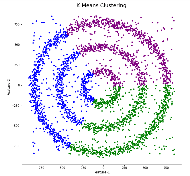
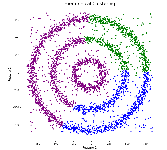
As you can see the results generated by these alternative Clustering algorithms produce very different results to what was produced by DBScan (see image at top of post) and we can easily see which algorithm best fits the dataset used.
Make sure you check out the post on DBScan.
DBScan Clustering in Python
Unsupervised Learning is a common approach for discovering patterns in datasets. The main algorithmic approach in Unsupervised Learning is Clustering, where the data is searched to discover groupings, or clusters, of data. Each of these clusters contain data points which have some set of characteristics in common with each other, and each cluster is distinct and different. There are many challenges with clustering which include trying to interpret the meaning of each cluster and how it is related to the domain in question, what is the “best” number of clusters to use or have, the shape of each cluster can be different (not like the nice clean examples we see in the text books), clusters can be overlapping with a data point belonging to many different clusters, and the difficulty with trying to decide which clustering algorithm to use.
The last point above about which clustering algorithm to use is similar to most problems in Data Science and Machine Learning. The simple answer is we just don’t know, and this is where the phases of “No free lunch” and “All models are wrong, but some models are model that others”, apply. This is where we need to apply the various algorithms to our data, and through a deep process of investigation the outputs, of each algorithm, need to be investigated to determine what algorithm, the parameters, etc work best for our dataset, specific problem being investigated and the domain. This involve the needs for lots of experiments and analysis. This work can take some/a lot of time to complete.
The k-Means clustering algorithm gets a lot of attention and focus for Clustering. It’s easy to understand what it does and to interpret the outputs. But it isn’t perfect and may not describe your data, as it can have different characteristics including shape, densities, sparseness, etc. k-Means focuses on a distance measure, while algorithms like DBScan can look at the relative densities of data. These two different approaches can produce by different results. Careful analysis of the data and the results/outcomes of these algorithms needs some care.
Let’s illustrate the use of DBScan (Density Based Spatial Clustering of Applications with Noise), using the scikit-learn Python package, for a “manufactured” dataset. This example will illustrate how this density based algorithm works (See my other blog post which compares different Clustering algorithms for this same dataset). DBSCAN is better suited for datasets that have disproportional cluster sizes (or densities), and whose data can be separated in a non-linear fashion.
There are two key parameters of DBScan:
- eps: The distance that specifies the neighborhoods. Two points are considered to be neighbors if the distance between them are less than or equal to eps.
- minPts: Minimum number of data points to define a cluster.
Based on these two parameters, points are classified as core point, border point, or outlier:
- Core point: A point is a core point if there are at least minPts number of points (including the point itself) in its surrounding area with radius eps.
- Border point: A point is a border point if it is reachable from a core point and there are less than minPts number of points within its surrounding area.
- Outlier: A point is an outlier if it is not a core point and not reachable from any core points.
The algorithm works by randomly selecting a starting point and it’s neighborhood area is determined using radius eps. If there are at least minPts number of points in the neighborhood, the point is marked as core point and a cluster formation starts. If not, the point is marked as noise. Once a cluster formation starts (let’s say cluster A), all the points within the neighborhood of initial point become a part of cluster A. If these new points are also core points, the points that are in the neighborhood of them are also added to cluster A. Next step is to randomly choose another point among the points that have not been visited in the previous steps. Then same procedure applies. This process finishes when all points are visited.
Let’s setup our data set and visualize it.
import numpy as np
import pandas as pd
import math
import matplotlib.pyplot as plt
import matplotlib
#initialize the random seed
np.random.seed(42) #it is the answer to everything!
#Create a function to create our data points in a circular format
#We will call this function below, to create our dataframe
def CreateDataPoints(r, n):
return [(math.cos(2*math.pi/n*x)*r+np.random.normal(-30,30),math.sin(2*math.pi/n*x)*r+np.random.normal(-30,30)) for x in range(1,n+1)]
#Use the function to create different sets of data, each having a circular format
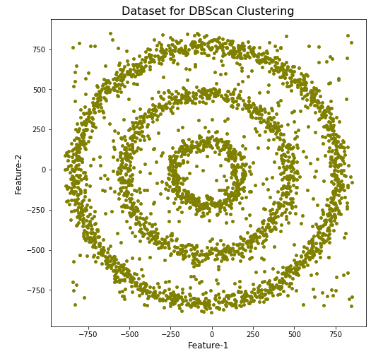
df=pd.DataFrame(CreateDataPoints(800,1500)) #500, 1000
df=df.append(CreateDataPoints(500,850)) #300, 700
df=df.append(CreateDataPoints(200,450)) #100, 300
# Adding noise to the dataset
df=df.append([(np.random.randint(-850,850),np.random.randint(-850,850)) for i in range(450)])
plt.figure(figsize=(8,8))
plt.scatter(df[0],df[1],s=15,color='olive')
plt.title('Dataset for DBScan Clustering',fontsize=16)
plt.xlabel('Feature-1',fontsize=12)
plt.ylabel('Feature-2',fontsize=12)
plt.show()

We can see the dataset we’ve just created has three distinct circular patterns of data. We also added some noisy data too, which can be see as the points between and outside of the circular patterns.
Let’s use the DBScan algorithm, using the default setting, to see what it discovers.
from sklearn.cluster import DBSCAN
#DBSCAN without any parameter optimization and see the results.
dbscan=DBSCAN()
dbscan.fit(df[[0,1]])

df['DBSCAN_labels']=dbscan.labels_

# Plotting resulting clusters
colors=['purple','red','blue','green']
plt.figure(figsize=(8,8))
plt.scatter(df[0],df[1],c=df['DBSCAN_labels'],cmap=matplotlib.colors.ListedColormap(colors),s=15)
plt.title('DBSCAN Clustering',fontsize=16)
plt.xlabel('Feature-1',fontsize=12)
plt.ylabel('Feature-2',fontsize=12)
plt.show()
#Not very useful !
#Everything belongs to one cluster.
Everything is the one color! which means all data points below to the same cluster. This isn’t very useful and can at first seem like this algorithm doesn’t work for our dataset. But we know it should work given the visual representation of the data. The reason for this occurrence is because the value for epsilon is very small. We need to explore a better value for this. One approach is to use KNN (K-Nearest Neighbors) to calculate the k-distance for the data points and based on this graph we can determine a possible value for epsilon.
#Let's explore the data and work out a better setting
from sklearn.neighbors import NearestNeighbors
neigh = NearestNeighbors(n_neighbors=2)
nbrs = neigh.fit(df[[0,1]])
distances, indices = nbrs.kneighbors(df[[0,1]])

# Plotting K-distance Graph
distances = np.sort(distances, axis=0)
distances = distances[:,1]
plt.figure(figsize=(14,8))
plt.plot(distances)
plt.title('K-Distance - Check where it bends',fontsize=16)
plt.xlabel('Data Points - sorted by Distance',fontsize=12)
plt.ylabel('Epsilon',fontsize=12)
plt.show()
#Let’s plot our K-distance graph and find the value of epsilon

Look at the graph above we can see the main curvature is between 20 and 40. Taking 30 at the mid-point of this we can now use this value for epsilon. The value for the number of samples needs some experimentation to see what gives the best fit.
Let’s now run DBScan to see what we get now.
from sklearn.cluster import DBSCAN
dbscan_opt=DBSCAN(eps=30,min_samples=3)
dbscan_opt.fit(df[[0,1]])

df['DBSCAN_opt_labels']=dbscan_opt.labels_
df['DBSCAN_opt_labels'].value_counts()

# Plotting the resulting clusters
colors=['purple','red','blue','green', 'olive', 'pink', 'cyan', 'orange', 'brown' ]
plt.figure(figsize=(8,8))
plt.scatter(df[0],df[1],c=df['DBSCAN_opt_labels'],cmap=matplotlib.colors.ListedColormap(colors),s=15)
plt.title('DBScan Clustering',fontsize=18)
plt.xlabel('Feature-1',fontsize=12)
plt.ylabel('Feature-2',fontsize=12)
plt.show()

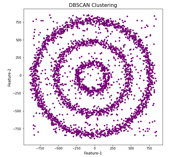
When we look at the dataframe we can see it create many different cluster, beyond the three that we might have been expecting. Most of these clusters contain small numbers of data points. These could be considered outliers and alternative view of this results is presented below, with this removed.
df['DBSCAN_opt_labels']=dbscan_opt.labels_
df['DBSCAN_opt_labels'].value_counts()

 0     1559
 2      898
 3      470
-1      282
 8        6
 5        5
 4        4
 10       4
 11       4
 6        3
 12       3
 1        3
 7        3
 9        3
 13       3
Name: DBSCAN_opt_labels, dtype: int64
The cluster labeled with -1 contains the outliers. Let’s clean this up a little.
df2 = df[df['DBSCAN_opt_labels'].isin([-1,0,2,3])]
df2['DBSCAN_opt_labels'].value_counts()
 0    1559
 2     898
 3     470
-1     282
Name: DBSCAN_opt_labels, dtype: int64

# Plotting the resulting clusters
colors=['purple','red','blue','green', 'olive', 'pink', 'cyan', 'orange']
plt.figure(figsize=(8,8))
plt.scatter(df2[0],df2[1],c=df2['DBSCAN_opt_labels'],cmap=matplotlib.colors.ListedColormap(colors),s=15)
plt.title('DBScan Clustering',fontsize=18)
plt.xlabel('Feature-1',fontsize=12)
plt.ylabel('Feature-2',fontsize=12)
plt.show()

See my other blog post which compares different Clustering algorithms for this same dataset.
OML4Py – AutoML – Oracle GUI for AutoML
In addition to the new AutoML features with OML4Py (Oracle Machine Learning for Python), which is currently available on ADW/ATP using Oracle Machine Learning (OML) Notebooks, Oracle has just released a GUI for AutoML.
As with all new releases there are a few things that Oracle need to tidy up with the interface and CX with this GUI. I’m sure these will be corrected/updated quietly behind the scenes and we will gradually see these improvements over the weeks to come (after product release). Part of the joys of cloud first deployment.
The initial release of AutoML GUI is SO SLOW. It is several, several times slower than trying to do the same task in OML4Py. Plus the Algorithms used and models created seem to be different. Maybe this is down to the “meta-learning” AutoML uses, but for repeatability and ensuring confidence with of outputs, some additional work is needed otherwise it is unreliable and people won’t use something that is unreliable.
To illustrate how to use the AutoML GUI, I’m going to use the same example and same Oracle Cloud environment I’ve used to illustrate the other ways of running AutoML using OML4Py (see post 1, see post 2).
The AutoML GUI can be accessed from the main OML Notebooks welcome page. On the next webpage, called AutoML Experiment, click on the Create button.

The Create Experiment page allows you to specify the required details for you AutoML experiment. Although this tool is aims at non-technical people, they still require a certain degree of knowledge of Machine Learning and what the different terms mean! On the Create Experiment page enter the following details, and enter them in this order. Numbers below correspond to numbers on image below
- Name of experiment – free format text – enter a meaningful name
- Data Source – Click on Magnifying Glass – Select your Schema, and Table/View from the list
- Predict – what attribute is the Target variable/column
- Case ID – Select attribute that is unique e.g. PK, or some other attribute. Selecting an attribute for this is not necessary
- Features – Exclude any attributes you don’t want included, for example attributes that are correlated to the target values
You can now run the AutoML process by clicking the Start button at the top of the page (6).

But maybe before you do this, you can look at the Additional Settings, and alter these if you want or just leave them as they are

After clicking the Start button, you are given two options or modes. You can run the AutoML Experiment with “Faster Results” or with “Better Accuracy”. Both of these are SLOW to execute, but I’d advice running using Both options/modes to see how the results differ. This does require you to setup two version of the same AutoML Experiment!
When the AutoML Experiment is running, see image below, the dashboard displays results are each part of the experiment completes. These include the Algorithms, the accuracy levels and the Features/Attributes that are important.

The AutoML Experiment will eventually finish! Even after displaying the details of the last algorithm in the Leaders Board, it will keep running for some time before completing. Initially the dashboard will just display Accuracy for the model. You can expand this list of evaluation metrics by clicking the ‘Metrics’ located just under the Leader Board title, and selecting the additional evaluation metrics from the list. These will now be displayed on the Leaders Board.

That’s it! Relatively simple to use, but you do still know what you are doing, and it isn’t really aimed at novices despite some of the marketing.
One final feature that is kind of nice is the ‘Create Notebook’. Located in Leader Board section, select one of the models, and then click on ‘Create Notebook’ and it will create an OML Notebook for you based on the model you have selected. You will be promoted to give the notebook a name. A message will be displayed at the top of the webpage saying ‘…notebook successfully created’. Go to your list of Notebooks and open it. It will be a basic notebook with code to create/define the data set, setup model settings, create the model, display model details and use the model to label a data set.

AutoML is just too slow at the moment (I’ve tested with several data sets of different sizes). Start the process and go for lunch. It might be finished when you get back! I’ve been told things would run a lot quicker if I wasn’t using the Free Tier. I hope that is true, but how many people have easy access to such an environment to test this? Not many, including myself, which makes it difficult to test and compare the results. The Free Tier is the gateway for people get to try new Oracle products. First impression are important.
I mentioned earlier I used the same data set and Oracle Cloud environment when I showed how to use AutoML in OML4Py (using OML Notebooks). The results from OML4Py AutoML are different to those show above using AutoML (G)UI. Getting different results with similar setttings/configurations is very confusing. Which approach should be used for AutoML? Can you trust the results from AutoML if you are getting different results? If the data scientist uses OML4Py and the data analyst uses the AutoML GUI, then there should be some commonality in what is produced by these same/similar AutoML. Realiability and reproducibility is vital in Data Science, Machine Learning, etc.
In my tests, there was no similarity/commonality with the outputs from AutoML, that was my experience. In such a situation where different AutoML outputs are produced which one should we believe/trust? Who will the business users believe? Who is doing it correctly? Who is producing results the business can rely upon?

You must be logged in to post a comment.