Visualizations
Change the size of ORE PNG graphics using in-database R functions
In a previous blog post I showed you how create and display a ggplot2 R graphic using SQL. Make sure to check it out before reading the rest of this blog post.
In my previous blog post, I showed and mentioned that the PNG graphic returned by the embedded R execution SQL statement was not the same as what was produced if you created the graphic in an R session.
Here is the same ggplot2 graphic. The first one is what is produced in an R session and the section is what is produced by SQL query and the embedded R execution in Oracle.

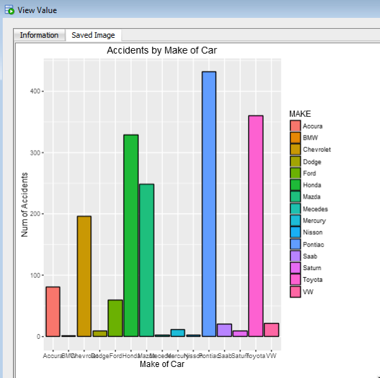
As you can see the second image (produced using the embedded R execution) gives a very square image.
The reason for this is that Oracle R Enterprise (ORE) creates the graphic image in PNG format. The default setting from this is 480 x 480. You will find this information when you go digging in the R documentation and not in the Oracle documentation.
So, how can I get my ORE produced graphic to appear like what is produced in R?
What you need to do is to change the height and width of the PNG image produced by ORE. You can do this by passing parameters in the SQL statement used to call the user defined R function, that in turn produces the ggplot2 image.
In my previous post, I gave the SQL statement to call and produce the graphic (shown above). One of the parameters to the rqTableEval function was set to null. This was because we didn’t have any parameters to pass, apart from the data set.
We can replace this null with any parameters we want to pass to the user defined R function (demo_ggpplot). To pass the parameters we need to define them using a SELECT statement.
cursor(select 500 as "ore.png.height", 850 as "ore.png.width" from dual),
The full SELECT statement now becomes
select *
from table(rqTableEval( cursor(select * from claims),
                        cursor(select 500 as "ore.png.height", 850 as "ore.png.width" from dual),
                        'PNG',
                        'demo_ggpplot'));
When you view the graphic in SQL Developer, you will get something that looks a bit more like what you would expect or want to see.
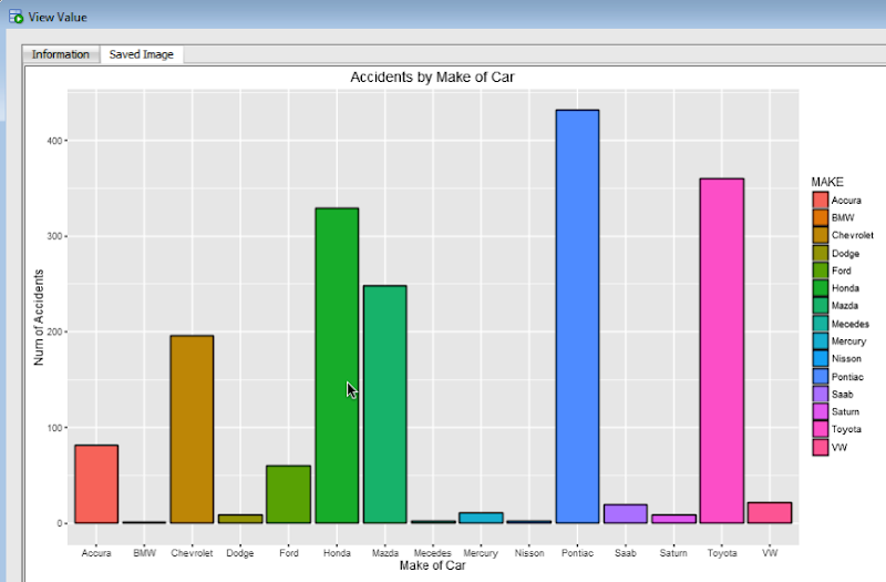
For each graphic image you want to produce using ORE you will need to figure out that are the best PNG height and width settings to use. Plus it also depends on what tool or application you are going to use to display the images (eg. APEX etc)
Creating ggplot2 graphics using SQL
Did you read the title of this blog post! Read it again.
Yes, Yes, I know what you are saying, “SQL cannot produce graphics or charts and particularly not ggplot2 graphics”.
You are correct to a certain extent. SQL is rubbish a creating graphics (and I’m being polite).
But with Oracle R Enterprise you can now produce graphics on your data using the embedded R execution feature of Oracle R Enterprise using SQL. In this blog post I will show you how.
1. Pre-requisites
You need to have installed Oracle R Enterprise on your Oracle Database Server. Plus you need to install the ggplot2 R package.
In your R session you will need to setup a ORE connection to your Oracle schema.
2. Write and Test your R code to produce the graphic
It is always a good idea to write and test your R code before you go near using it in a user defined function.
For our (first) example we are going to create a bar chart using the ggplot2 R package. This is a basic example and the aim is to illustrate the steps you need to go through to call and produce this graphic using SQL.
The following code using the CLAIMS data set that is available with/for Oracle Advanced Analytics. The first step is to pull the data from the table in your Oracle schema to your R session. This is because ggplot2 cannot work with data referenced by an ore.frame object.
data.subset <- ore.pull(CLAIMS)
Next we need to aggregate the data. Here we are counting the number of records for each Make of car.
aggdata2 <- aggregate(data.subset$POLICYNUMBER,
                      by = list(MAKE = data.subset$MAKE),
                      FUN = length)
Now load the ggplot2 R package and use it to build the bar chart.
ggplot(data=aggdata2, aes(x=MAKE, y=x, fill=MAKE)) +
       geom_bar(color="black", stat="identity") +
       xlab("Make of Car") +
       ylab("Num of Accidents") +
       ggtitle("Accidents by Make of Car")
The following is the graphic that our call to ggplot2 produces in R.
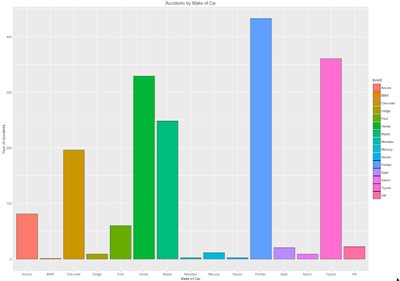
At this point we have written and tested our R code and know that it works.
3. Create a user defined R function and store it in the Oracle Database
Our next step in the process is to create an in-database user defined R function. This is were we store R code in our Oracle Database and make this available as an R function. To create the user defined R function we can use some PL/SQL to define it, and then take our R code (see above) and in it.
BEGIN
   -- sys.rqScriptDrop('demo_ggpplot');
   sys.rqScriptCreate('demo_ggpplot',
      'function(dat) {
         library(ggplot2)

         aggdata2 <- aggregate(dat$POLICYNUMBER,
                      by = list(MAKE = dat$MAKE),
                      FUN = length)

        g <-ggplot(data=aggdata2, aes(x=MAKE, y=x, fill=MAKE)) + geom_bar(color="black", stat="identity") +
                   xlab("Make of Car") + ylab("Num of Accidents") + ggtitle("Accidents by Make of Car")

        plot(g)
   }');
END;
We have to make a small addition to our R code. We need need to include a call to the plot function so that the image can be returned as a BLOB object. If you do not do this then the SQL query in step 4 will return no rows.
4. Write the SQL to call it
To call our defined R function we will need to use one of the ORE SQL API functions. In the following example we are using the rqTableEval function. The first parameter for this function passes in the data to be processed. In our case this is the data from the CLAIMS table. The second parameter is set to null. The third parameter is set to the output format and in our case we want this to be PNG. The fourth parameter is the name of the user defined R function.
select *
from table(rqTableEval( cursor(select * from claims),
                        null,
                        'PNG',
                        'demo_ggpplot'));
5. How to view the results
The SQL query in Step 4 above will return one row and this row will contain a column with a BLOB data type.

The easiest way to view the graphic that is produced is to use SQL Developer. It has an inbuilt feature that allows you to display BLOB objects. All you need to do is to double click on the BLOB cell (under the column labeled IMAGE). A window will open called ‘View Value’. In this window click the ‘View As Image’ check box on the top right hand corner of the window. When you do the R ggplot2 graphic will be displayed.

Yes the image is not 100% the same as the image produced in our R session. I will have another blog post that deals with this at a later date.
But, now you have written a SQL query, that calls R code to produce an R graphic (using ggplot2) of our data.
6. Now you can enhance the graphics (without changing your SQL)
What if you get bored with the bar chart and you want to change it to a different type of graphic? All you need to do is to change the relevant code in the user defined R function.
For example, if we want to change the graphic to a polar plot. The following is the PL/SQL code that re-defines the user defined R script.
BEGIN
   sys.rqScriptDrop('demo_ggpplot');
   sys.rqScriptCreate('demo_ggpplot',
      'function(dat) {
         library(ggplot2)

         aggdata2 <- aggregate(dat$POLICYNUMBER,
                      by = list(MAKE = dat$MAKE),
                      FUN = length)

         n <- nrow(aggdata2)
         degrees <- 360/n

        aggdata2$MAKE_ID <- 1:nrow(aggdata2)

        g<- ggplot(data=aggdata2, aes(x=MAKE, y=x, fill=MAKE)) + geom_bar(color="black", stat="identity") +
               xlab("Make of Car") + ylab("Num of Accidents") + ggtitle("Accidents by Make of Car") + coord_polar(theta="x")
        plot(g)
   }');
END;
We can use the exact same SQL query we defined in Step 4 above to call the next graphic.
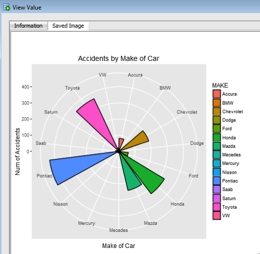
All done.
Now that was easy! Right?
I kind of is easy once you have been shown. There are a few challenges when working in-database user defined R functions and writing the SQL to call them. Most of the challenges are around the formatting of R code in the function and the syntax of the SQL statement to call it. With a bit of practice it does get easier.
7. Where/How can you use these graphics ?
Any application or program that can call and process a BLOB data type can display these images. For example, I’ve been able to include these graphics in applications developed in APEX.
googleVis R package for creating google charts in R
I’ve recently come across the ‘googleVis’ R package. This allows you to create a variety of different (typical and standard) charts in R but with the look and feel of the charts we can get from a number of different Google sites.
I won’t bore you with some examples in the post but I’ll point you to a good tutorial on the various charts.
Here is the link to the mini-tutorial.
Before you can use the package you will need to install it. The simplest way is to run the following in your R session.
> install.packages("googleVis")
Depending on your version of R you may need to upgrade.
Here is a selection of some of the charts you can create, and there are many, many more.
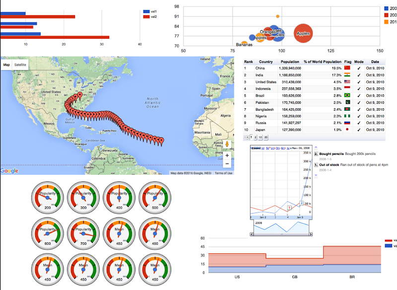
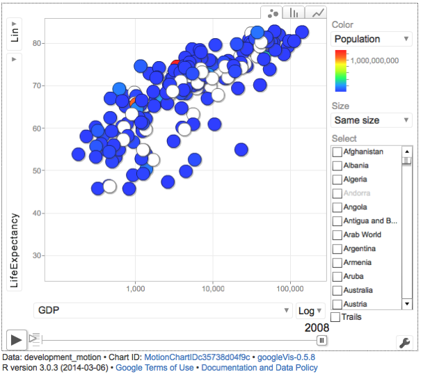
Some of you might be familiar with the presenting that Hans Rosling gives. Some of the same technology is behind these bubble charts from Google, as they bought the software years ago. Hans typically uses a data set that consists of GDP, Population and Life Expectancy for countries around the World. You too can use this same data set and is available from rdatamarket. The following R codes will extract this data set to you local R session and you can then use it as input to the various charts in the googleVis functions.
install.packages("rdatamarket")
library(rdatamarket)
dminit(NULL)

# Pull in life expectancy and population data
life_expectancy <- dmlist("15r2!hrp")
population <- dmlist("1cfl!r3d")

# Pull in the yearly GDP for each country
gdp <- dmlist("15c9!hd1")

# Load in the plyr package
library("plyr")

# Rename the Value for each dataset
names(gdp)[3] <- "GDP"

# Use plyr to join your three data frames into one: development
gdp_life_exp <- join(gdp, life_expectancy)
names(gdp_life_exp)[4] <- "LifeExpectancy"
development <- join(gdp_life_exp, population)
names(development)[5] <- "Population"
Here is an example of the bubble chart using this data set.
There are a few restrictions with using this package. All the results will be displayed in a web browser, so you need to make sure that this is possible. Some of the charts are require flash. Again you need to make sure you are the latest version and/or you many have restrictions in your workplace on using it.
