
Data Analytics
Leaving Certificate 2023: In-line or more adjustments
The Leaving Certificate results were released this morning. Congratulations to everyone who has completed this major milestone. It’s a difficult set of examinations and despite all the calls to reform the examinations process, it has largely remained unchanged in decades, apart from some minor changes.
Last year (2022) I analysed some of the Leaving Certificate results. This was primarily focused on higher level papers and for a subset of the subjects. Some of these are the core subjects and some of the optional subjects. Just like last year we are told by the Department of Education the results this year will in-aggregate be in-line with last year. This statement is very confusing and also misleading. What does it really mean? No one has given a clear definition or explanation. What it tries to convey is the profile marks by subject are the same as last year. We say last year this was Not the case and we saw some grade deflation back towards the pre-Covid profile. Some though a similar stepping back this year, just like we have seen in the UK and other European countries.
The State Examinations Commission has released the break down of numbers and percentages of student who were awarded each grade by students. There are lots of ways to analyse this data from using Python and other Data Analytics tools, but for me I’ve loaded the data into an Oracle Database, and used Oracle Analytics Cloud to do some of the analysis along with other tools.
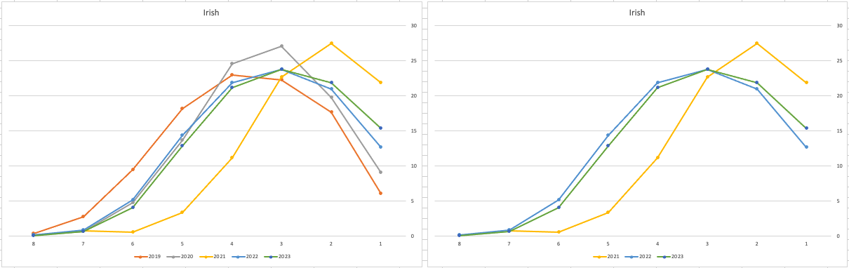
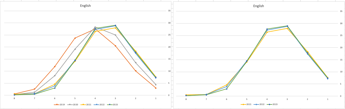
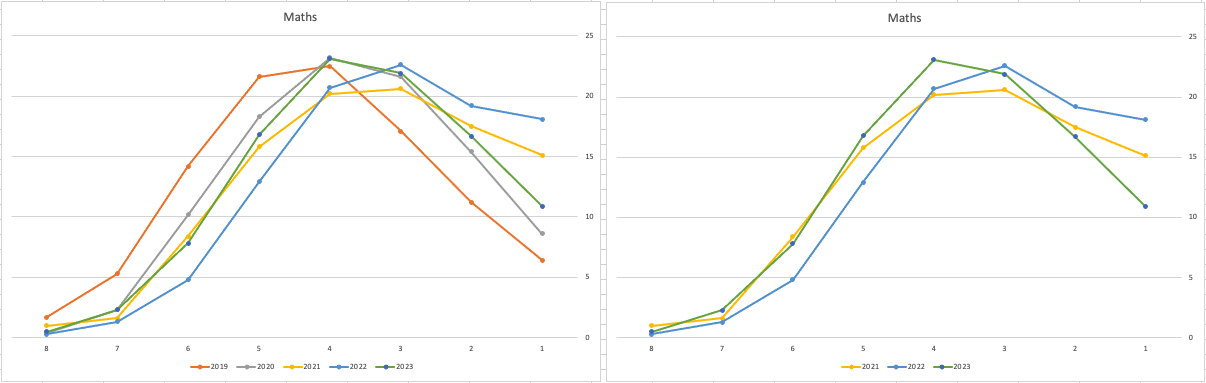
Let’s start with the core exam subjects of Irish, English and Maths. For Irish, last year we saw a step back in the profile of marks. This was a significant step back towards the marks in 2019 (pre-Covid). There wasn’t much discussion about this last year, and perhaps one of the reason is Irish is typically not counted towards their CAO points, as it is typically one of the weaker subjects for a lot of students. This year the profile of marks for Irish is in-line with last year’s profile (+/- small percentages) with slight up tick in H1 grades. For English, the profile of marks for 2021, 2022 and 2023 are almost exactly the same. But for Maths we do see a step back (moving the the left in the figure below) with a significantly lower percentage of student achieving a H2 or H1. Although we do see a slight increase in those getting H4 and H3 grades There was some problems with one of the Maths papers and perhaps marks were not adjusted due to those issues, which isn’t right to me as something should have been done. But perhaps a decision was made to all this step back in Maths to reduce the number of students achieving the top points of 625 and avoiding the scenario where those student do not get their first choice course for university.
The SEC have said the following about the marking of Maths Paper 1. “This process resulted in a marking scheme that was at the more lenient end of the normal range“. Even with more lenient marking and grade adjustments the profile of marks has taken a step backwards. This does raise question about how lenient they were or no and if the post mark adjusts took into account last year’s profile, or they are looking to step back to pre-Covid profiles.
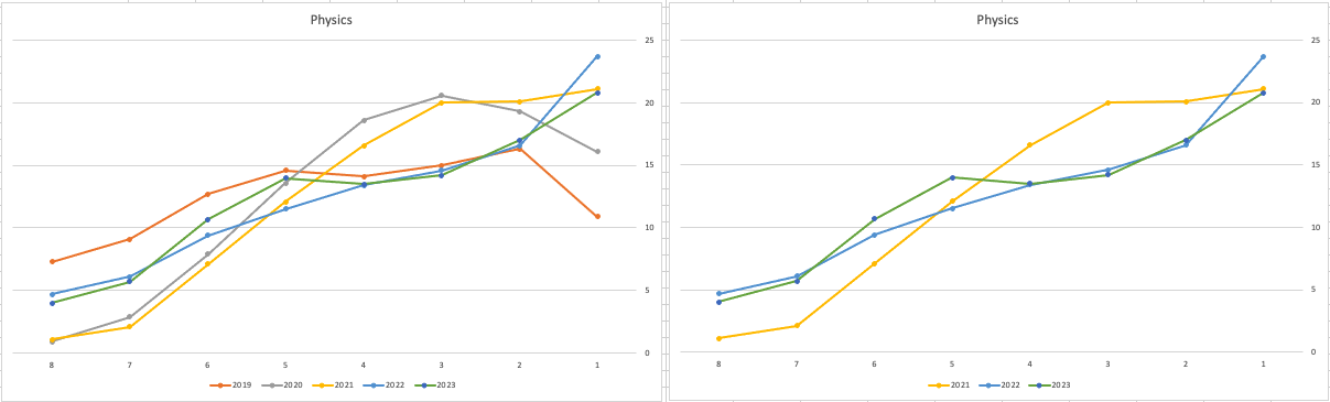
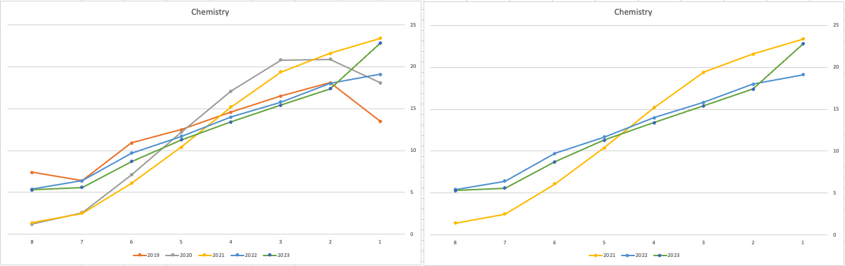
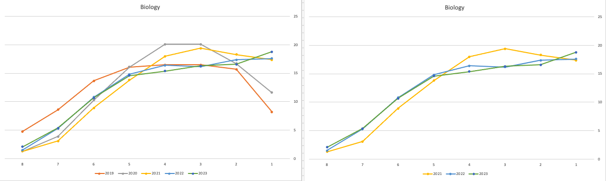
When we look at the Science students of Physics, Chemistry and Biology, we can see the profile of marks for this year is broadly in line with last years (2022). When looking at the profiles for these subjects, we can see that they are very similar to the pre-Covid profiles. Although there are some minor differences. We are still seeing an increased level H1s across this students when compared to pre-Covid 2019 levels. With lower grades having a slightly smaller percentage profile when compared to pre-Covid 2019 level. Look at the profiles 2022 and 2023 are broadly in-line with with 2019 (with some minor variations).
There are more subjects to report upon, but those listed above will cover most students.
What do these results and profile of marks mean for students looking to go to University or further education where the courses are based on the CAO Points systems. It looks like the step back in grade profile for Maths will have the biggest impact on CAO Points for courses. This will particularly impact those courses in the 525-625 range in 2022. We could see a small drop in marks for courses in that range with a possible drop of up to 10 points for some of those courses.
For courses in the 400-520 range in 2022, we might see a small increase in marks. Again this might be due to the profile of marks in Maths, but also with some of the other optional subjects. This year we could see a slight increase of 5-15 points for those courses.
Time will tell if these predictions come true, and hopefully every student will get the course they are hoping for as the nervous wait for CAO Round 1 offers commece. (Wednesday 30th August). I’ll have another post looking at the CAO Points profiles, so look out for that.
Exploring Database trends using Python pytrends (Google Trends)
A little word of warning before you read the rest of this post. The examples shown below are just examples of what is possible. It isn’t very scientific or rigorous, so don’t come complaining if what is shown doesn’t match your knowledge and other insights. This is just a little fun to see what is possible. Yes a more rigorous scientific study is needed, and some attempts at this can be seen at DB-Engines.com. Less scientific are examples shown at TOPDB Top Database index and that isn’t meant to be very scientific.
After all of that, here we go 🙂
pytrends is a library providing an API to Google Trends using Python. The following examples show some ways you can use this library and the focus area I’ll be using is Databases. Many of you are already familiar with using Google Trends, and if this isn’t something you have looked at before then I’d encourage you to go have a look at their website and to give it a try. You don’t need to run Python to use it. For example, here is a quick example taken from the Google Trends website. Here are a couple of screen shots from Google Trends, comparing Relational Database to NoSQL Database. The information presented is based on what searches have been performed over the past 12 months. Some of the information is kind of interesting when you look at the related queries and also the distribution of countries.


To install pytrends use the pip command
pip3 install pytrends
As usual it will change the various pendent libraries and will update where necessary. In my particular case, the only library it updated was the version of pandas.
You do need to be careful of how many searches you perform as you may be limited due to Google rate limits. You can get around this by using a proxy and there is an example on the pytrends PyPi website on how to get around this.
The following code illustrates how to import and setup an initial request. The pandas library is also loaded as the data returned by pytrends API into a pandas dataframe. This will make it ease to format and explore the data.
import pandas as pd
from pytrends.request import TrendReq

pytrends = TrendReq()
The pytrends API has about nine methods. For my example I’ll be using the following:
- Interest Over Time: returns historical, indexed data for when the keyword was searched most as shown on Google Trends’ Interest Over Time section.
- Interest by Region: returns data for where the keyword is most searched as shown on Google Trends’ Interest by Region section.
- Related Queries: returns data for the related keywords to a provided keyword shown on Google Trends’ Related Queries section.
- Suggestions: returns a list of additional suggested keywords that can be used to refine a trend search.
Let’s now explore these APIs using the Databases as the main topic of investigation and examining some of the different products. I’ve used the db-engines.com website to select the top 5 databases (as per date of this blog post). These were:
- Oracle
- MySQL
- SQL Server
- PostgreSQL
- MongoDB
I will use this list to look for number of searches and other related information. First thing is to import the necessary libraries and create the connection to Google Trends.
import pandas as pd
from pytrends.request import TrendReq

pytrends = TrendReq()
Next setup the payload and keep the timeframe for searches to the past 12 months only.
search_list = ["Oracle", "MySQL", "SQL Server", "PostgreSQL", "MongoDB"] #max of 5 values allowed
pytrends.build_payload(search_list, timeframe='today 12-m')
We can now look at the the interest over time method to see the number of searches, based on a ranking where 100 is the most popular.
df_ot = pd.DataFrame(pytrends.interest_over_time()).drop(columns='isPartial')
df_ot

and to see a breakdown of these number on an hourly bases you can use the get_historical_interest method.
pytrends.get_historical_interest(search_list)
Let’s move on to exploring the level of interest/searches by country. The following retrieves this information, ordered by Oracle (in decending order) and then select the top 20 countries. Here we can see the relative number of searches per country. Note these doe not necessarily related to the countries with the largest number of searches
df_ibr = pytrends.interest_by_region(resolution='COUNTRY') # CITY, COUNTRY or REGION
df_ibr.sort_values('Oracle', ascending=False).head(20)

Visualizing data is always a good thing to do as we can see a patterns and differences in the data in a clearer way. The following takes the above query and creates a stacked bar chart.
import matplotlib
from matplotlib import pyplot as plt

df2 = df_ibr.sort_values('Oracle', ascending=False).head(20)

df2.reset_index().plot(x='geoName', y=['Oracle', 'MySQL', 'SQL Server', 'PostgreSQL', 'MongoDB'], kind ='bar', stacked=True, title="Searches by Country")

plt.rcParams["figure.figsize"] = [20, 8]
plt.xlabel("Country")
plt.ylabel("Ranking")

We can delve into the data more, by focusing on one particular country and examine the google searches by city or region. The following looks at the data from USA and gives the rankings for the various states.
pytrends.build_payload(search_list, geo='US')
df_ibr = pytrends.interest_by_region(resolution='COUNTRY', inc_low_vol=True)
df_ibr.sort_values('Oracle', ascending=False).head(20)

df2.reset_index().plot(x='geoName', y=['Oracle', 'MySQL', 'SQL Server', 'PostgreSQL', 'MongoDB'], kind ='bar', stacked=True, title="test")
plt.rcParams["figure.figsize"] = [20, 8]

plt.title("Searches for USA")
plt.xlabel("State")
plt.ylabel("Ranking")


We can find the top related queries and and top queries including the names of each database.
search_list = ["Oracle", "MySQL", "SQL Server", "PostgreSQL", "MongoDB"] #max of 5 values allowed
pytrends.build_payload(search_list, timeframe='today 12-m')

rq = pytrends.related_queries()
rq.values()

#display rising terms
rq.get('Oracle').get('rising')
We can see the top related rising queries for Oracle are about tik tok. No real surprise there!

and the top queries for Oracle included:
rq.get('Oracle').get('top')

This was an interesting exercise to do. I didn’t show all the results, but when you explore the other databases in the list and see the results from those, and then compare them across the five databases you get to see some interesting patterns.

You must be logged in to post a comment.