
Python
Exploring Apache Iceberg using PyIceberg – Part 2
Apache Iceberg, an open-source table format that has become the industry standard for data sharing in modern data architectures. In my previous posts on Apache Iceberg I explored the core features of Iceberg Tables and gave examples of using Python code to create, store, add data, read a table and apply filters to an Iceberg Table. In this post I’ll explore some of the more advanced features of interacting with an Iceberg Table, how to add partitioning and how to moved data to a DuckDB database.
Check out the link at the bottom of this post to download the Notebook containing all the PyIceberg code in this post. I had a similar notebook for all the code examples in my previous post. You should check that our first as the examples in the post and notebook are an extension of those.
This post will cover:
- Partitioning an Iceberg Table
- Schema Evolution
- Row Level Operations
- Advanced Scanning & Query Patterns
- DuckDB and Iceberg Tables
Setup & Conguaration
Before we can start on the core aspects of this post, we need to do some basic setup like importing the necessary Python packages, defining the location of the warehouse and catalog and checking the namespace exists. These were created created in the previous post.
import os, pandas as pd, pyarrow as pafrom datetime import datefrom pyiceberg.catalog.sql import SqlCatalogfrom pyiceberg.schema import Schemafrom pyiceberg.types import ( NestedField, LongType, StringType, DoubleType, DateType)from pyiceberg.partitioning import PartitionSpec, PartitionFieldfrom pyiceberg.transforms import ( MonthTransform, IdentityTransform, BucketTransform)WAREHOUSE = "/Users/brendan.tierney/Dropbox/Iceberg-Demo"os.makedirs(WAREHOUSE, exist_ok=True)catalog = SqlCatalog("local", **{ "uri": f"sqlite:///{WAREHOUSE}/catalog.db", "warehouse": f"file://{WAREHOUSE}",})for ns in ["sales_db"]: if ns not in [n[0] for n in catalog.list_namespaces()]: catalog.create_namespace(ns)
Partitioning an Iceberg Table
Partitioning is how Iceberg physically organises data files on disk to enable partition pruning. Partitioning pruning will automactically skip directorys and files that don’t contain the data you are searching for. This can have a significant improvement of query response times.
The following will create a partition table based on the combination of the fiels order_date and region.
# ── Explicit Iceberg schema (gives us full control over field IDs) ─────schema = Schema( NestedField(field_id=1, name="order_id", field_type=LongType(), required=False), NestedField(field_id=2, name="customer", field_type=StringType(), required=False), NestedField(field_id=3, name="product", field_type=StringType(), required=False), NestedField(field_id=4, name="region", field_type=StringType(), required=False), NestedField(field_id=5, name="order_date", field_type=DateType(), required=False), NestedField(field_id=6, name="revenue", field_type=DoubleType(), required=False),)# ── Partition spec: partition by month(order_date) AND identity(region) ─partition_spec = PartitionSpec( PartitionField( source_id=5, # order_date field_id field_id=1000, transform=MonthTransform(), name="order_date_month", ), PartitionField( source_id=4, # region field_id field_id=1001, transform=IdentityTransform(), name="region", ),)tname = ("sales_db", "orders_partitioned")if catalog.table_exists(tname): catalog.drop_table(tname)
Now we can create the table and inspect the details
table = catalog.create_table( tname, schema=schema, partition_spec=partition_spec,)print("Partition spec:", table.spec())Partition spec: [ 1000: order_date_month: month(5) 1001: region: identity(4)]
We can now add data to the partitioned table.
# Write data — Iceberg routes each row to the correct partition directorydf = pd.DataFrame({ "order_id": [1001, 1002, 1003, 1004, 1005, 1006], "customer": ["Alice", "Bob", "Carol", "Dave", "Eve", "Frank"], "product": ["Laptop", "Phone", "Tablet", "Monitor", "Keyboard", "Webcam"], "region": ["EU", "US", "EU", "APAC", "US", "EU"], "order_date": [date(2024,1,15), date(2024,1,20), date(2024,2,3), date(2024,2,20), date(2024,3,5), date(2024,3,12)], "revenue": [1299.99, 1798.00, 549.50, 1197.00, 399.95, 258.00],})table.append(pa.Table.from_pandas(df))
We can inspect the directories and files created. I’ve only include a partical listing below but it should be enough for you to get and idea of what Iceberg as done.
# Verify partition directories were created!find {WAREHOUSE}/sales_db/orders_partitioned/data -type f/Users/brendan.tierney/Dropbox/Iceberg-Demo/sales_db/orders_partitioned/data/region=APAC/order_date_day=2024-04-05/00000-4-0542db6c-f67f-4a26-9012-59d8267b5005.parquet/Users/brendan.tierney/Dropbox/Iceberg-Demo/sales_db/orders_partitioned/data/region=APAC/order_date_day=2024-02-20/00000-2-0542db6c-f67f-4a26-9012-59d8267b5005.parquet/Users/brendan.tierney/Dropbox/Iceberg-Demo/sales_db/orders_partitioned/data/order_date_month=2024-01/region=EU/00000-0-e9ad65a0-c088-46fc-a537-12a6b60b38c5.parquet/Users/brendan.tierney/Dropbox/Iceberg-Demo/sales_db/orders_partitioned/data/order_date_month=2024-01/region=EU/00000-0-1f976101-f836-4db3-bf4a-c0e0cf7dd4c6.parquet/Users/brendan.tierney/Dropbox/Iceberg-Demo/sales_db/orders_partitioned/data/order_date_month=2024-01/region=EU/00000-0-4233dad6-ef48-4ad5-95c9-5842e641fc0f.parquet/Users/brendan.tierney/Dropbox/Iceberg-Demo/sales_db/orders_partitioned/data/order_date_month=2024-01/region=EU/00000-0-b0a10298-d2a6-45b4-a541-9a459e478496.parquet/Users/brendan.tierney/Dropbox/Iceberg-Demo/sales_db/orders_partitioned/data/order_date_month=2024-01/region=US/00000-1-b0a10298-d2a6-45b4-a541-9a459e478496.parquet/Users/brendan.tierney/Dropbox/Iceberg-Demo/sales_db/orders_partitioned/data/order_date_month=2024-01/region=US/00000-1-4233dad6-ef48-4ad5-95c9-5842e641fc0f.parquet/Users/brendan.tierney/Dropbox/Iceberg-Demo/sales_db/orders_partitioned/data/order_date_month=2024-01/region=US/00000-1-1f976101-f836-4db3-bf4a-c0e0cf7dd4c6.parquet/Users/brendan.tierney/Dropbox/Iceberg-Demo/sales_db/orders_partitioned/data/order_date_month=2024-01/region=US/00000-1-e9ad65a0-c088-46fc-a537-12a6b60b38c5.parquet/Users/brendan.tierney/Dropbox/Iceberg-Demo/sales_db/orders_partitioned/data/region=EU/order_date_day=2024-02-03/00000-1-0542db6c-f67f-4a26-9012-59d8267b5005.parquet/Users/brendan.tierney/Dropbox/Iceberg-Demo/sales_db/orders_partitioned/data/region=EU/order_date_day=2024-01-15/00000-0-0542db6c-f67f-4a26-9012-59d8267b5005.parquet/Users/brendan.tierney/Dropbox/Iceberg-Demo/sales_db/orders_partitioned/data/region=EU/order_date_day=2024-04-01/00000-3-0542db6c-f67f-4a26-9012-59d8267b5005.parquet/Users/brendan.tierney/Dropbox/Iceberg-Demo/sales_db/orders_partitioned/data/order_date_month=2024-02/region=APAC/00000-3-b0a10298-d2a6-45b4-a541-9a459e478496.parquet/Users/brendan.tierney/Dropbox/Iceberg-Demo/sales_db/orders_partitioned/data/order_date_month=2024-02/region=APAC/00000-3-e9ad65a0-c088-46fc-a537-12a6b60b38c5.parquet/Users/brendan.tierney/Dropbox/Iceberg-Demo/sales_db/orders_partitioned/data/order_date_month=2024-02/region=APAC/00000-3-4233dad6-ef48-4ad5-95c9-5842e641fc0f.parquet/Users/brendan.tierney/Dropbox/Iceberg-Demo/sales_db/orders_partitioned/data/order_date_month=2024-02/region=APAC/00000-3-1f976101-f836-4db3-bf4a-c0e0cf7dd4c6.parquet
We can change the partictioning specification without rearranging or reorganising the data
from pyiceberg.transforms import DayTransform# Iceberg can change the partition spec without rewriting old data.# Old files keep their original partitioning; new files use the new spec.with table.update_spec() as update: # Upgrade month → day granularity for more recent data update.remove_field("order_date_month") update.add_field( source_column_name="order_date", transform=DayTransform(), partition_field_name="order_date_day", )print("Updated spec:", table.spec())
I’ll leave you to explore the additional directories, files and meta-data files.
#find all files starting from this directory!find {WAREHOUSE}/sales_db/orders_partitioned/data -type f
Schema Evolution
Iceberg tracks every schema version with a numeric ID and never silently breaks existing readers. You can add, rename, and drop columns, change types (safely), and reorder fields, all with zero data rewriting.
#Add new columnsfrom pyiceberg.types import FloatType, BooleanType, TimestampTypeprint("Before:", table.schema())with table.update_schema() as upd: # Add optional columns — old files return NULL for these upd.add_column("discount_pct", FloatType(), "Discount percentage applied") upd.add_column("is_returned", BooleanType(), "True if the order was returned") upd.add_column("updated_at", TimestampType())print("After:", table.schema())Before: table { 1: order_id: optional long 2: customer: optional string 3: product: optional string 4: region: optional string 5: order_date: optional date 6: revenue: optional double}After: table { 1: order_id: optional long 2: customer: optional string 3: product: optional string 4: region: optional string 5: order_date: optional date 6: revenue: optional double 7: discount_pct: optional float (Discount percentage applied) 8: is_returned: optional boolean (True if the order was returned) 9: updated_at: optional timestamp}
We can rename columns. A column rename is a meta-data only change. The Parquet files are untouched. Older readers will still see the previous versions of the column name, whicl new readers will see the new column name.
#rename a columnwith table.update_schema() as upd: upd.rename_column("discount_pct", "discount_percent")print("Updated:", table.schema())Updated: table { 1: order_id: optional long 2: customer: optional string 3: product: optional string 4: region: optional string 5: order_date: optional date 6: revenue: optional double 7: discount_percent: optional float (Discount percentage applied) 8: is_returned: optional boolean (True if the order was returned) 9: updated_at: optional timestamp}
Similarly when dropping a column, it is a meta-data change
#drop a columnwith table.update_schema() as upd: upd.delete_column("updated_at")print("Updated:", table.schema())Updated: table { 1: order_id: optional long 2: customer: optional string 3: product: optional string 4: region: optional string 5: order_date: optional date 6: revenue: optional double 7: discount_percent: optional float (Discount percentage applied) 8: is_returned: optional boolean (True if the order was returned)}
We can see all the different changes or versions of the Iceberg Table schema.
import json, globmeta_files = sorted(glob.glob( f"{WAREHOUSE}/sales_db/orders_partitioned/metadata/*.metadata.json"))with open(meta_files[-1]) as f: meta = json.load(f)print(f"Total schema versions: {len(meta['schemas'])}")for s in meta["schemas"]: print(f" schema-id={s['schema-id']} fields={[f['name'] for f in s['fields']]}")Total schema versions: 4 schema-id=0 fields=['order_id', 'customer', 'product', 'region', 'order_date', 'revenue'] schema-id=1 fields=['order_id', 'customer', 'product', 'region', 'order_date', 'revenue', 'discount_pct', 'is_returned', 'updated_at'] schema-id=2 fields=['order_id', 'customer', 'product', 'region', 'order_date', 'revenue', 'discount_percent', 'is_returned', 'updated_at'] schema-id=3 fields=['order_id', 'customer', 'product', 'region', 'order_date', 'revenue', 'discount_percent', 'is_returned']
Agian if you inspect the directories and files in the warehouse, you’ll see the impact of these changes at the file system level.
#find all files starting from this directory!find {WAREHOUSE}/sales_db/orders_partitioned/data -type f
Row Level Operations
Iceberg v2 introduces two delete file formats that enable row-level mutations without rewriting entire data files immediately — writes stay fast, and reads merge deletes on the fly.
Operations Iceberg Mechanism Write cost Read cost Append New data files only Low Low Delete rows Position or equality delete files Low Medium Update rows Delete + new data file Medium Medium (copy-on-write or merge-on-read) Overwrite Atomic swap of data files Medium Low (replace partition).
from pyiceberg.expressions import EqualTo, In# Delete all orders from the APAC regiontable.delete(EqualTo("region", "APAC"))print(table.scan().to_pandas()) order_id customer product region order_date revenue discount_percent \0 1001 Alice Laptop EU 2024-01-15 1299.99 NaN 1 1002 Bob Phone US 2024-01-20 1798.00 NaN 2 1003 Carol Tablet EU 2024-02-03 549.50 NaN 3 1005 Eve Keyboard US 2024-03-05 399.95 NaN 4 1006 Frank Webcam EU 2024-03-12 258.00 NaN is_returned 0 None 1 None 2 None 3 None 4 None
Also
# Delete specific order IDstable.delete(In("order_id", [1001, 1003]))# Verify — deleted rows are gone from the logical viewdf_after = table.scan().to_pandas()print(f"Rows after delete: {len(df_after)}")print(df_after[["order_id", "customer", "region"]])Rows after delete: 3 order_id customer region0 1002 Bob US1 1005 Eve US2 1006 Frank EU
We can see partiton pruning in action with a scan EqualTo(“region”, “EU”) will skip all data files in region=US/ and region=APAC/ directories entirely — zero bytes read from those files.
Advanced Scanning & Query Processing
The full expression API (And, Or, Not, In, NotIn, StartsWith, IsNull), time travel by snapshot ID, incremental reads between two snapshots for CDC pipelines, and streaming via Arrow RecordBatchReader for out-of-memory processing.
PyIceberg’s scan API supports rich predicate pushdown, snapshot-based time travel, incremental reads between snapshots, and streaming via Arrow record batches.
Let’s start by adding some data back into the table.
df3 = pd.DataFrame({ "order_id": [1001, 1003, 1004, 1006, 1007], "customer": ["Alice", "Carol", "Dave", "Frank", "Grace"], "product": ["Laptop", "Tablet", "Monitor", "Headphones", "Webcam"], "order_date": [ date(2024, 1, 15), date(2024, 2, 3), date(2024, 2, 20), date(2024, 4, 1), date(2024, 4, 5)], "region": ["EU", "EU", "APAC", "EU", "APAC"], "revenue": [1299.99, 549.50, 1197, 498.00, 129.00]})#Add the datatable.append(pa.Table.from_pandas(df3))
Let’s try a query with several predicates.
from pyiceberg.expressions import ( And, Or, Not, EqualTo, NotEqualTo, GreaterThan, GreaterThanOrEqual, LessThan, LessThanOrEqual, In, NotIn, IsNull, IsNaN, StartsWith,)# EU or US orders, revenue > 500, product is not "Keyboard"df_complex = table.scan( row_filter=And( Or( EqualTo("region", "EU"), EqualTo("region", "US"), ), GreaterThan("revenue", 500.0), NotEqualTo("product", "Keyboard"), ), selected_fields=("order_id", "customer", "product", "region", "revenue"),).to_pandas()print(df_complex) order_id customer product region revenue0 1001 Alice Laptop EU 1299.991 1003 Carol Tablet EU 549.502 1002 Bob Phone US 1798.00
Now let’s try a NOT predicate
df_not_in = table.scan( row_filter=Not(In("region", ["US", "APAC"]))).to_pandas()print(df_not_in) order_id customer product region order_date revenue \0 1001 Alice Laptop EU 2024-01-15 1299.99 1 1003 Carol Tablet EU 2024-02-03 549.50 2 1006 Frank Headphones EU 2024-04-01 498.00 3 1006 Frank Webcam EU 2024-03-12 258.00 discount_percent is_returned 0 NaN None 1 NaN None 2 NaN None 3 NaN None
Now filter data with data starting with certain values.
df_starts = table.scan( row_filter=StartsWith("product", "Lap") # matches "Laptop", "Laptop Pro").to_pandas()print(df_starts) order_id customer product region order_date revenue discount_percent \0 1001 Alice Laptop EU 2024-01-15 1299.99 NaN is_returned 0 None
Using the LIMIT function.
df_sample = table.scan(limit=3).to_pandas()print(df_sample) order_id customer product region order_date revenue discount_percent \0 1001 Alice Laptop EU 2024-01-15 1299.99 NaN 1 1003 Carol Tablet EU 2024-02-03 549.50 NaN 2 1004 Dave Monitor APAC 2024-02-20 1197.00 NaN is_returned 0 None 1 None 2 None
We can also perform data streaming.
# Process very large tables without loading everything into memory at oncescan = table.scan(selected_fields=("order_id", "revenue"))total_revenue = 0.0total_rows = 0# to_arrow_batch_reader() returns an Arrow RecordBatchReaderfor batch in scan.to_arrow_batch_reader(): df_chunk = batch.to_pandas() total_revenue += df_chunk["revenue"].sum() total_rows += len(df_chunk)print(f"Total rows: {total_rows}")print(f"Total revenue: ${total_revenue:,.2f}")Total rows: 8Total revenue: $6,129.44
DuckDB and Iceberg Tables
We can register an Iceberg scan plan as a DuckDB virtual table. PyIceberg handles metadata; DuckDB reads the Parquet files.
conn = duckdb.connect()# Expose the scan plan as an Arrow dataset DuckDB can queryscan = table.scan()arrow_dataset = scan.to_arrow() # or to_arrow_batch_reader()conn.register("orders", arrow_dataset)# Full SQL on the tableresult = conn.execute(""" SELECT region, COUNT(*) AS order_count, ROUND(SUM(revenue), 2) AS total_revenue, ROUND(AVG(revenue), 2) AS avg_revenue, ROUND(MAX(revenue) - MIN(revenue), 2) AS revenue_range FROM orders GROUP BY region ORDER BY total_revenue DESC""").df()print(result) region order_count total_revenue avg_revenue revenue_range0 EU 4 2605.49 651.37 1041.991 US 2 2197.95 1098.97 1398.052 APAC 2 1326.00 663.00 1068.00
DuckDB has a native Iceberg extension that reads Parquet files directly.
import duckdb, globconn = duckdb.connect()conn.execute("INSTALL iceberg; LOAD iceberg;")# Enable version guessing for Iceberg tablesconn.execute("SET unsafe_enable_version_guessing = true;")# Point DuckDB at the Iceberg table root directorytable_path = f"{WAREHOUSE}/sales_db/orders_partitioned"df_duck = conn.execute(f""" SELECT * FROM iceberg_scan('{table_path}', allow_moved_paths = true) WHERE revenue > 500 ORDER BY revenue DESC""").df()print(df_duck) order_id customer product region order_date revenue discount_percent \0 1002 Bob Phone US 2024-01-20 1798.00 NaN 1 1001 Alice Laptop EU 2024-01-15 1299.99 NaN 2 1004 Dave Monitor APAC 2024-02-20 1197.00 NaN 3 1003 Carol Tablet EU 2024-02-03 549.50 NaN is_returned 0 <NA> 1 <NA> 2 <NA> 3 <NA>
We can access the data using the time travel Iceberg feature.
# Time travel via DuckDBsnap_id = table.history()[0].snapshot_iddf_tt = conn.execute(f""" SELECT * FROM iceberg_scan( '{table_path}', snapshot_from_id = {snap_id}, allow_moved_paths = true )""").df()print(f"Time travel rows: {len(df_tt)}")Time travel rows: 6
How to download a Kaggle Competition dataset
Kaggle is a popular website for data science and machine learning, where users can participate in machine learning competitions, access an extensive library of open datasets, notebooks and training. It is used by Data scientists and students around the world to learn and test their skills on a wider variety of problems.
One of the first tasks any person using Kaggle will need to do is to download a dataset. One simple way of doing this is by logging into the website and manually downloading the dataset.
But what if you want to automate this step into your Notebook or other Python environment you might be using? Building repeatedly into your projects is an important step, as it can ilimate any postting errors that might occur when perform these manually. The examples give below were all run in a Jupyter Notebook.
First thing to do is to install the kaggle and kagglehub python packages.
!pip3 install kaggle!pip3 install kagglehub
Before we do anything else in the Jupyter Notebook, you will need to log into the Kaggle website and get and API Key Token for your account
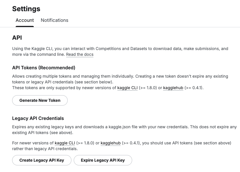
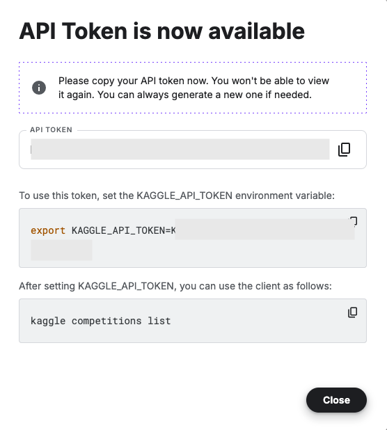
Copy the Kaggle API Key and add it to an environment variable. Here is the code to do this in the Jupyter Notebook.
import osos.environ["KAGGLE_API_TOKEN"] = "..."
You can check that it has been set correctly by running
print(os.environ["KAGGLE_API_TOKEN"])
Now we can get on with accessing the Kaggle datasets. This first approach will use the kaggle python package. With this you can use a mixture of command line commands and package functions
#import kaggle packageimport kaggle#use command line to list the datasets - limited output!kaggle datasets list#use a kaggle package function to list competitionsfrom kaggle.api.kaggle_api_extended import KaggleApiapi = KaggleApi()api.authenticate()api.competitions_list_cli()
I’ve not listed the outputs above, as the output would be very long. I’ll leave that for you to explore.
To download a dataset or all the files for a competion, we can run the following:
#list the files that are part of a competition!kaggle competitions files -c "house-prices-advanced-regression-techniques"name size creationDate --------------------- ---------- -------------------------- data_description.txt 13370 2019-12-15 21:33:35.157000 sample_submission.csv 31939 2019-12-15 21:33:35.224000 test.csv 451405 2019-12-15 21:33:35.212000 train.csv 460676 2019-12-15 21:33:35.259000 #download the competion files!kaggle competitions download -c "house-prices-advanced-regression-techniques"Downloading house-prices-advanced-regression-techniques.zip to /Users/brendan.tierney100%|█████████████████████████████████████████| 199k/199k [00:00<00:00, 714kB/s]
If you get a 403 error when running the above commands, just open the kaggle website and log into your account. Then run again.
The download will create a Zip file on your computer, which you’ll need to unzip.
#!apt-get install unzip!unzip house-prices-advanced-regression-techniques.zip
When unzipped you can now load the dataset into a Pandas dataframe.
import pandas as pd#path to CSV filepath = "train.csv"train_data = pd.read_csv('train.csv')train_data
Or a Spark dataframe.
from pyspark.sql import SparkSession#Create a Spark Sessionspark = SparkSession.builder \ .appName('Kaggle-Data') \ .master('local[*]') \ .getOrCreate()#Spark dataframe - Read CSVdf = spark.read.csv(path)# or if the file has a header record#Spark dataframe - Read CSV with Header df2 = spark.read.option("header", True).csv(path)
An alternative to the above is to use kagglehub package. The download function in this package will download load the files into a local directory
#install kagglehub!pip3 install kagglehubimport kagglehub#download the data fileskagglehub.competition_download('house-prices-advanced-regression-techniques', output_dir='./Kaggle_data', force_download=True)Downloading to ./Kaggle_data/house-prices-advanced-regression-techniques.archive...100%|█████████████████████████████████████████████████████████████████████████████████| 199k/199k [00:00<00:00, 670kB/s]Extracting files...
!ls -l ./Kaggle_datatotal 1888-rw-r--r-- 1 brendan.tierney staff 13370 16 Mar 12:38 data_description.txt-rw-r--r-- 1 brendan.tierney staff 31939 16 Mar 12:38 sample_submission.csv-rw-r--r-- 1 brendan.tierney staff 451405 16 Mar 12:38 test.csv-rw-r--r-- 1 brendan.tierney staff 460676 16 Mar 12:38 train.csv
Exploring Apache Iceberg using PyIceberg – Part 1
Apache Iceberg, an open-source table format that has become the industry standard for data sharing in modern data architectures. In a previous post I explored the core feature of Apache Iceberg and compared it with related technologies such as Apache Hudi and Delta Lake.
In this post we’ll look at some of the inital steps to setup and explore Iceberg tables using Python. I’ll have follow-on posts which will explore more advanced features of Apache Iceberg, again using Python. In this post, we’ll explore the following:
- Environmental setup
- Create an Iceberg Table from a Pandas dataframae
- Explore the Iceberg Table and file system
- Appending data and Time Travel
- Read an Iceberg Table into a Pandas dataframe
- Filtered scans with push-down predicates
Check out the link at the bottom of this post to download the Notebook containing all the PyIceberg code.
Environmental setup
Before we can get started with Apache Iceberg, we need to install it in our environment. I’m going with using Python for these blog posts and that means we need to install PyIceberg. In addition to this package, we also need to install pyiceberg-core. This is needed for some additional feature and optimisations of Iceberg.
pip install "pyiceberg[pyiceberg-core]"
This is a very quick install.
Next we need to do some environmental setup, like importing various packages used in the example code, setuping up some directories on the OS where the Iceberg files will be stored, creating a Catalog and a Namespace.
# Import other packages for this Demo Notebookimport pyarrow as paimport pandas as pdfrom datetime import dateimport osfrom pyiceberg.catalog.sql import SqlCatalog#define location for the WAREHOUSE, where the Iceberg files will be locatedWAREHOUSE = "/Users/brendan.tierney/Dropbox/Iceberg-Demo"#create the directory, True = if already exists, then don't report an erroros.makedirs(WAREHOUSE, exist_ok=True)#create a local Catalogcatalog = SqlCatalog( "local", **{ "uri": f"sqlite:///{WAREHOUSE}/catalog.db", "warehouse": f"file://{WAREHOUSE}", })#create a namespace (a bit like a database schema)NAMESPACE = "sales_db"if NAMESPACE not in [ns[0] for ns in catalog.list_namespaces()]: catalog.create_namespace(NAMESPACE)
That’s the initial setup complete.
Create an Iceberg Table from a Pandas dataframe
We can not start creating tables in Iceberg. To do this, the following code examples will initially create a Pandas dataframe, will convert it from table to columnar format (as the data will be stored in Parquet format in the Iceberg table), and then create and populate the Iceberg table.
#create a Pandas DF with some basic data# Create a sample sales DataFramedf = pd.DataFrame({ "order_id": [1001, 1002, 1003, 1004, 1005], "customer": ["Alice", "Bob", "Carol", "Dave", "Eve"], "product": ["Laptop", "Phone", "Tablet", "Monitor", "Keyboard"], "quantity": [1, 2, 1, 3, 5], "unit_price": [1299.99, 899.00, 549.50, 399.00, 79.99], "order_date": [ date(2024, 1, 15), date(2024, 1, 16), date(2024, 2, 3), date(2024, 2, 20), date(2024, 3, 5)], "region": ["EU", "US", "EU", "APAC", "US"]})# Compute total revenue per orderdf["revenue"] = df["quantity"] * df["unit_price"]print(df)print(df.dtypes) order_id customer product quantity unit_price order_date region \0 1001 Alice Laptop 1 1299.99 2024-01-15 EU 1 1002 Bob Phone 2 899.00 2024-01-16 US 2 1003 Carol Tablet 1 549.50 2024-02-03 EU 3 1004 Dave Monitor 3 399.00 2024-02-20 APAC 4 1005 Eve Keyboard 5 79.99 2024-03-05 US revenue 0 1299.99 1 1798.00 2 549.50 3 1197.00 4 399.95 order_id int64customer objectproduct objectquantity int64unit_price float64order_date objectregion objectrevenue float64dtype: object
That’s the Pandas dataframe created. Now we can convert it to columnar format using PyArrow.
#Convert pandas DataFrame → PyArrow Table # PyIceberg writes via Arrow (columnar format), so this step is requiredarrow_table = pa.Table.from_pandas(df)print("Arrow schema:")print(arrow_table.schema)Arrow schema:order_id: int64customer: stringproduct: stringquantity: int64unit_price: doubleorder_date: date32[day]region: stringrevenue: double-- schema metadata --pandas: '{"index_columns": [{"kind": "range", "name": null, "start": 0, "' + 1180
Now we can define the Iceberg table along with the namespace for it.
#Create an Iceberg table from the Arrow schemaTABLE_NAME = (NAMESPACE, "orders")table = catalog.create_table( TABLE_NAME, schema=arrow_table.schema,)tableorders( 1: order_id: optional long, 2: customer: optional string, 3: product: optional string, 4: quantity: optional long, 5: unit_price: optional double, 6: order_date: optional date, 7: region: optional string, 8: revenue: optional double),partition by: [],sort order: [],snapshot: null
The table has been defined in Iceberg and we can see there are no partitions, snapshots, etc. The Iceberg table doesn’t have any data. We can Append the Arrow table data to the Iceberg table.
#add the data to the tabletable.append(arrow_table)#table.append() adds new data files without overwriting existing ones. #Use table.overwrite() to replace all data in a single atomic operation.
We can look at the file system to see what has beeb written.
print(f"Table written to: {WAREHOUSE}/sales_db/orders/")print(f"Snapshot ID: {table.current_snapshot().snapshot_id}")Table written to: /Users/brendan.tierney/Dropbox/Iceberg-Demo/sales_db/orders/Snapshot ID: 3939796261890602539
Explore the Iceberg Table and File System
And Iceberg Table is just a collection of files on the file system, organised into a set of folders. You can look at these using your file system app, or use a terminal window, or in the examples below are from exploring those directories and files from a Jupyter Notebook.
Let’s start at the Warehouse level. This is the topic level that was declared back when the Environment was being setup. Check that out above in the first section.
!ls -l {WAREHOUSE}-rw-r--r--@ 1 brendan.tierney staff 20480 28 Feb 15:26 catalog.dbdrwxr-xr-x@ 3 brendan.tierney staff 96 28 Feb 12:59 sales_db
We can see the catalog file and a directiory for our ‘sales_db’ namespace. When you explore the contents of this file you will find two directorys. These contain the ‘metadata’ and the ‘data’ files. The following list the files found in the ‘data’ directory containing the data and these are stored in parquet format.
!ls -l {WAREHOUSE}/sales_db/orders/data-rw-r--r--@ 1 brendan.tierney staff 3179 28 Feb 15:22 00000-0-357c029e-b420-459b-8248-b1caf3c030ce.parquet-rw-r--r--@ 1 brendan.tierney staff 3307 28 Feb 15:23 00000-0-3fae55d7-1229-448c-9ffb-ae33c77003a3.parquet-rw-r--r--@ 1 brendan.tierney staff 3179 28 Feb 15:03 00000-0-4ec1ef74-cd24-412e-a35f-bcf3d745bf42.parquet-rw-r--r--@ 1 brendan.tierney staff 3179 28 Feb 15:23 00000-0-984ed6d2-4067-43c4-8c11-5f5a96febd24.parquet-rw-r--r-- 1 brendan.tierney staff 3307 28 Feb 15:26 00000-0-a61264e8-b361-490e-90f7-105a33f20dec.parquet-rw-r--r--@ 1 brendan.tierney staff 3307 28 Feb 15:22 00000-0-ac913dfe-548c-4cb3-99aa-4f1332e02248.parquet-rw-r--r--@ 1 brendan.tierney staff 3307 28 Feb 13:00 00000-0-b3fa23ec-79c6-48da-ba81-ba35f25aa7ad.parquet-rw-r--r--@ 1 brendan.tierney staff 3179 28 Feb 15:25 00000-0-d534a298-adab-4744-baa1-198395cc93bd.parquet-rw-r--r--@ 1 brendan.tierney staff 3307 28 Feb 15:21 00000-0-ef5dd6d8-84c0-4860-828e-86e4e175a9eb.parquet-rw-r--r--@ 1 brendan.tierney staff 3179 28 Feb 15:21 00000-0-f108db1c-39f9-4e2b-b825-3e580cccc808.parquet
I’ll leave you to explore the ‘metadata’ directory.
Read the Iceberg Table back into our Environment
To load an Iceberg table into your environment, you’ll need to load the Catalog and then load the table. We have already have the Catalog setup from a previous step, but tht might not be the case in your typical scenario. The following sets up the Catalog and loads the Iceberg table.
#Re-load the catalog and table (as you would in a new session)catalog = SqlCatalog( "local", **{ "uri": f"sqlite:///{WAREHOUSE}/catalog.db", "warehouse": f"file://{WAREHOUSE}", })table2 = catalog.load_table(("sales_db", "orders"))
When we inspect the structure of the Iceberg table we get the names of the columns and the datatypes.
print("--- Iceberg Schema ---")print(table2.schema())--- Iceberg Schema ---table { 1: order_id: optional long 2: customer: optional string 3: product: optional string 4: quantity: optional long 5: unit_price: optional double 6: order_date: optional date 7: region: optional string 8: revenue: optional double}
An Iceberg table can have many snapshots for version control. As we have only added data to the Iceberg table, we should only have one snapshot.
#Snapshot history print("--- Snapshot History ---")for snap in table2.history(): print(snap)--- Snapshot History ---snapshot_id=3939796261890602539 timestamp_ms=1772292384231
We can also inspect the details of the snapshot.
#Current snapshot metadata snap = table2.current_snapshot()print("--- Current Snapshot ---")print(f" ID: {snap.snapshot_id}")print(f" Operation: {snap.summary.operation}")print(f" Records: {snap.summary.get('total-records')}")print(f" Data files: {snap.summary.get('total-data-files')}")print(f" Size bytes: {snap.summary.get('total-files-size')}")--- Current Snapshot --- ID: 3939796261890602539 Operation: Operation.APPEND Records: 5 Data files: 1 Size bytes: 3307
The above shows use there was 5 records added using an Append operation.
An Iceberg table can be partitioned. When we created this table we didn’t specify a partition key, but in an example in another post I’ll give an example of partitioning this table
#Partition spec & sort order print("--- Partition Spec ---")print(table.spec()) # unpartitioned by default--- Partition Spec ---[]
We can also list the files that contain the data for our Iceberg table.
#List physical data files via scanprint("--- Data Files ---")for task in table.scan().plan_files(): print(f" {task.file.file_path}") print(f" record_count={task.file.record_count}, " f"file_size={task.file.file_size_in_bytes} bytes")--- Data Files --- file:///Users/brendan.tierney/Dropbox/Iceberg-Demo/sales_db/orders/data/00000-0-a61264e8-b361-490e-90f7-105a33f20dec.parquet record_count=5, file_size=3307 bytes
Appending Data and Time Travel
Iceberg tables facilitates changes to the schema and data, and to be able to view the data at different points in time. This is refered to as Time Travel. Let’s have a look at an example of this by adding some additional data to the Iceberg table.
# Get and Save the first snapshot id before writing moresnap_v1 = table.current_snapshot().snapshot_id# New batch of orders - 2 new ordersdf2 = pd.DataFrame({ "order_id": [1006, 1007], "customer": ["Frank", "Grace"], "product": ["Headphones", "Webcam"], "quantity": [2, 1], "unit_price": [249.00, 129.00], "order_date": [date(2024, 4, 1), date(2024, 4, 5)], "region": ["EU", "APAC"], "revenue": [498.00, 129.00],})#Add the datatable.append(pa.Table.from_pandas(df2))
We can list the snapshots.
#Get the new snapshot id and check if different to previoussnap_v2 = table.current_snapshot().snapshot_idprint(f"v1 snapshot: {snap_v1}")print(f"v2 snapshot: {snap_v2}")v1 snapshot: 3939796261890602539v2 snapshot: 8666063993760292894
and we can see how see how many records are in each Snapshot, using Time Travel.
#Time travel: read the ORIGINAL 5-row tabledf_v1 = table.scan(snapshot_id=snap_v1).to_pandas()print(f"Snapshot v1 — {len(df_v1)} rows")#Current snapshot has all 7 rowsdf_v2 = table.scan().to_pandas()print(f"Snapshot v2 — {len(df_v2)} rows")Snapshot v1 — 5 rowsSnapshot v2 — 7 rows
If you inspect the file system, in the data and metadata dirctories, you will notices some additional files.
!ls -l {WAREHOUSE}/sales_db/orders/data!ls -l {WAREHOUSE}/sales_db/orders/metadata
Read an Iceberg Table into a Pandas dataframe
To load the Iceberg table into a Pandas dataframe we can
pd_df = table2.scan().to_pandas()
or we can use the Pandas package fuction
df = pd.read_iceberg("orders", "catalog")
Filtered scans with push-down predicates
PyIceberg provides a fluent scan API. You can read the full table or push down filters, column projections, and row limits — all evaluated at the file level.
Filtered Scan with Push Down Predicates
from pyiceberg.expressions import ( EqualTo, GreaterThanOrEqual, And)# Only EU orders with revenue above €1000df_filtered = ( table2.scan( row_filter=And( EqualTo("region", "EU"), GreaterThanOrEqual("revenue", 1000.0), ) ).to_pandas() )print(df_filtered) order_id customer product quantity unit_price order_date region revenue0 1001 Alice Laptop 1 1299.99 2024-01-15 EU 1299.99
Column Projection – select specific columns
# Only fetch the columns you need — saves I/Odf_slim = ( table2.scan(selected_fields=("order_id", "customer", "revenue")) .to_pandas() )print(df_slim) order_id customer revenue0 1001 Alice 1299.991 1002 Bob 1798.002 1003 Carol 549.503 1004 Dave 1197.004 1005 Eve 399.95
We can also use Arrow for more control.
arrow_result = table2.scan().to_arrow()print(arrow_result.schema)df_from_arrow = arrow_result.to_pandas(timestamp_as_object=True)print(df_from_arrow.head())
order_id: int64
customer: string
product: string
quantity: int64
unit_price: double
order_date: date32[day]
region: string
revenue: double
   order_id customer   product  quantity  unit_price  order_date region  \
0      1001    Alice    Laptop         1     1299.99  2024-01-15     EU
1      1002      Bob     Phone         2      899.00  2024-01-16     US
2      1003    Carol    Tablet         1      549.50  2024-02-03     EU
3      1004     Dave   Monitor         3      399.00  2024-02-20   APAC
4      1005      Eve  Keyboard         5       79.99  2024-03-05     US

   revenue
0  1299.99
1  1798.00
2   549.50
3  1197.00
4   399.95
I’ve put all of the above into a Juputer Notebook. You can download this from here, and you can use it for your explorations of Apache Iceberg.
Check out my next post of Apache Iceberg to see my Python code on explore some additional, and advanced features of Apache Iceberg.
Handling Multi-Column Indexes in Pandas Dataframes
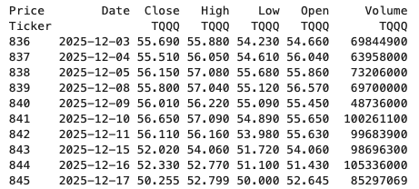
It’s a little annoying when an API changes the structure of the data it returns and you end up with your code breaking. In my case, I experienced it when a dataframe having a single column index went to having a multi-column index. This was a new experience for me, at this time, as I hadn’t really come across it before. The following illustrates one particular case similar (not the same) that you might encounter. In this test/demo scenario I’ll be using the yfinance API to illustrate how you can remove the multi-column index and go back to having a single column index.
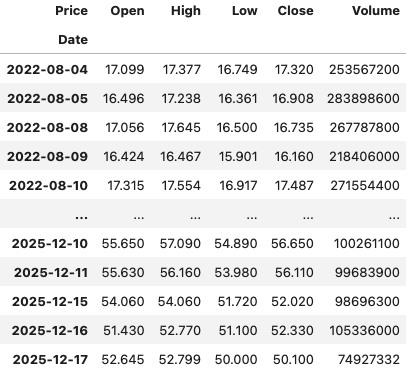
In this demo scenario, we are using yfinance to get data on various stocks. After the data is downloaded we get something like this.
The first step is to do some re-organisation.
df = data.stack(level="Ticker", future_stack=True)
df.index.names = ["Date", "Symbol"]
df = df[["Open", "High", "Low", "Close", "Volume"]]
df = df.swaplevel(0, 1)
df = df.sort_index()
df
This gives us the data in the following format.
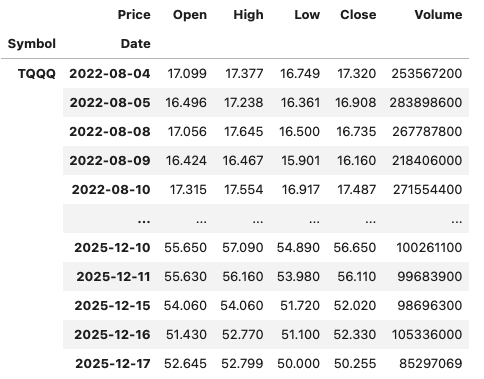
The final part is to extract the data we want by applying a filter.
df.xs(“TQQQ”)
And there we have it.
As I said at the beginning the example above is just to illustrate what you can do.
If this was a real work example of using yfinance, I could just change a parameter setting in the download function, to not use multi_level_index.
data = yf.download(t, start=s_date, interval=time_interval, progress=False, multi_level_index=False)
Creating Test Data in your Database using Faker
A some point everyone needs some test data for their database. There area a number of ways of doing this, and in this post I’ll walk through using the Python library Faker to create some dummy test data (that kind of looks real) in my Oracle Database. I’ll have another post using the GenAI in-database feature available in the Oracle Autonomous Database. So keep an eye out for that.
Faker is one of the available libraries in Python for creating dummy/test data that kind of looks realistic. There are several more. I’m not going to get into the relative advantages and disadvantages of each, so I’ll leave that task to yourself. I’m just going to give you a quick demonstration of what is possible.
One of the key elements of using Faker is that we can set a geograpic location for the data to be generated. We can also set multiples of these and by setting this we can get data generated specific for that/those particular geographic locations. This is useful for when testing applications for different potential markets. In my example below I’m setting my local for USA (en_US).
Here’s the Python code to generate the Test Data with 15,000 records, which I also save to a CSV file.
import pandas as pd
from faker import Faker
import random
from datetime import date, timedelta

#####################
NUM_RECORDS = 15000
LOCALE = 'en_US'

#Initialise Faker
Faker.seed(42)
fake = Faker(LOCALE)

#####################

#Create a function to generate the data
def create_customer_record():
    #Customer Gender
    gender = random.choice(['Male', 'Female', 'Non-Binary'])
    #Customer Name
    if gender == 'Male':
        name = fake.name_male()
    elif gender == 'Female':
        name = fake.name_female()
    else:
        name = fake.name()

    #Date of Birth
    dob = fake.date_of_birth(minimum_age=18, maximum_age=90)

    #Customer Address and other details
    address = fake.street_address()
    email = fake.email()
    city = fake.city()
    state = fake.state_abbr()
    zip_code = fake.postcode()
    full_address = f"{address}, {city}, {state} {zip_code}"
    phone_number = fake.phone_number()

    #Customer Income
    #  - annual income between $30,000 and $250,000
    income = random.randint(300, 2500) * 100

    #Credit Rating
    credit_rating = random.choices(['A', 'B', 'C', 'D'], weights=[0.40, 0.30, 0.20, 0.10], k=1)[0]

    #Credit Card and Banking details
    card_type = random.choice(['visa', 'mastercard', 'amex'])
    credit_card_number = fake.credit_card_number(card_type=card_type)
    routing_number = fake.aba()
    bank_account = fake.bban()

    return {
        'CUSTOMERID': fake.unique.uuid4(), # Unique identifier
        'CUSTOMERNAME': name,
        'GENDER': gender,
        'EMAIL': email,
        'DATEOFBIRTH': dob.strftime('%Y-%m-%d'),
        'ANNUALINCOME': income,
        'CREDITRATING': credit_rating,
        'CUSTOMERADDRESS': full_address,
        'ZIPCODE': zip_code,
        'PHONENUMBER': phone_number,
        'CREDITCARDTYPE': card_type.capitalize(),
        'CREDITCARDNUMBER': credit_card_number,
        'BANKACCOUNTNUMBER': bank_account,
        'ROUTINGNUMBER': routing_number,
    }

#Generate the Demo Data
print(f"Generating {NUM_RECORDS} customer records...")
data = [create_customer_record() for _ in range(NUM_RECORDS)]
print("Sample Data Generation complete")

#Convert to Pandas DataFrame
df = pd.DataFrame(data)

print("\n--- DataFrame Sample (First 10 Rows) : sample of columns ---")
# Display relevant columns for verification
display_cols = ['CUSTOMERNAME', 'GENDER', 'DATEOFBIRTH', 'PHONENUMBER', 'CREDITCARDNUMBER', 'CREDITRATING', 'ZIPCODE']
print(df[display_cols].head(10).to_markdown(index=False))

print("\n--- DataFrame Information ---")
print(f"Total Rows: {len(df)}")
print(f"Total Columns: {len(df.columns)}")
print("Data Types:")
print(df.dtypes)
The output from the above code gives the following:
Generating 15000 customer records...
Sample Data Generation complete

--- DataFrame Sample (First 10 Rows) : sample of columns ---
| CUSTOMERNAME     | GENDER     | DATEOFBIRTH   | PHONENUMBER            |   CREDITCARDNUMBER | CREDITRATING   |   ZIPCODE |
|:-----------------|:-----------|:--------------|:-----------------------|-------------------:|:---------------|----------:|
| Allison Hill     | Non-Binary | 1951-03-02    | 479.540.2654           |   2271161559407810 | A              |     55488 |
| Mark Ferguson    | Non-Binary | 1952-09-28    | 724.523.8849x696       |    348710122691665 | A              |     84760 |
| Kimberly Osborne | Female     | 1973-08-02    | 001-822-778-2489x63834 |   4871331509839301 | B              |     70323 |
| Amy Valdez       | Female     | 1982-01-16    | +1-880-213-2677x3602   |   4474687234309808 | B              |     07131 |
| Eugene Green     | Male       | 1983-10-05    | (442)678-4980x841      |   4182449353487409 | A              |     32519 |
| Timothy Stanton  | Non-Binary | 1937-10-13    | (707)633-7543x3036     |    344586850142947 | A              |     14669 |
| Eric Parker      | Male       | 1964-09-06    | 577-673-8721x48951     |   2243200379176935 | C              |     86314 |
| Lisa Ball        | Non-Binary | 1971-09-20    | 516.865.8760           |    379096705466887 | A              |     93092 |
| Garrett Gibson   | Male       | 1959-07-05    | 001-437-645-2991       |    349049663193149 | A              |     15494 |
| John Petersen    | Male       | 1978-02-14    | 367.683.7770           |   2246349578856859 | A              |     11722 |

--- DataFrame Information ---
Total Rows: 15000
Total Columns: 14
Data Types:
CUSTOMERID           object
CUSTOMERNAME         object
GENDER               object
EMAIL                object
DATEOFBIRTH          object
ANNUALINCOME          int64
CREDITRATING         object
CUSTOMERADDRESS      object
ZIPCODE              object
PHONENUMBER          object
CREDITCARDTYPE       object
CREDITCARDNUMBER     object
BANKACCOUNTNUMBER    object
ROUTINGNUMBER        object
Having generated the Test data, we now need to get it into the database. There a various ways of doing this. As we are already using Python I’ll illustrate getting the data into the Database below. An alternative option is to use SQL Command Line (SQLcl) and the LOAD feature in that tool.
Here’s the Python code to load the data. I’m using the oracledb python library.
### Connect to Database
import oracledb

p_username = "..."
p_password = "..."

#Give OCI Wallet location and details
try:
    con = oracledb.connect(user=p_username, password=p_password, dsn="adb26ai_high",
                       config_dir="/Users/brendan.tierney/Dropbox/Wallet_ADB26ai",
                       wallet_location="/Users/brendan.tierney/Dropbox/Wallet_ADB26ai",
                       wallet_password=p_walletpass)
except Exception as e:
    print('Error connecting to the Database')
    print(f'Error:{e}')

print(con)
### Create Customer Table
drop_table = 'DROP TABLE IF EXISTS demo_customer'
cre_table = '''CREATE TABLE DEMO_CUSTOMER (
CustomerID VARCHAR2(50) PRIMARY KEY,
CustomerName VARCHAR2(50),
Gender VARCHAR2(10),
Email VARCHAR2(50),
DateOfBirth DATE,
AnnualIncome NUMBER(10,2),
CreditRating VARCHAR2(1),
CustomerAddress VARCHAR2(100),
ZipCode VARCHAR2(10),
PhoneNumber VARCHAR2(50),
CreditCardType VARCHAR2(10),
CreditCardNumber VARCHAR2(30),
BankAccountNumber VARCHAR2(30),
RoutingNumber VARCHAR2(10) )'''
cur = con.cursor()
print('--- Dropping DEMO_CUSTOMER table ---')
cur.execute(drop_table)
print('--- Creating DEMO_CUSTOMER table ---')
cur.execute(cre_table)
print('--- Table Created ---')### Insert Data into Table
insert_data = '''INSERT INTO DEMO_CUSTOMER values (:1, :2, :3, :4, :5, :6, :7, :8, :9, :10, :11, :12, :13, :14)'''
print("--- Inserting records ---")
cur.executemany(insert_data, df )
con.commit()
print("--- Saving to CSV ---")
df.to_csv('/Users/brendan.tierney/Dropbox/DEMO_Customer_data.csv', index=False)
print("- Finished -")### Close Connections to DB
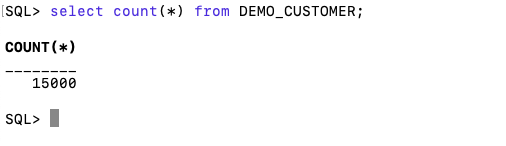
con.close()and to prove the records got inserted we can connect to the schema using SQLcl and check.
What a difference a Bind Variable makes
To bind or not to bind, that is the question?
Over the years, I heard and read about using Bind variables and how important they are, particularly when it comes to the efficient execution of queries. By using bind variables, the optimizer will reuse the execution plan from the cache rather than generating it each time. Recently, I had conversations about this with a couple of different groups, and they didn’t really believe me and they asked me to put together a demonstration. One group said they never heard of ‘prepared statements’, ‘bind variables’, ‘parameterised query’, etc., which was a little surprising.
The following is a subset of what I demonstrated to them to illustrate the benefits and potential benefits.
Here is a basic example of a typical scenario where we have a SQL query being constructed using concatenation.
select * from order_demo where order_id = || 'i';That statement looks simple and harmless. When we try to check the EXPLAIN plan from the optimizer we will get an error, so let’s just replace it with a number, because that’s what the query will end up being like.
select * from order_demo where order_id = 1;When we check the Explain Plan, we get the following. It looks like a good execution plan as it is using the index and then doing a ROWID lookup on the table. The developers were happy, and that’s what those recent conversations were about and what they are missing.
-------------------------------------------------------------
| Id  | Operation                   | Name         | E-Rows |
-------------------------------------------------------------
|   0 | SELECT STATEMENT            |              |        |
|   1 |  TABLE ACCESS BY INDEX ROWID| ORDER_DEMO   |      1 |
|*  2 |   INDEX UNIQUE SCAN         | SYS_C0014610 |      1 |
-------------------------------------------------------------
The missing part in their understanding was what happens every time they run their query. The Explain Plan looks good, so what’s the problem? The problem lies with the Optimizer evaluating the execution plan every time the query is issued. But the developers came back with the idea that this won’t happen because the execution plan is cached and will be reused. The problem with this is how we can test this, and what is the alternative, in this case, using bind variables (which was my suggestion).
Let’s setup a simple test to see what happens. Here is a simple piece of PL/SQL code which will look 100K times to retrieve just one row. This is very similar to what they were running.
DECLARE
   start_time TIMESTAMP;
   end_time   TIMESTAMP;
BEGIN
   start_time := systimestamp;
   dbms_output.put_line('Start time : ' || to_char(start_time,'HH24:MI:SS:FF4'));
   --
   for i in 1 .. 100000 loop
      execute immediate 'select * from order_demo where order_id = '||i;
   end loop;
   --
   end_time := systimestamp;
   dbms_output.put_line('End time : ' || to_char(end_time,'HH24:MI:SS:FF4'));
END;
/
When we run this test against a 23.7 Oracle Database running in a VM on my laptop, this completes in little over 2 minutes
Start time : 16:26:04:5527
End time : 16:28:13:4820


PL/SQL procedure successfully completed.

Elapsed: 00:02:09.158
The developers seemed happy with that time! Ok, but let’s test it using bind variables and see if it’s any different. There are a few different ways of setting up bind variables. The PL/SQL code below is one example.
DECLARE
   order_rec  ORDER_DEMO%rowtype;
   start_time TIMESTAMP;
   end_time   TIMESTAMP;
BEGIN
   start_time := systimestamp;
   dbms_output.put_line('Start time : ' || to_char(start_time,'HH24:MI:SS:FF9'));
   --
   for i in 1 .. 100000 loop
   execute immediate 'select * from order_demo where order_id = :1' using i;
	end loop;
	--
    end_time := systimestamp;
    dbms_output.put_line('End time : ' || to_char(end_time,'HH24:MI:SS:FF9'));
END;
/
Start time : 16:31:39:162619000
End time : 16:31:40:479301000


PL/SQL procedure successfully completed.

Elapsed: 00:00:01.363
This just took a little over one second to complete. Let me say that again, a little over one second to complete. We went from taking just over two minutes to run, down to just over one second to run.
The developers were a little surprised or more correctly, were a little shocked. But they then said the problem with that demonstration is that it is running directly in the Database. It will be different running it in Python across the network.
Ok, let me set up the same/similar demonstration using Python. The image below show some back Python code to connect to the database, list the tables in the schema and to create the test table for our demonstration

The first demonstration is to measure the timing for 100K records using the concatenation approach. I
# Demo - The SLOW way - concat values
#print start-time
print('Start time: ' + datetime.now().strftime("%H:%M:%S:%f"))

# only loop 10,000 instead of 100,000 - impact of network latency
for i in range(1, 100000):
    cursor.execute("select * from order_demo where order_id = " + str(i))

#print end-time
print('End time: ' + datetime.now().strftime("%H:%M:%S:%f"))
----------
Start time: 16:45:29:523020
End time: 16:49:15:610094
This took just under four minutes to complete. With PL/SQL it took approx two minutes. The extrat time is due to the back and forth nature of the client-server communications between the Python code and the Database. The developers were a little unhappen with this result.
The next step for the demonstrataion was to use bind variables. As with most languages there are a number of different ways to write and format these. Below is one example, but some of the others were also tried and give the same timing.
#Bind variables example - by name

#print start-time
print('Start time: ' + datetime.now().strftime("%H:%M:%S:%f"))

for i in range(1, 100000):
    cursor.execute("select * from order_demo where order_id = :order_num", order_num=i )

#print end-time
print('End time: ' + datetime.now().strftime("%H:%M:%S:%f"))
----------
Start time: 16:53:00:479468
End time: 16:54:14:197552
This took 1 minute 14 seconds. [Read that sentence again]. Compared to approx four minutes, and yes the other bind variable options has similar timing.
To answer the quote at the top of this post, “To bind or not to bind, that is the question?”, the answer is using Bind Variables, Prepared Statements, Parameterised Query, etc will make you queries and applications run a lot quicker. The optimizer will see the structure of the query, will see the parameterised parts of it, will see the execution plan already exists in the cache and will use it instead of generating the execution plan again. Thereby saving time for frequently executed queries which might just have a different value for one or two parts of a WHERE clause.
OCI Speech Real-time Capture
Capturing Speech-to-Text is a straight forward step. I’ve written previously about this, giving an example. But what if you want the code to constantly monitor for text input, giving a continuous. For this we need to use the asyncio python library. Using the OCI Speech-to-Text API in combination with asyncio we can monitor a microphone (speech input) on a continuous basis.
There are a few additional configuration settings needed, including configuring a speech-to-text listener. Here is an example of what is needed
lass MyListener(RealtimeSpeechClientListener):
    def on_result(self, result):
        if result["transcriptions"][0]["isFinal"]:
            print(f"1-Received final results: {transcription}")
        else:
            print(f"2-{result['transcriptions'][0]['transcription']} \n")

    def on_ack_message(self, ackmessage):
        return super().on_ack_message(ackmessage)

    def on_connect(self):
        return super().on_connect()

    def on_connect_message(self, connectmessage):
        return super().on_connect_message(connectmessage)

    def on_network_event(self, ackmessage):
        return super().on_network_event(ackmessage)

    def on_error(self, error_message):
        return super().on_error(error_message)

    def on_close(self, error_code, error_message):
        print(f'\nOCI connection closing.')

async def start_realtime_session(customizations=[], compartment_id=None, region=None):
    rt_client = RealtimeSpeechClient(
        config=config,
        realtime_speech_parameters=realtime_speech_parameters,
        listener=MyListener(),
        service_endpoint=realtime_speech_url,
        signer=None,   #authenticator(),
        compartment_id=compartment_id,
    )
    asyncio.create_task(send_audio(rt_client))

if __name__ == "__main__":
    asyncio.run(
        start_realtime_session(
            customizations=customization_ids,
            compartment_id=COMPARTMENT_ID,
            region=REGION_ID,
        )
    )
Additional customizations can be added to the Listener, for example, what to do with the Audio captured, what to do with the text, how to mange the speech-to-text (there are lots of customizations)
python-oracledb driver version 3 – load data into pandas df
The Python Oracle driver had a new release recently (version 3) and with it comes a new way to load data from a Table into a Pandas dataframe. This can now be done using the pyarrow library. Here’s an example:
import oracledb ora
import pyarrow py
import pandas

#create a connection to the database
con = ora.connect( <enter your connection details> )

query = "select cust_id, cust_first_name, cust_last_name, cust_city from customers"

#get Oracle DF and set array size - care is needed for setting this
ora_df = con.fetch_df_all(statement=query, arraysize=2000)

#run query and return into Pandas Dataframe
#  using pyarrow and the to_pandas() function
df = py.Table.from_arrays(ora_df.column_arrays(), names=ora_df.columns()).to_pandas()

print(df.columns)
Once you get used to the syntax it is a simpler way to get the data into dataframe.
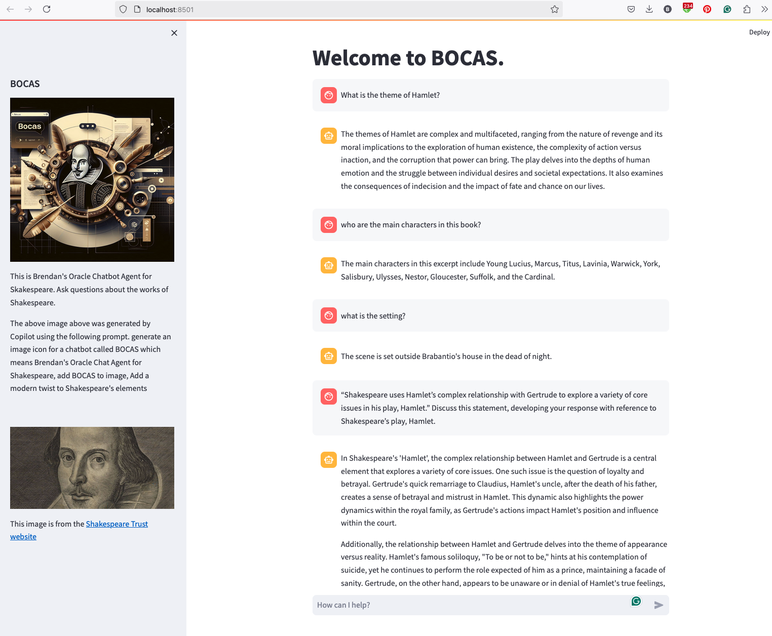
BOCAS – using OCI GenAI Agent and Stremlit
BOCAS stands for Brendan’s Oracle Chatbot Agent for Shakespeare. I’ve previously posted on how to go about creating a GenAI Agent on a specific data set. In this post, I’ll share code on how I did this using Python Streamlit.
And here’s the code
import streamlit as st
import time
import oci
from oci import generative_ai_agent_runtime
import json


# Page Title
welcome_msg = "Welcome to BOCAS."
welcome_msg2 = "This is Brendan's Oracle Chatbot Agent for Skakespeare. Ask questions about the works of Shakespeare."
st.title(welcome_msg)

# Sidebar Image
st.sidebar.header("BOCAS")
st.sidebar.image("bocas-3.jpg", use_column_width=True)
#with st.sidebar:
#    with st.echo:
#        st.write(welcome_msg2)
st.sidebar.markdown(welcome_msg2)
st.sidebar.markdown("The above image above was generated by Copilot using the following prompt.  generate an image icon for a chatbot called BOCAS which means Brendan's Oracle Chat Agent for Shakespeare, add BOCAS to image, Add a modern twist to Shakespeare's elements")

st.sidebar.write("")
st.sidebar.write("")
st.sidebar.write("")
st.sidebar.image("https://media.shakespeare.org.uk/images/SBT_SR_OS_37_Shakespeare_Firs.ec42f390.fill-1200x600-c75.jpg")
link="This image is from the [Shakespeare Trust website](https://media.shakespeare.org.uk/images/SBT_SR_OS_37_Shakespeare_Firs.ec42f390.fill-1200x600-c75.jpg)"
st.sidebar.write(link,unsafe_allow_html=True)

# OCI GenAI settings
CONFIG_PROFILE = "DEFAULT"
config = oci.config.from_file('~/.oci/config', CONFIG_PROFILE)
###
SERVICE_EP = <your service endpoint>
AGENT_EP_ID = <your agent endpoint>
###

# Response Generator
def response_generator(text_input):
    #Initiate AI Agent runtime client
    genai_agent_runtime_client = generative_ai_agent_runtime.GenerativeAiAgentRuntimeClient(config, service_endpoint=SERVICE_EP, retry_strategy=oci.retry.NoneRetryStrategy())

    create_session_details = generative_ai_agent_runtime.models.CreateSessionDetails()
    create_session_details.display_name = "Welcome to BOCAS"
    create_session_details.idle_timeout_in_seconds = 20
    create_session_details.description = welcome_msg

    create_session_response = genai_agent_runtime_client.create_session(create_session_details, AGENT_EP_ID)

    #Define Chat details and input message/question
    session_details = generative_ai_agent_runtime.models.ChatDetails()
    session_details.session_id = create_session_response.data.id
    session_details.should_stream = False
    session_details.user_message = text_input

    #Get AI Agent Respose
    session_response = genai_agent_runtime_client.chat(agent_endpoint_id=AGENT_EP_ID, chat_details=session_details)

    #print(str(response.data))
    response = session_response.data.message.content.text
    return response

# Initialize chat history
if "messages" not in st.session_state:
    st.session_state.messages = []

# Display chat messages from history on app rerun
for message in st.session_state.messages:
    with st.chat_message(message["role"]):
        st.markdown(message["content"])

# Accept user input
if prompt := st.chat_input("How can I help?"):
    # Add user message to chat history
    st.session_state.messages.append({"role": "user", "content": prompt})
    # Display user message in chat message container
    with st.chat_message("user"):
        st.markdown(prompt)

    # Display assistant response in chat message container
    with st.chat_message("assistant"):
        response = response_generator(prompt)
        write_response = st.write(response)
        st.session_state.messages.append({"role": "ai", "content": response})
# Add assistant response to chat historyOracle Object Storage – Parallel Downloading
In previous posts, I’ve given example Python code (and functions) for processing files into and out of OCI Object and Bucket Storage. One of these previous posts includes code and a demonstration of uploading files to an OCI Bucket using the multiprocessing package in Python.
Building upon these previous examples, the code below will download a Bucket using parallel processing. Like my last example, this code is based on the example code I gave in an earlier post on functions within a Jupyter Notebook.
Here’s the code.
import oci
import os
import argparse
from multiprocessing import Process
from glob import glob
import time

####
def upload_file(config, NAMESPACE, b, f, num):
    file_exists = os.path.isfile(f)
    if file_exists == True:
        try:
            start_time = time.time()
            object_storage_client = oci.object_storage.ObjectStorageClient(config)
            object_storage_client.put_object(NAMESPACE, b, os.path.basename(f), open(f,'rb'))
            print(f'. Finished {num} uploading {f}   in {round(time.time()-start_time,2)} seconds')
        except Exception as e:
            print(f'Error uploading file {num}. Try again.')
            print(e)
    else:
        print(f'... File {f} does not exist or cannot be found. Check file name and full path')

####
def check_bucket_exists(config, NAMESPACE, b_name):
    #check if Bucket exists
    is_there = False
    object_storage_client = oci.object_storage.ObjectStorageClient(config)
    l_b = object_storage_client.list_buckets(NAMESPACE, config.get("tenancy")).data
    for bucket in l_b:
        if bucket.name == b_name:
            is_there = True

    if is_there == True:
        print(f'Bucket {b_name} exists.')
    else:
        print(f'Bucket {b_name} does not exist.')

    return is_there

####

def download_bucket_file(config, NAMESPACE, b, d, f, num):
    print(f'..Starting Download File ({num}):',f, ' from Bucket', b, ' at ', time.strftime("%H:%M:%S"))

    try:
        start_time = time.time()
        object_storage_client = oci.object_storage.ObjectStorageClient(config)
        get_obj = object_storage_client.get_object(NAMESPACE, b, f)
        with open(os.path.join(d, f), 'wb') as f:
            for chunk in get_obj.data.raw.stream(1024 * 1024, decode_content=False):
                f.write(chunk)

        print(f'..Finished Download ({num}) in ', round(time.time()-start_time,2), 'seconds.')
    except:
        print(f'Error trying to download file {f}. Check parameters and try again')

####

if __name__ == "__main__":
	#setup for OCI
    config = oci.config.from_file()
    object_storage = oci.object_storage.ObjectStorageClient(config)
    NAMESPACE = object_storage.get_namespace().data

    ####
    description = "\n".join(["Upload files in parallel to OCI storage.",
                             "All files in <directory> will be uploaded. Include '/' at end.",
                             "",
                             "<bucket_name> must already exist."])

    parser = argparse.ArgumentParser(description=description,
                                     formatter_class=argparse.RawDescriptionHelpFormatter)
    parser.add_argument(dest='bucket_name',
                        help="Name of object storage bucket")
    parser.add_argument(dest='directory',
                        help="Path to local directory containing files to upload.")
    args = parser.parse_args()

    ####
    bucket_name = args.bucket_name
    directory = args.directory
    if not os.path.isdir(directory):
        parser.usage()
    else:
        dir = directory + os.path.sep + "*"

    start_time = time.time()
    print('Starting Downloading Bucket - Parallel:', bucket_name, '  at ', time.strftime("%H:%M:%S"))
    object_storage_client = oci.object_storage.ObjectStorageClient(config)
    object_list = object_storage_client.list_objects(NAMESPACE, bucket_name).data
    count = 0
    for i in object_list.objects:
        count+=1

    print(f'... {count} files to download')

    proc_list = []
    num=0
    for o in object_list.objects:
        p = Process(target=download_bucket_file, args=(config, NAMESPACE, bucket_name, directory, o.name, num))
        p.start()
        num+=1
        proc_list.append(p)

    for job in proc_list:
        job.join()

    print('---')
    print(f'Download Finished in {round(time.time()-start_time,2)} seconds.({time.strftime("%H:%M:%S")})')

#### the end ####
I’ve saved the code to a file called bucket_parallel_download.py.
To call this, I run the following using the same DEMO_Bucket and directory of files I used in my previous posts.
python bucket_parallel_download.py DEMO_Bucket /Users/brendan.tierney/Dropbox/OCI-Vision-Images/Blue-Peter/
This creates the following output, and between 3.6 seconds to 4.4 seconds to download the 13 files, based on my connection.
[16:30~/Dropbox]> python bucket_parallel_download.py DEMO_Bucket /Users/brendan.tierney/DEMO_BUCKET
Starting Downloading Bucket - Parallel: DEMO_Bucket   at  16:30:05
... 13 files to download
..Starting Download File (0): 2017-08-31 19.46.42.jpg  from Bucket DEMO_Bucket  at  16:30:08
..Starting Download File (1): 2017-10-16 13.13.20.jpg  from Bucket DEMO_Bucket  at  16:30:08
..Starting Download File (2): 2017-11-22 20.18.58.jpg  from Bucket DEMO_Bucket  at  16:30:08
..Starting Download File (3): 2018-12-03 11.04.57.jpg  from Bucket DEMO_Bucket  at  16:30:08
..Starting Download File (11): thumbnail_IMG_2333.jpg  from Bucket DEMO_Bucket  at  16:30:08
..Starting Download File (5): IMG_2347.jpg  from Bucket DEMO_Bucket  at  16:30:08
..Starting Download File (9): thumbnail_IMG_1711.jpg  from Bucket DEMO_Bucket  at  16:30:08
..Starting Download File (4): 347397087_620984963239631_2131524631626484429_n.jpg  from Bucket DEMO_Bucket  at  16:30:08
..Starting Download File (10): thumbnail_IMG_1712.jpg  from Bucket DEMO_Bucket  at  16:30:08
..Starting Download File (8): thumbnail_IMG_1710.jpg  from Bucket DEMO_Bucket  at  16:30:08
..Starting Download File (7): oug_ire18_1.jpg  from Bucket DEMO_Bucket  at  16:30:08
..Starting Download File (6): IMG_6779.jpg  from Bucket DEMO_Bucket  at  16:30:08
..Starting Download File (12): thumbnail_IMG_2336.jpg  from Bucket DEMO_Bucket  at  16:30:08
..Finished Download (9) in  0.67 seconds.
..Finished Download (11) in  0.74 seconds.
..Finished Download (10) in  0.7 seconds.
..Finished Download (5) in  0.8 seconds.
..Finished Download (7) in  0.7 seconds.
..Finished Download (1) in  1.0 seconds.
..Finished Download (12) in  0.81 seconds.
..Finished Download (4) in  1.02 seconds.
..Finished Download (6) in  0.97 seconds.
..Finished Download (2) in  1.25 seconds.
..Finished Download (8) in  1.16 seconds.
..Finished Download (0) in  1.47 seconds.
..Finished Download (3) in  1.47 seconds.
---
Download Finished in 4.09 seconds.(16:30:09)Oracle Object Storage – Parallel Uploading
In my previous posts on using Python to work with OCI Object Storage, I gave code examples and illustrated how to create Buckets, explore Buckets, upload files, download files and delete files and buckets, all using Python and files on your computer.
- Oracle Object Storage – Setup and Explore
- Oracle Object Storage – Buckets & Loading files
- Oracle Object Storage – Downloading and Deleting
- Oracle Object Storage – Parallel Uploading
Building upon the code I’ve given for uploading files, which did so sequentially, in his post I’ve taken that code and expanded it to allow the files to be uploaded in parallel to an OCI Bucket. This is achieved using the Python multiprocessing library.
Here’s the code.
import oci
import os
import argparse
from multiprocessing import Process
from glob import glob
import time

####
def upload_file(config, NAMESPACE, b, f, num):
    file_exists = os.path.isfile(f)
    if file_exists == True:
        try:
            start_time = time.time()
            object_storage_client = oci.object_storage.ObjectStorageClient(config)
            object_storage_client.put_object(NAMESPACE, b, os.path.basename(f), open(f,'rb'))
            print(f'. Finished {num} uploading {f}   in {round(time.time()-start_time,2)} seconds')
        except Exception as e:
            print(f'Error uploading file {num}. Try again.')
            print(e)
    else:
        print(f'... File {f} does not exist or cannot be found. Check file name and full path')

####
def check_bucket_exists(config, NAMESPACE, b_name):
    #check if Bucket exists
    is_there = False
    object_storage_client = oci.object_storage.ObjectStorageClient(config)
    l_b = object_storage_client.list_buckets(NAMESPACE, config.get("tenancy")).data
    for bucket in l_b:
        if bucket.name == b_name:
            is_there = True

    if is_there == True:
        print(f'Bucket {b_name} exists.')
    else:
        print(f'Bucket {b_name} does not exist.')

    return is_there

####
if __name__ == "__main__":
	#setup for OCI
    config = oci.config.from_file()
    object_storage = oci.object_storage.ObjectStorageClient(config)
    NAMESPACE = object_storage.get_namespace().data

    ####
    description = "\n".join(["Upload files in parallel to OCI storage.",
                             "All files in <directory> will be uploaded. Include '/' at end.",
                             "",
                             "<bucket_name> must already exist."])

    parser = argparse.ArgumentParser(description=description,
                                     formatter_class=argparse.RawDescriptionHelpFormatter)
    parser.add_argument(dest='bucket_name',
                        help="Name of object storage bucket")
    parser.add_argument(dest='directory',
                        help="Path to local directory containing files to upload.")
    args = parser.parse_args()

    ####
    bucket_name = args.bucket_name
    directory = args.directory
    if not os.path.isdir(directory):
        parser.usage()
    else:
        dir = directory + os.path.sep + "*"

    #### Check if Bucket Exists ####
    b_exists = check_bucket_exists(config, NAMESPACE, bucket_name)
    if b_exists == True:
        try:
            proc_list = []
            num=0
            start_time = time.time()
            #### Start uploading files ####
            for file_path in glob(dir):
                print(f"Starting {num} upload for {file_path}")
                p = Process(target=upload_file, args=(config, NAMESPACE, bucket_name, file_path, num))
                p.start()
                num+=1
                proc_list.append(p)
        except Exception as e:
            print(f'Error uploading file ({num}). Try again.')
            print(e)
    else:
        print('... Create Bucket before uploading Directory.')

    for job in proc_list:
        job.join()

    print('---')
    print(f'Finished uploading all files ({num}) in {round(time.time()-start_time,2)} seconds')
#### the end ####
I’ve saved the code to a file called bucket_parallel.py.
To call this, I run the following using the same DEMO_Bucket and directory of files I used in my previous posts.
python bucket_parallel.py DEMO_Bucket /Users/brendan.tierney/Dropbox/OCI-Vision-Images/Blue-Peter/
This creates the following output, and between 3.3 seconds to 4.6 seconds to upload the 13 files, based on my connection.
[15:29~/Dropbox]> python bucket_parallel.py DEMO_Bucket /Users/brendan.tierney/Dropbox/OCI-Vision-Images/Blue-Peter/
Bucket DEMO_Bucket exists.
Starting 0 upload for /Users/brendan.tierney/Dropbox/OCI-Vision-Images/Blue-Peter/thumbnail_IMG_2336.jpg
Starting 1 upload for /Users/brendan.tierney/Dropbox/OCI-Vision-Images/Blue-Peter/2017-08-31 19.46.42.jpg
Starting 2 upload for /Users/brendan.tierney/Dropbox/OCI-Vision-Images/Blue-Peter/thumbnail_IMG_2333.jpg
Starting 3 upload for /Users/brendan.tierney/Dropbox/OCI-Vision-Images/Blue-Peter/347397087_620984963239631_2131524631626484429_n.jpg
Starting 4 upload for /Users/brendan.tierney/Dropbox/OCI-Vision-Images/Blue-Peter/thumbnail_IMG_1712.jpg
Starting 5 upload for /Users/brendan.tierney/Dropbox/OCI-Vision-Images/Blue-Peter/thumbnail_IMG_1711.jpg
Starting 6 upload for /Users/brendan.tierney/Dropbox/OCI-Vision-Images/Blue-Peter/2017-11-22 20.18.58.jpg
Starting 7 upload for /Users/brendan.tierney/Dropbox/OCI-Vision-Images/Blue-Peter/thumbnail_IMG_1710.jpg
Starting 8 upload for /Users/brendan.tierney/Dropbox/OCI-Vision-Images/Blue-Peter/2018-12-03 11.04.57.jpg
Starting 9 upload for /Users/brendan.tierney/Dropbox/OCI-Vision-Images/Blue-Peter/IMG_6779.jpg
Starting 10 upload for /Users/brendan.tierney/Dropbox/OCI-Vision-Images/Blue-Peter/oug_ire18_1.jpg
Starting 11 upload for /Users/brendan.tierney/Dropbox/OCI-Vision-Images/Blue-Peter/2017-10-16 13.13.20.jpg
Starting 12 upload for /Users/brendan.tierney/Dropbox/OCI-Vision-Images/Blue-Peter/IMG_2347.jpg
. Finished 2 uploading /Users/brendan.tierney/Dropbox/OCI-Vision-Images/Blue-Peter/thumbnail_IMG_2333.jpg   in 0.752561092376709 seconds
. Finished 5 uploading /Users/brendan.tierney/Dropbox/OCI-Vision-Images/Blue-Peter/thumbnail_IMG_1711.jpg   in 0.7750208377838135 seconds
. Finished 4 uploading /Users/brendan.tierney/Dropbox/OCI-Vision-Images/Blue-Peter/thumbnail_IMG_1712.jpg   in 0.7535321712493896 seconds
. Finished 0 uploading /Users/brendan.tierney/Dropbox/OCI-Vision-Images/Blue-Peter/thumbnail_IMG_2336.jpg   in 0.8419861793518066 seconds
. Finished 7 uploading /Users/brendan.tierney/Dropbox/OCI-Vision-Images/Blue-Peter/thumbnail_IMG_1710.jpg   in 0.7582859992980957 seconds
. Finished 10 uploading /Users/brendan.tierney/Dropbox/OCI-Vision-Images/Blue-Peter/oug_ire18_1.jpg   in 0.8714470863342285 seconds
. Finished 12 uploading /Users/brendan.tierney/Dropbox/OCI-Vision-Images/Blue-Peter/IMG_2347.jpg   in 0.8753311634063721 seconds
. Finished 1 uploading /Users/brendan.tierney/Dropbox/OCI-Vision-Images/Blue-Peter/2017-08-31 19.46.42.jpg   in 1.2201581001281738 seconds
. Finished 11 uploading /Users/brendan.tierney/Dropbox/OCI-Vision-Images/Blue-Peter/2017-10-16 13.13.20.jpg   in 1.2848408222198486 seconds
. Finished 3 uploading /Users/brendan.tierney/Dropbox/OCI-Vision-Images/Blue-Peter/347397087_620984963239631_2131524631626484429_n.jpg   in 1.325110912322998 seconds
. Finished 9 uploading /Users/brendan.tierney/Dropbox/OCI-Vision-Images/Blue-Peter/IMG_6779.jpg   in 1.6633048057556152 seconds
. Finished 8 uploading /Users/brendan.tierney/Dropbox/OCI-Vision-Images/Blue-Peter/2018-12-03 11.04.57.jpg   in 1.8549730777740479 seconds
. Finished 6 uploading /Users/brendan.tierney/Dropbox/OCI-Vision-Images/Blue-Peter/2017-11-22 20.18.58.jpg   in 2.018144130706787 seconds
---
Finished uploading all files (13) in 3.9126579761505127 seconds
Oracle Object Storage – Downloading and Deleting
In my previous posts on using Object Storage I illustrated what you needed to do to setup your connect, explore Object Storage, create Buckets and how to add files. In this post, I’ll show you how to download files from a Bucket, and to delete Buckets.
- Oracle Object Storage – Setup and Explore
- Oracle Object Storage – Buckets & Loading files
- Oracle Object Storage – Downloading and Deleting
- Oracle Object Storage – Parallel Uploading
Let’s start with downloading the files in a Bucket. In my previous post, I gave some Python code and functions to perform these steps for you. The Python function below will perform this for you. A Bucket needs to be empty before it can be deleted. The function checks for files and if any exist, will delete these files before proceeding with deleting the Bucket.
Namespace needs to be defined, and you can see how that is defined by looking at my early posts on this topic.
def download_bucket(b, d):
    if os.path.exists(d) == True:
        print(f'{d} already exists.')
    else:
        print(f'Creating {d}')
        os.makedirs(d)

    print('Downloading Bucket:',b)
    object_list = object_storage_client.list_objects(NAMESPACE, b).data
    count = 0
    for i in object_list.objects:
        count+=1

    print(f'... {count} files')

    for o in object_list.objects:
        print(f'Downloading object {o.name}')
        get_obj = object_storage_client.get_object(NAMESPACE, b, o.name)
        with open(os.path.join(d,o.name), 'wb') as f:
            for chunk in get_obj.data.raw.stream(1024 * 1024, decode_content=False):
                f.write(chunk)

    print('Download Finished.')
Here’s an example of this working.
download_dir = '/Users/brendan.tierney/DEMO_BUCKET'
download_bucket(BUCKET_NAME, download_dir)

/Users/brendan.tierney/DEMO_BUCKET already exists.
Downloading Bucket: DEMO_Bucket
... 14 files
Downloading object .DS_Store
Downloading object 2017-08-31 19.46.42.jpg
Downloading object 2017-10-16 13.13.20.jpg
Downloading object 2017-11-22 20.18.58.jpg
Downloading object 2018-12-03 11.04.57.jpg
Downloading object 347397087_620984963239631_2131524631626484429_n.jpg
Downloading object IMG_2347.jpg
Downloading object IMG_6779.jpg
Downloading object oug_ire18_1.jpg
Downloading object thumbnail_IMG_1710.jpg
Downloading object thumbnail_IMG_1711.jpg
Downloading object thumbnail_IMG_1712.jpg
Downloading object thumbnail_IMG_2333.jpg
Downloading object thumbnail_IMG_2336.jpg
Download Finished.
We can also download individual files. Here’s a function to do that. It’s a simplified version of the previous function
def download_bucket_file(b, d, f):
    print('Downloading File:',f, ' from Bucket', b)

    try:
        get_obj = object_storage_client.get_object(NAMESPACE, b, f)
        with open(os.path.join(d, f), 'wb') as f:
            for chunk in get_obj.data.raw.stream(1024 * 1024, decode_content=False):
                f.write(chunk)
        print('Download Finished.')
    except:
        print('Error trying to download file. Check parameters and try again')
download_dir = '/Users/brendan.tierney/DEMO_BUCKET'
file_download = 'oug_ire18_1.jpg'
download_bucket_file(BUCKET_NAME, download_dir, file_download)

Downloading File: oug_ire18_1.jpg  from Bucket DEMO_Bucket
Download Finished.
The final function is to delete a Bucket from your OCI account.
def delete_bucket(b_name):
    bucket_exists = check_bucket_exists(b_name)
    objects_exist = False
    if bucket_exists == True:
        print('Starting - Deleting Bucket '+b_name)
        print('... checking if objects exist in Bucket (bucket needs to be empty)')
        try:
            object_list = object_storage_client.list_objects(NAMESPACE, b_name).data
            objects_exist = True
        except Exception as e:
            objects_exist = False

        if objects_exist == True:
            print('... ... Objects exists in Bucket. Deleting these objects.')
            count = 0
            for o in object_list.objects:
                count+=1
                object_storage_client.delete_object(NAMESPACE, b_name, o.name)

            if count > 0:
                print(f'... ... Deleted {count} objects in {b_name}')
            else:
                print(f'... ... Bucket is empty. No objects to delete.')

        else:
            print(f'... No objects to delete, Bucket {b_name} is empty')


        print(f'... Deleting bucket {b_name}')
        response = object_storage_client.delete_bucket(NAMESPACE, b_name)
        print(f'Deleted bucket {b_name}')
Before running this function, lets do a quick check to see what Buckets I have in my OCI account.
list_bucket_counts()

Bucket name:  ADW_Bucket
... num of objects : 2
Bucket name:  Cats-and-Dogs-Small-Dataset
... num of objects : 100
Bucket name:  DEMO_Bucket
... num of objects : 14
Bucket name:  Demo
... num of objects : 210
Bucket name:  Finding-Widlake-Bucket
... num of objects : 424
Bucket name:  Planes-in-Satellites
... num of objects : 89
Bucket name:  Vision-Demo-1
... num of objects : 10
Bucket name:  root-bucket
... num of objects : 2
I’ve been using DEMO_Bucket in my previous examples and posts. We’ll use this to demonstrate the deleting of a Bucket.
delete_bucket(BUCKET_NAME)

Bucket DEMO_Bucket exists.
Starting - Deleting Bucket DEMO_Bucket
... checking if objects exist in Bucket (bucket needs to be empty)
... ... Objects exists in Bucket. Deleting these objects.
... ... Deleted 14 objects in DEMO_Bucket
... Deleting bucket DEMO_Bucket
Deleted bucket DEMO_Bucket

You must be logged in to post a comment.