
Data Science
Automated Data Visualizations in Python
Creating data visualizations in Python can be a challenge. For some it an be easy, but for most (and particularly new people to the language) they always have to search for the commands in the documentation or using some search engine. Over the past few years we have seem more and more libraries coming available to assist with many of the routine and tedious steps in most data science and machine learning projects. I’ve written previously about some data profiling libraries in Python. These are good up to a point, but additional work/code is needed to explore the data to suit your needs. One of these Python libraries, designed to make your initial work on a new data set easier is called AutoViz. It’s good to see there is continued development work on this library, which can be really help for creating initial sets of charts for all the variables in your data set, plus it has some additional features which help to make it very useful and cuts down on some of the additional code you might need to write.
The outputs from AutoViz are very extensive, and are just too long to show in this post. The images below will give you an indication of what if typically generated. I’d encourage you to install the library and run it on one of your data sets to see the full extent of what it can do. For this post, I’ll concentrate on some of the commands/parameters/settings to get the most out of AutoViz.
Firstly there is the install via pip command or install using Anaconda.
pip3 install autovizFor comparison purposes I’m going to use the same data set as I’ve used in the data profiling post (see above). Here’s a quick snippet from that post to load the data and perform the data profiling (see post for output)
import pandas as pd
import pandas_profiling as pp

#load the data into a pandas dataframe
df = pd.read_csv("/Users/brendan.tierney/Downloads/Video_Games_Sales_as_at_22_Dec_2016.csv")
We can not skip to using AutoViz. It supports the loading and analzying of data sets direct from a file or from a pandas dataframe. In the following example I’m going to use the dataframe (df) created above.
from autoviz import AutoViz_Class

AV = AutoViz_Class()
df2 = AV.AutoViz(filename="", dfte=df)  #for a file, fill in the filename and remove dfte parameter
This will analyze the data and create lots and lots of charts for you. Some are should in the following image. One the helpful features is the ‘data cleaning improvements’ section where it has performed a data quality assessment and makes some suggestions to improve the data, maybe as part of the data preparation/cleaning step.

There is also an option for creating different types of out put with perhaps the Bokeh charts being particularly useful.
chart_format='bokeh': interactive Bokeh dashboards are plotted in Jupyter Notebooks.chart_format='server', dashboards will pop up for each kind of chart on your web browser.chart_format='html', interactive Bokeh charts will be silently saved as Dynamic HTML files underAutoViz_Plotsdirectory
df2 = AV.AutoViz(filename="", dfte=df, chart_format='bokeh')
The next example allows for the report and charts to be focused on a particular dependent or target variable, particular in scenarios where classification will be used.
df2 = AV.AutoViz(filename="", dfte=df, depVar="Platform")
A little warning when using this library. It can take a little bit of time for it to run and create all the different charts. On the flip side, it save you from having to write lots and lots of code!
CAO Points 2022 – Grade inflation, deflation or in-line
Last week I wrote a blog post analysing the Leaving Cert results over the past 3-8 years. Part of that post also looked at the claim from the Dept of Education saying the results in 2022 would be “in-line on aggregate” with the results from 2021. The outcome of the analysis was grade deflation was very evident in many subjects, but when analysed and profiled at a very high level, they did look similar.
I didn’t go into how that might impact on the CAO (Central Applications Office) Points. If there was deflation in some of the core and most popular subjects, then you might conclude there could be some changes in the profile of CAO Points being awarded, and that in turn would have a small change on the CAO Points needed for a lot of University courses. But not all of them, as we saw last week, the increased number of students who get grades in the H4-H7 range. This could mean a small decrease in points for courses in the 520+ range, and a small increase in points needed in the 300-500-ish range.
The CAO have published the number of students of each 10 point range. I’ve compared the 2022 data, with each year going back to 2015. The following table is a high level summary of the results in 50 point ranges.
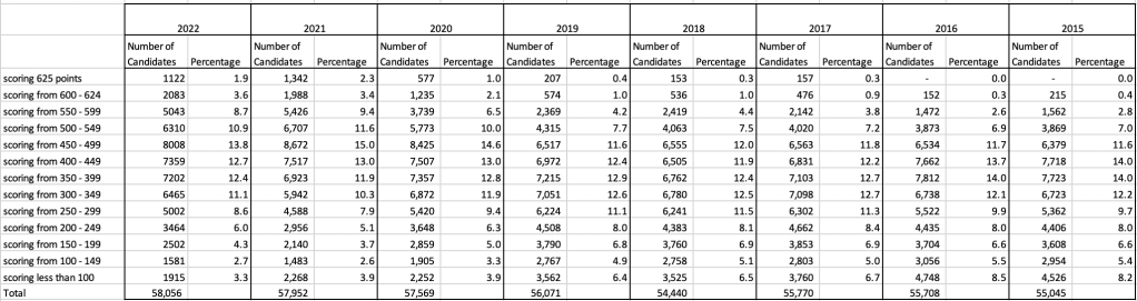
An initial look at these numbers and percentages might look like points are similar to last year and even 2020. But for 2015-2019 the similarity is closer. Again looking back at the previous blog post, we can see the results profiles for 20215-2019 are broadly similar and does indicate some normalisation might have been happening each year. The following chart illustrate the percentage of students who achieved points in each range.
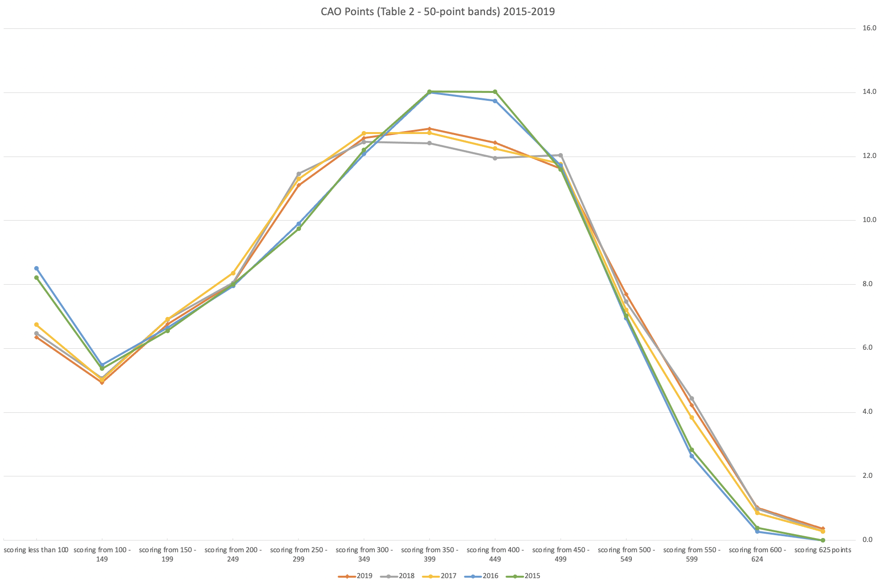
From the above we can see the profile is similar across 2015-2019, although there does seem to be a flattening of the curve between 2015-2016!
Let’s now have a look at 2019 (the last pre-coivd year), 2021 and 2022. This will allow use to compare the “inflated” years to the last “normal” year.
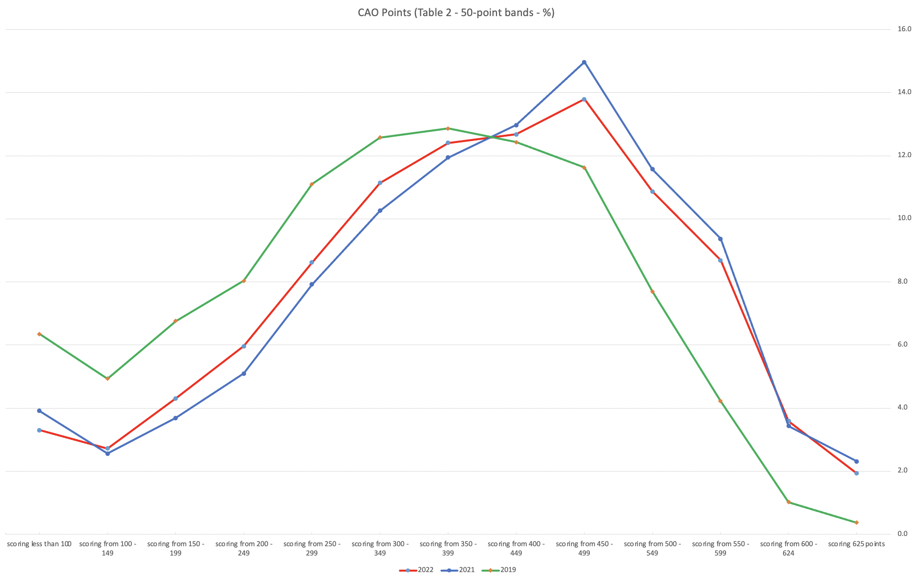
This chart clearly shows a shifting of the profile to the left for the red line which represents 2022. This also supports my blog post last week, and that the Dept of Education has started the process of deflating marks.
Based on this shifting/deflating of marks, we could see the grade/CAO Points profiles reverting back to almost 2019 profile by 2025. For students sitting the Leaving Cert in 2023, there will be another shift to the left, and with another similar shift in 2024. In 2024, the students will be the last group to sit the Leaving Cert who were badly affected during the Covid years. Many of them lost large chunks on school and many didn’t sit the Junior Cert. I’d predict 2025 will see the first time the marks/points profiles will match pre-covid years.
For this analysis I’ve used a variety of tools including Excel, Python and Oracle Analytics.
The Dataset used can be found under Dataset menu, and listed as ‘CAO Points Profiles 2015-2022’. Also, check out the Leaving Certificate 2015-2022 dataset.
Leaving Cert 2022 Results – Inflation, deflation or in-line!
The Leaving Certificate 2022 results are out. Up and down the country there are people who are delighted with their results, while others are disappointed, and lots of other emotions.
The Leaving Certificate is the terminal examination for secondary education in Ireland, with most students being examined in seven subjects, with their best six grades counting towards their “points”, which in turn determines what university course they might get. Check out this link for learn more about the Leaving Certificate.
The Dept of Education has been saying, for several months, this results this year (2022) will be “in-line on aggregate” with the results from 2021. There has been some concerns about grade inflation in 2021 and the impact it will have on the students in 2022 and future years. At some point the Dept of Education needs to address this grade inflation and look to revert back to the normal profile of grades pre-Covid.
Let’s have a look to see if this is true, and if it is true when we look a little deeper. Do the aggregate results hide grade deflation in some subjects.
For the analysis presented in this blog post, I’ve just looked at results at Higher Level across all subjects, and for the deeper dive I’ll look at some of the most popular subjects.
Firstly let’s have a quick look at the distribution of grades by subject for 2022 and 2021.
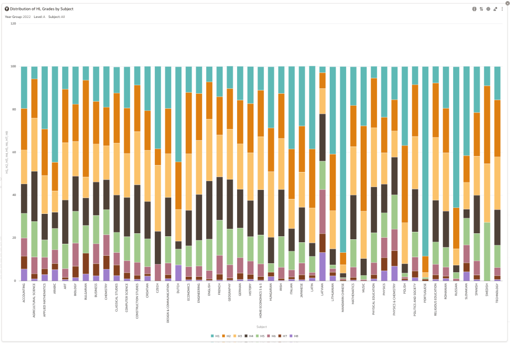
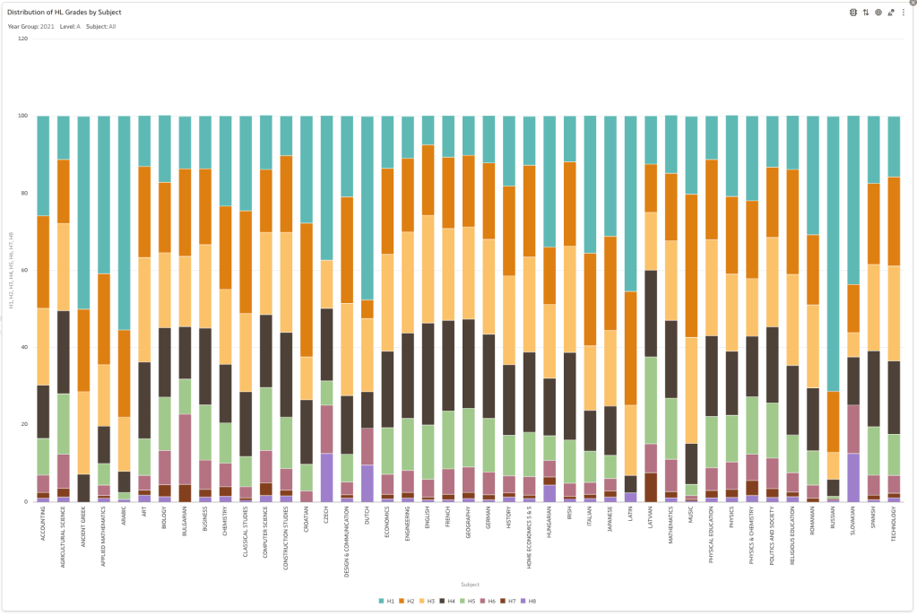
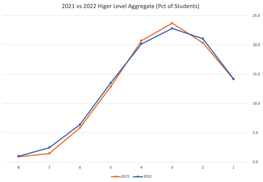
Remember the Dept of Education said the 2022 results should be in-line with the results of 2021. This required them to apply some adjustments, after marking the exam scripts, to give an updated profile. The following chart shows this comparison between the two years. On initial inspection we can see it is broadly similar. This is good, right? It kind of is and at a high level things look broadly in-line and maybe we can believe the Dept of Education. Looking a little closer we can see a small decrease in the H2-H4 range, and a slight increase in the H5-H8.
Let’s dive a little deeper. When we look at the grade profile of students in 2021 and 2022, How many subjects increased the number of students at each grade vs How many subjects decreased grades vs How many approximately stated the same. The table below shows the results and only counts a change if it is greater than 1% (to allow for minor variations between years).
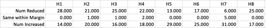
This table in very interesting in that more subjects decreased their H1s, with some variation for the H2-H4s, while for the lower range of H5-H7 we can see there has been an increase in grades. If I increased the margin to 3% we get a slightly different results, but only minor changes.
“in-line on aggregate” might be holding true, although it appears a slight increase on the numbers getting the lower grades. This might indicate either more of an adjustment to weaker students and/or a bit of a down shifting of grades from the H2-H4 range. But at the higher end, more subjects reduced than increase. The overall (aggregate) numbers are potentially masking movements in grade profiles.
Let’s now have a look at some of the core subjects of English, Irish and Mathematics.
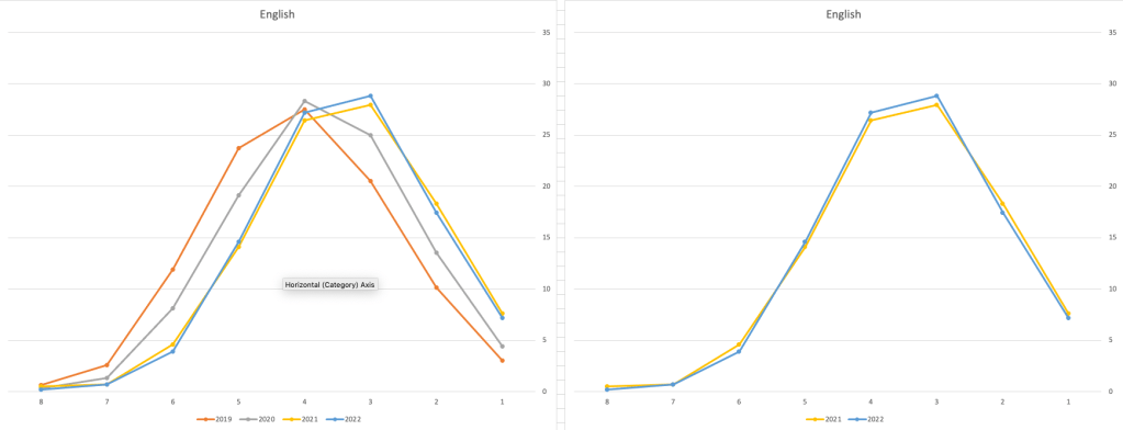
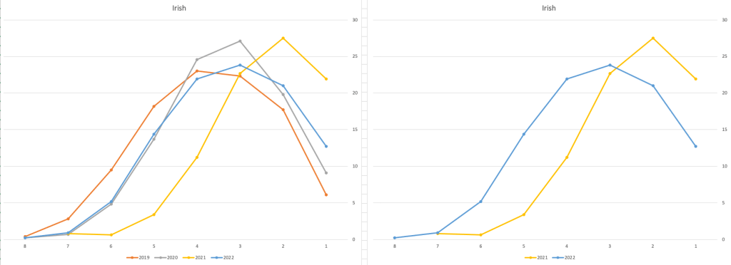
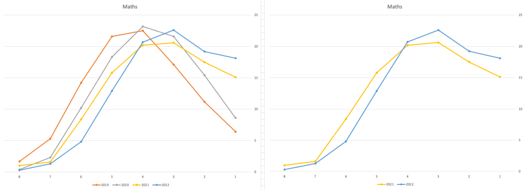
For English, it looks like they fitted to the curve perfectly! keeping grades in-line between the two years. Mathematics is a little different with a slight increase in grades. But when you look at Irish we can see there was definite grade deflation. For each of these subjects, the chart on the left contains four years of data including 2019 when the last “normal” leaving certificate occurred. With Irish the grade profile has been adjusted (deflated) significantly and is closer to 2019 profile than it is to 2021. There was been lots and lots of discussions nationally about how and when grades will revert to normal profile. The 2022 profile for Irish seems to show this has started to happen in this subject, which raises the question if this is occurring in any other subjects, and is hidden/masked by the “in-line on aggregate” figures.
This blog post would become just too long if I was to present the results profile for each of the 42+ subjects.
Let’s have a look as two of the most common foreign languages, French and Spanish.
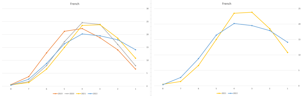
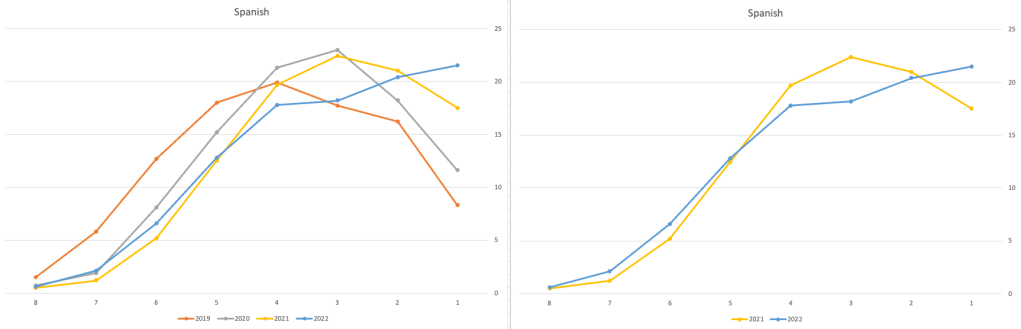
Again we can see some grade deflation, although not to be same extent as Irish. For both French and Spanish, we have reduced numbers for the H2-H4 range and a slight increase for H5-H7, and shift to the left in the profile. A slight exception is for those getting a H1 for both subjects. The adjustment in the results profile is more pronounced for French, and could indicate some deflation adjustments.
Next we’ll look at some of the science subjects of Physics, Chemistry and Biology.
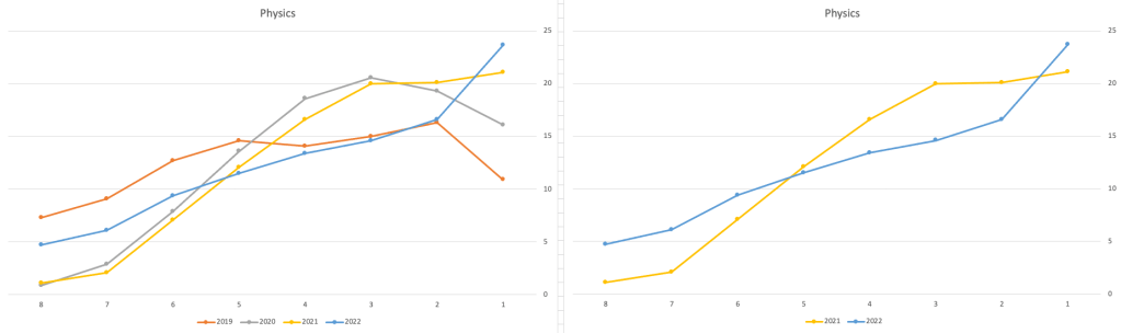
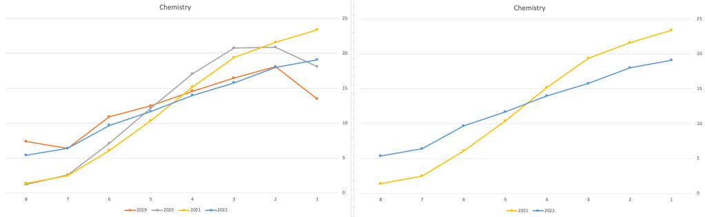
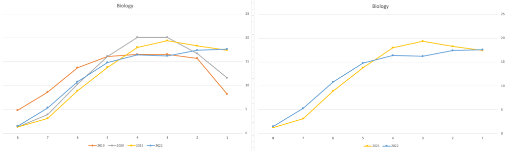
These three subjects also indicate some adjusts back towards the pre-Covid profile, with exception of H1 grades. We can see the 2022 profile almost reflect the 2019 profile (excluding H1s) and for Biology appears to be at a half way point between 2019 and 2022 (excluding H1s)
Just one more example of grade deflation, and this with Design, Communication and Graphics (or DCG)
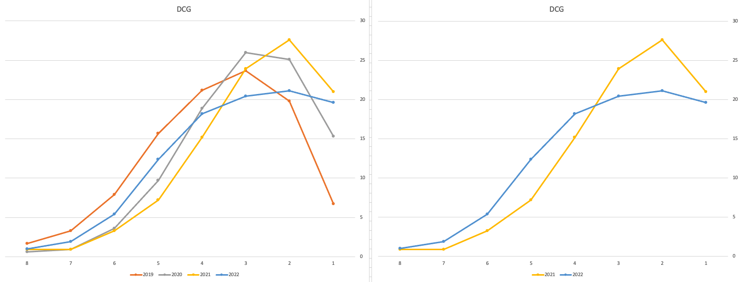
Yes there is obvious grade deflation and almost back to 2019 profile, with the exception of H1s again.
I’ve mentioned some possible grade deflation in various subjects, but there are also subjects where the profile very closely matches the 2021 profile. We have seen above English is one of those. Others include Technology, Art and Computer Science.
I’ve analyzed many more subjects and similar shifting of the profile is evident in those. Has the Dept of Education and State Examinations Commission taken steps to start deflating grades from the highs of 2021? I’d said the answer lies in the data, and the data I’ve looked at shows they have started the deflation process. This might take another couple of years to work out of the system and we will be back to “normal” pre-covid profiles. Which raises another interesting question, Was the grade profile for subjects, pre-covid, fitted to the curve? For the core set of subjects and for many of the more popular subjects, the data seems to indicate this. Maybe the “normal” distribution of marks is down to the “normal” distribution of abilities of the student population each year, or have grades been normalised in some way each year, for years, even decades?
For this analysis I’ve used a variety of tools including Excel, Python and Oracle Analytics.
The Dataset used can be found under Dataset menu, and listed as ‘Leaving Certificate 2015-2022’. An additional Dataset, I’ll be adding soon, will be for CAO Points Profiles 2015-2022.
Python Data Profiling libraries
One of the most common, and sometimes boring, task when working with datasets is writing some code to profile the data. Most data scientists will have built a set of tools/scripts to help them with this regular and slightly boring task. As with most IT tasks we should be trying to automate what we can, to allow us to spend more time on more important tasks, such as deriving insights and delivering value to the business, instead of repeatedly writing code to produce various statistics about the data and drawing pretty pictures.
I’ve written previously about automating and using some data profiling libraries to help us with this task. There are lots of packages available on pypi.og and on GitHub. Below I give examples of 5 Python Data Profiling libraries, with links to their GitHubs.
This is probably one of the better and more popular Python libraries for exploring data. The aim is to make it as simple as possible using one line of code.
pandas-profilingpackage naming was changed. To continue profiling data useydata-profilinginstead
import pandas_profiling as pp

df2.profile_report()


2. skimpy
Following the line line of code approach skimpy is a light weight tool that provides summary statistics about variables in data frames. They like to thing skimpy is a super-charged version of df.describe(). Skimpy also has some automated data cleaning functions.
from skimpy import skim

skim(df)
3. dataprep
Dataprep has multiple features with the two main features being EDA (Exploratory Data Analysis) and Data Cleaning. For EDA functionality, it is build to scale for larger data sets and provides some interactive charts.
from dataprep.eda import *
from dataprep.datasets import load_dataset
from dataprep.eda import plot, plot_correlation, plot_missing, plot_diff, create_report

df = load_dataset("titanic")
plot(df)

plot_missing(df)
plot_missing(df, "Age")

4. SweetViz
Sweetviz creates high-density visualizations to help kickstart EDA with just two lines of code. Output is a fully self-contained HTML application.
import pandas as pd
import sweetviz as sv

df = pd.read_csv('../input/titanic/train.csv')
report = sweetviz.analyze(df, "Survived")
5. AutoViz
Autoviz works on visualizing the relationship of the data, it can find the most impactful features and plot creative visualization.
from autoviz.AutoViz_Class import AutoViz_Class
AV = AutoViz_Class()

df = AV.AutoViz('titanic_train.csv')
Always try to automate the boring tasks, and using one of these packages is a step towards doing for for any Data Analysts, Data Sciences, Data Engineers, Machine Learning Engineer, AI Engineer, etc.
Comparing Cluster Algorithms on Density Data
In a previous posted I gave a detailed description of using DBScan to create clusters for a dataset containing different density based data. This “manufactured” dataset was created to illustrate how and why DBScan can be used.
But taking the previous post in isolation is perhaps not recommended. As a Data Scientist you will need to use many Clustering algorithms to determine which algorithm can best identify the patterns in your data, and this can be determined by the type of data distributions within the dataset.
The DBScan post created the following diagrams. The diagram on the left is a plot of the dataset where we can easily identify different groupings/clusters. The diagram on the right illustrates the clusters identified by DBScan. As you can see it did a good job.
We can see the three clusters and the noisy data point which were added to the dataset.
But what about other Clustering algorithms? What about k-Means and Hierarchical Clustering algorithms? How would they perform on this dataset?
Here is the code for k-Means with three clusters. Three clusters was selected as we have three clear clusters in the dataset.
#k-Means with 3 clusters
from sklearn.cluster import KMeans
k_means=KMeans(n_clusters=3,random_state=42)
k_means.fit(df[[0,1]])

df['KMeans_labels']=k_means.labels_

# Plotting resulting clusters
colors=['purple','red','blue','green']
plt.figure(figsize=(10,10))
plt.scatter(df[0],df[1],c=df['KMeans_labels'],cmap=matplotlib.colors.ListedColormap(colors),s=15)
plt.title('K-Means Clustering',fontsize=18)
plt.xlabel('Feature-1',fontsize=12)
plt.ylabel('Feature-2',fontsize=12)
plt.show()
Here is the code for Hierarchical Clustering, again three clusters was selected.
from sklearn.cluster import AgglomerativeClustering
model = AgglomerativeClustering(n_clusters=3, affinity='euclidean')
model.fit(df[[0,1]])

df['HR_labels']=model.labels_

# Plotting resulting clusters
plt.figure(figsize=(10,10))
plt.scatter(df[0],df[1],c=df['HR_labels'],cmap=matplotlib.colors.ListedColormap(colors),s=15)
plt.title('Hierarchical Clustering',fontsize=20)
plt.xlabel('Feature-1',fontsize=14)
plt.ylabel('Feature-2',fontsize=14)
plt.show()
The diagrams from both of these are shown below.
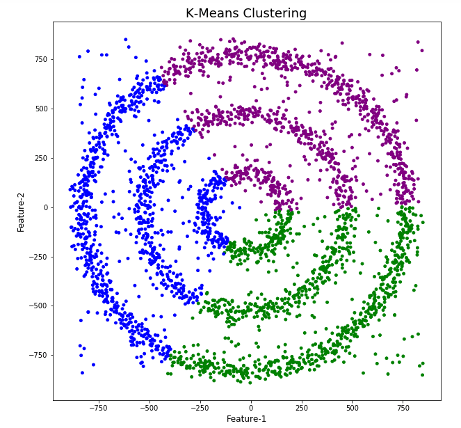
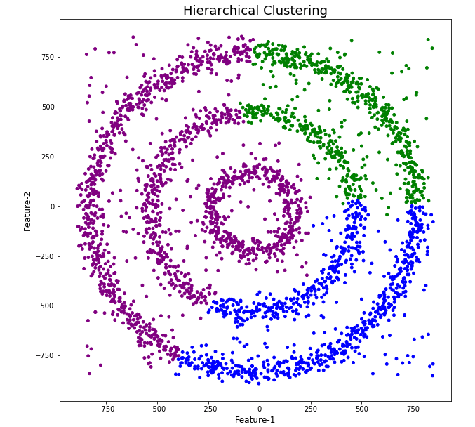
As you can see the results generated by these alternative Clustering algorithms produce very different results to what was produced by DBScan (see image at top of post) and we can easily see which algorithm best fits the dataset used.
Make sure you check out the post on DBScan.
DBScan Clustering in Python
Unsupervised Learning is a common approach for discovering patterns in datasets. The main algorithmic approach in Unsupervised Learning is Clustering, where the data is searched to discover groupings, or clusters, of data. Each of these clusters contain data points which have some set of characteristics in common with each other, and each cluster is distinct and different. There are many challenges with clustering which include trying to interpret the meaning of each cluster and how it is related to the domain in question, what is the “best” number of clusters to use or have, the shape of each cluster can be different (not like the nice clean examples we see in the text books), clusters can be overlapping with a data point belonging to many different clusters, and the difficulty with trying to decide which clustering algorithm to use.
The last point above about which clustering algorithm to use is similar to most problems in Data Science and Machine Learning. The simple answer is we just don’t know, and this is where the phases of “No free lunch” and “All models are wrong, but some models are model that others”, apply. This is where we need to apply the various algorithms to our data, and through a deep process of investigation the outputs, of each algorithm, need to be investigated to determine what algorithm, the parameters, etc work best for our dataset, specific problem being investigated and the domain. This involve the needs for lots of experiments and analysis. This work can take some/a lot of time to complete.
The k-Means clustering algorithm gets a lot of attention and focus for Clustering. It’s easy to understand what it does and to interpret the outputs. But it isn’t perfect and may not describe your data, as it can have different characteristics including shape, densities, sparseness, etc. k-Means focuses on a distance measure, while algorithms like DBScan can look at the relative densities of data. These two different approaches can produce by different results. Careful analysis of the data and the results/outcomes of these algorithms needs some care.
Let’s illustrate the use of DBScan (Density Based Spatial Clustering of Applications with Noise), using the scikit-learn Python package, for a “manufactured” dataset. This example will illustrate how this density based algorithm works (See my other blog post which compares different Clustering algorithms for this same dataset). DBSCAN is better suited for datasets that have disproportional cluster sizes (or densities), and whose data can be separated in a non-linear fashion.
There are two key parameters of DBScan:
- eps: The distance that specifies the neighborhoods. Two points are considered to be neighbors if the distance between them are less than or equal to eps.
- minPts: Minimum number of data points to define a cluster.
Based on these two parameters, points are classified as core point, border point, or outlier:
- Core point: A point is a core point if there are at least minPts number of points (including the point itself) in its surrounding area with radius eps.
- Border point: A point is a border point if it is reachable from a core point and there are less than minPts number of points within its surrounding area.
- Outlier: A point is an outlier if it is not a core point and not reachable from any core points.
The algorithm works by randomly selecting a starting point and it’s neighborhood area is determined using radius eps. If there are at least minPts number of points in the neighborhood, the point is marked as core point and a cluster formation starts. If not, the point is marked as noise. Once a cluster formation starts (let’s say cluster A), all the points within the neighborhood of initial point become a part of cluster A. If these new points are also core points, the points that are in the neighborhood of them are also added to cluster A. Next step is to randomly choose another point among the points that have not been visited in the previous steps. Then same procedure applies. This process finishes when all points are visited.
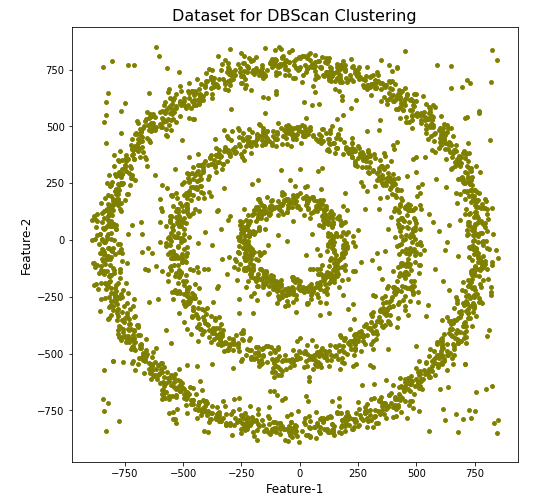
Let’s setup our data set and visualize it.
import numpy as np
import pandas as pd
import math
import matplotlib.pyplot as plt
import matplotlib

#initialize the random seed
np.random.seed(42) #it is the answer to everything!

#Create a function to create our data points in a circular format
#We will call this function below, to create our dataframe
def CreateDataPoints(r, n):
    return [(math.cos(2*math.pi/n*x)*r+np.random.normal(-30,30),math.sin(2*math.pi/n*x)*r+np.random.normal(-30,30)) for x in range(1,n+1)]

#Use the function to create different sets of data, each having a circular format
df=pd.DataFrame(CreateDataPoints(800,1500))  #500, 1000
df=df.append(CreateDataPoints(500,850))      #300, 700
df=df.append(CreateDataPoints(200,450))      #100, 300

# Adding noise to the dataset
df=df.append([(np.random.randint(-850,850),np.random.randint(-850,850)) for i in range(450)])

plt.figure(figsize=(8,8))
plt.scatter(df[0],df[1],s=15,color='olive')
plt.title('Dataset for DBScan Clustering',fontsize=16)
plt.xlabel('Feature-1',fontsize=12)
plt.ylabel('Feature-2',fontsize=12)
plt.show()

We can see the dataset we’ve just created has three distinct circular patterns of data. We also added some noisy data too, which can be see as the points between and outside of the circular patterns.
Let’s use the DBScan algorithm, using the default setting, to see what it discovers.
from sklearn.cluster import DBSCAN
#DBSCAN without any parameter optimization and see the results.
dbscan=DBSCAN()
dbscan.fit(df[[0,1]])

df['DBSCAN_labels']=dbscan.labels_

# Plotting resulting clusters
colors=['purple','red','blue','green']
plt.figure(figsize=(8,8))
plt.scatter(df[0],df[1],c=df['DBSCAN_labels'],cmap=matplotlib.colors.ListedColormap(colors),s=15)
plt.title('DBSCAN Clustering',fontsize=16)
plt.xlabel('Feature-1',fontsize=12)
plt.ylabel('Feature-2',fontsize=12)
plt.show()
#Not very useful !
#Everything belongs to one cluster.
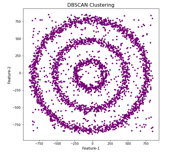
Everything is the one color! which means all data points below to the same cluster. This isn’t very useful and can at first seem like this algorithm doesn’t work for our dataset. But we know it should work given the visual representation of the data. The reason for this occurrence is because the value for epsilon is very small. We need to explore a better value for this. One approach is to use KNN (K-Nearest Neighbors) to calculate the k-distance for the data points and based on this graph we can determine a possible value for epsilon.
#Let's explore the data and work out a better setting
from sklearn.neighbors import NearestNeighbors
neigh = NearestNeighbors(n_neighbors=2)
nbrs = neigh.fit(df[[0,1]])
distances, indices = nbrs.kneighbors(df[[0,1]])

# Plotting K-distance Graph
distances = np.sort(distances, axis=0)
distances = distances[:,1]
plt.figure(figsize=(14,8))
plt.plot(distances)
plt.title('K-Distance - Check where it bends',fontsize=16)
plt.xlabel('Data Points - sorted by Distance',fontsize=12)
plt.ylabel('Epsilon',fontsize=12)
plt.show()
#Let’s plot our K-distance graph and find the value of epsilon

Look at the graph above we can see the main curvature is between 20 and 40. Taking 30 at the mid-point of this we can now use this value for epsilon. The value for the number of samples needs some experimentation to see what gives the best fit.
Let’s now run DBScan to see what we get now.
from sklearn.cluster import DBSCAN
dbscan_opt=DBSCAN(eps=30,min_samples=3)
dbscan_opt.fit(df[[0,1]])

df['DBSCAN_opt_labels']=dbscan_opt.labels_
df['DBSCAN_opt_labels'].value_counts()

# Plotting the resulting clusters
colors=['purple','red','blue','green', 'olive', 'pink', 'cyan', 'orange', 'brown' ]
plt.figure(figsize=(8,8))
plt.scatter(df[0],df[1],c=df['DBSCAN_opt_labels'],cmap=matplotlib.colors.ListedColormap(colors),s=15)
plt.title('DBScan Clustering',fontsize=18)
plt.xlabel('Feature-1',fontsize=12)
plt.ylabel('Feature-2',fontsize=12)
plt.show()

When we look at the dataframe we can see it create many different cluster, beyond the three that we might have been expecting. Most of these clusters contain small numbers of data points. These could be considered outliers and alternative view of this results is presented below, with this removed.
df['DBSCAN_opt_labels']=dbscan_opt.labels_
df['DBSCAN_opt_labels'].value_counts()

 0     1559
 2      898
 3      470
-1      282
 8        6
 5        5
 4        4
 10       4
 11       4
 6        3
 12       3
 1        3
 7        3
 9        3
 13       3
Name: DBSCAN_opt_labels, dtype: int64
The cluster labeled with -1 contains the outliers. Let’s clean this up a little.
df2 = df[df['DBSCAN_opt_labels'].isin([-1,0,2,3])]
df2['DBSCAN_opt_labels'].value_counts()
 0    1559
 2     898
 3     470
-1     282
Name: DBSCAN_opt_labels, dtype: int64

# Plotting the resulting clusters
colors=['purple','red','blue','green', 'olive', 'pink', 'cyan', 'orange']
plt.figure(figsize=(8,8))
plt.scatter(df2[0],df2[1],c=df2['DBSCAN_opt_labels'],cmap=matplotlib.colors.ListedColormap(colors),s=15)
plt.title('DBScan Clustering',fontsize=18)
plt.xlabel('Feature-1',fontsize=12)
plt.ylabel('Feature-2',fontsize=12)
plt.show()

See my other blog post which compares different Clustering algorithms for this same dataset.
Biases in Data
We work with data in a variety of different ways throughout our organisation. Some people are consumers of data and in particular data that is the output of various data analytics, machine learning or artificial intelligence applications. Being a consumer of data from these applications we (easily) made the assumption that the data used is correct and the results being presented to us (in various forms) is correct.
But all too often we hear about some adjustments being made to the data or the processing to correct “something” that was discovered. One the these “something” can be classified as a Data Bias. This kind of problem has been increasing in importance over the past couple of years. Some of this importance has been led by the people involved in creating and process this data discovering certain issues or “something” in the data. Some has been identified by the consumer when the discover “something” odd or unusual about the data. This list could get very long, but another aspect is with the introduction of EU GDPR, there is now a legal aspect to ensuring no data biases exist. Part of the problem with EU GDPR, in this aspect, is it is very vague on what is required. This in turn has caused some confusion on what is required of organisations and their staff. But with the arrival of the EU AI Regulations there is a renewed focus on identifying and addressing Data Bias. With the EU AI Regulations there is a requirement that Data Bias is addressed at each step when data is collected, processed and generated.
The following list outlines some of the typical Data Bias scenarios you or you organisation may encounter.
- Definition bias: Occurs when someone words or phrases a problem or description of data based on their own requirements, rather than based on the organisational or domain definitions. This can lead to misleading results or when commencing an analytics project can lead the project is a specific (biased) direction
- Sample bias: This occurs when the dataset created for input to the analytics or machine learning does not reflect the data from the original data sources. The sampling method used fails to attain true randomness before selection This can result in models having lower accuracy with certain sub-groups of the data (i.e. Customers) which might not have been included or under-represented in the sampled dataset. Sometimes this type of bias is referred to as selection bias.
- Measurement bias: This occurs when data collected for training differs from that collected in the original data sources. It can also occur when incorrect measurements or calculations are applied to the data. An example of this bias occurs with inconsistent annotation labeling and/or with re-coding of data to give incorrect or misleading meaning.
- Selection bias: This occurs when the dataset created for analytics is not large enough or representative enough to include all possible data combinations. This can occur due to human or algorithmic data processing biases. Sample bias plays a sub-role within Selection bias. This can happen at both record and attribute/feature selection levels. Selection bias is sometimes referred to as Exclusion bias, as certain data is excluded by the whoever is creating the dataset.
- Recall bias: This bias arises when labels (target feature) are inconsistently given based on subjective observations. This results in lower accuracy.
- Observer bias: This is the effect of seeing what you expect to see or want to see in data. The observers have subjective thoughts about their study, either conscious or unconscious. This leads to incorrectly labelled or recorded data. For example, two data scientist give different labels for an event. Their labeling is based on the subjective thoughts rather than following provided guidelines or seeking verification for their decisions. Sometimes this type of bias is referred to as Confirmation bias.
- Racial & Gender bias & Similar: Racial bias occurs when data skews in favor of particular demographics. Similar scenarios can occur for gender and other similar types of data. For example, facial recognition fails to recognize people of color as these have been under represented in the training datasets.
- Minority bias: This is similar to the previous Racial and Gender bias. This occurs when a minority group(s) are excluded from the dataset.
- Association bias: This occurs when the data reinforces or multiplies a cultural bias. Your dataset may have a collection of jobs in which all men have job X and all women have job Y. A machine learning model built using this data will preclude women from job X and men from job Y. Association bias is known for creating gender bias.
- Algorithmic bias: Occurs when the algorithm is selective on what data it uses to create a model for the data and problem. Extra validation checks and testing is needed to ensure no additional biases have been created and no biases (based on the previous types above) have been amplified by the algorithm.
- Reporting bias: Occurs when only a selection of results or outcomes are present. The person preparing the data is selective on what information they share with others. This typically leads to under reporting of certain, and somethings important, information.
- Confirmation bias: Occurs when the data/results are interpreted favoring information that confirms previously existing beliefs.
- Response / Non-Response bias: Occurs when results from surveys can be considered misleading based on the questions asked and subset of population who responded to the survey. If 95% of respondents said they link surveys, then is misleading. The quality and accuracy of the data will be poor in such situations
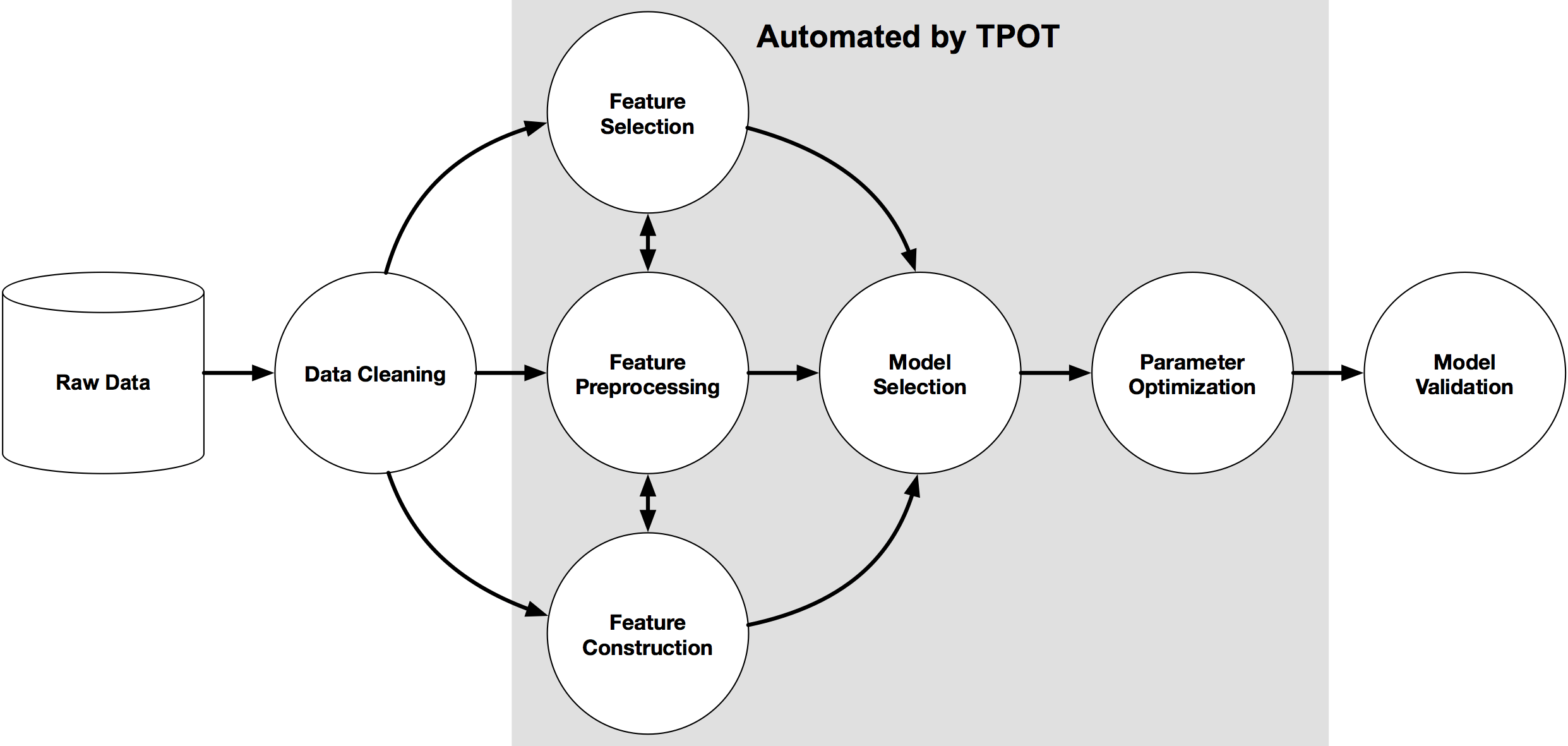
AutoML – using TPOT
Another popular AutoML library is TPOT, which stands for Tree-Based Pipeline Optimization Tool. The goal of TPOT is to automate the building of ML pipelines by combining a flexible expression tree representation of pipelines with stochastic search algorithms such as genetic programming. TPOT makes use of the Python-based scikit-learn library
Install the TPOT library using
pip3 install tpotHere is an example tree-based pipeline from TPOT. Each circle corresponds to a machine learning operator, and the arrows indicate the direction of the data flow

Let’s build upon my previous blog post on AutomML, by using the same data set, with no modifications, and using the training (X_train, y_train) and test (X_test, y_test) data sets (dataframes), based on the Bank data sets. Check the previous post for the detailed steps on getting to this point.
In a similar way as the autosklean library example, I’m just going to demonstrate using TPOT for a classification problem using TPOTClassifier class. For regression problems, there is the corresponding TPOTRegressor class (not demonstrated in this post).
TPOTClassifier has the following main parameters (there are others):
- generations: Number of iterations to the run pipeline optimization process. The default is 100.
- population_size: Number of individuals to retain in the genetic programming population every generation. The default is 100.
- offspring_size: Number of offspring to produce in each genetic programming generation. The default is 100.
- mutation_rate: Mutation rate for the genetic programming algorithm in the range [0.0, 1.0]. This parameter tells the GP algorithm how many pipelines to apply random changes to every generation. Default is 0.9
- crossover_rate: Crossover rate for the genetic programming algorithm in the range [0.0, 1.0]. This parameter tells the genetic programming algorithm how many pipelines to “breed” every generation.
- scoring: Function used to evaluate the quality of a given pipeline for the classification problem like
accuracy,average_precision,roc_auc,recall, etc. The default isaccuracy. - cv: Cross-validation strategy used when evaluating pipelines. The default is 5.
- random_state: The seed of the pseudo-random number generator used in TPOT. Use this parameter to make sure that TPOT will give you the same results each time you run it against the same data set with that seed.
- verbosity: How much information TPOT communicates while it is running. Default is 0 (zero) TPOT will display nothing. 1=display minimal information, 2=display more information and progress bar, 3=print everything and progress bar.
- n_jobs: Number of processes to use. Default is 1. Use -1 to use all available cores.
Care is needed with some of these settings, for example generations should be set small to begin with, for example set to 5 initially. Also, population_size should also be kept small, for example 5 initially. These initial settings will evaluate 25 piplelines (5×5) configurations before finishing, and for some these settings may need to be adjusted smaller for initial work/investigations. Another parameter to adjust is the ‘verbosity’ setting. The default is 0 which means no details will be displayed. I like to set this to 3, as it gives more details of the outcomes from each pipeline. Adjust higher for more details or lower to fewer details. Another parameter to consider adjusting is ‘max_time_min’ and ‘max_eval_time_min’, but setting these too low can result in no or minimum results.
Load the library, setup the configuration and run. This is very simple to setup
from tpot import TPOTClassifier

#configure settings
tpot = TPOTClassifier(generations=5, population_size=5, verbosity=3, n_jobs=4, scoring='accuracy')

#run TPOT
tpot.fit(X_train, y_train)
As verbosity is set to 3 we get a lot of detail being displayed for each generation. The final output is shown below. What is missing from this is the progress bars which are displayed while TPOT is running
32 operators have been imported by TPOT.


Generation 1 - Current Pareto front scores:

-1	0.8963961891371728	RandomForestClassifier(input_matrix, RandomForestClassifier__bootstrap=True, RandomForestClassifier__criterion=gini, RandomForestClassifier__max_features=0.7000000000000001, RandomForestClassifier__min_samples_leaf=5, RandomForestClassifier__min_samples_split=7, RandomForestClassifier__n_estimators=100)

-2	0.8978183008194085	RandomForestClassifier(ZeroCount(input_matrix), RandomForestClassifier__bootstrap=True, RandomForestClassifier__criterion=gini, RandomForestClassifier__max_features=0.7000000000000001, RandomForestClassifier__min_samples_leaf=5, RandomForestClassifier__min_samples_split=7, RandomForestClassifier__n_estimators=100)
Pipeline encountered that has previously been evaluated during the optimization process. Using the score from the previous evaluation.

Generation 2 - Current Pareto front scores:

-1	0.8974020496851336	RandomForestClassifier(input_matrix, RandomForestClassifier__bootstrap=True, RandomForestClassifier__criterion=gini, RandomForestClassifier__max_features=0.7000000000000001, RandomForestClassifier__min_samples_leaf=8, RandomForestClassifier__min_samples_split=7, RandomForestClassifier__n_estimators=100)

-2	0.8978183008194085	RandomForestClassifier(ZeroCount(input_matrix), RandomForestClassifier__bootstrap=True, RandomForestClassifier__criterion=gini, RandomForestClassifier__max_features=0.7000000000000001, RandomForestClassifier__min_samples_leaf=5, RandomForestClassifier__min_samples_split=7, RandomForestClassifier__n_estimators=100)
_pre_test decorator: _random_mutation_operator: num_test=0 '(slice(None, None, None), 0)' is an invalid key.
Pipeline encountered that has previously been evaluated during the optimization process. Using the score from the previous evaluation.

Generation 3 - Current Pareto front scores:

-1	0.8974020496851336	RandomForestClassifier(input_matrix, RandomForestClassifier__bootstrap=True, RandomForestClassifier__criterion=gini, RandomForestClassifier__max_features=0.7000000000000001, RandomForestClassifier__min_samples_leaf=8, RandomForestClassifier__min_samples_split=7, RandomForestClassifier__n_estimators=100)

-2	0.8978183008194085	RandomForestClassifier(ZeroCount(input_matrix), RandomForestClassifier__bootstrap=True, RandomForestClassifier__criterion=gini, RandomForestClassifier__max_features=0.7000000000000001, RandomForestClassifier__min_samples_leaf=5, RandomForestClassifier__min_samples_split=7, RandomForestClassifier__n_estimators=100)
Skipped pipeline #21 due to time out. Continuing to the next pipeline.
Skipped pipeline #23 due to time out. Continuing to the next pipeline.

Generation 4 - Current Pareto front scores:

-1	0.8974020496851336	RandomForestClassifier(input_matrix, RandomForestClassifier__bootstrap=True, RandomForestClassifier__criterion=gini, RandomForestClassifier__max_features=0.7000000000000001, RandomForestClassifier__min_samples_leaf=8, RandomForestClassifier__min_samples_split=7, RandomForestClassifier__n_estimators=100)

-2	0.8978183008194085	RandomForestClassifier(ZeroCount(input_matrix), RandomForestClassifier__bootstrap=True, RandomForestClassifier__criterion=gini, RandomForestClassifier__max_features=0.7000000000000001, RandomForestClassifier__min_samples_leaf=5, RandomForestClassifier__min_samples_split=7, RandomForestClassifier__n_estimators=100)

Generation 5 - Current Pareto front scores:

-1	0.8983385200075953	RandomForestClassifier(input_matrix, RandomForestClassifier__bootstrap=True, RandomForestClassifier__criterion=gini, RandomForestClassifier__max_features=0.55, RandomForestClassifier__min_samples_leaf=8, RandomForestClassifier__min_samples_split=7, RandomForestClassifier__n_estimators=100)

TPOTClassifier(generations=5, n_jobs=4, population_size=5, scoring='accuracy',
               verbosity=3)
We can now display the ‘best’ model configuration discovered by TPOT.
tpot.fitted_pipeline_


Pipeline(steps=[('normalizer', Normalizer(norm='l1')),
                ('xgbclassifier',
                 XGBClassifier(base_score=0.5, booster='gbtree',
                               colsample_bylevel=1, colsample_bynode=1,
                               colsample_bytree=1, gamma=0, gpu_id=-1,
                               importance_type='gain',
                               interaction_constraints='', learning_rate=0.01,
                               max_delta_step=0, max_depth=8,
                               min_child_weight=7, missing=nan,
                               monotone_constraints='()', n_estimators=100,
                               n_jobs=1, num_parallel_tree=1, random_state=0,
                               reg_alpha=0, reg_lambda=1, scale_pos_weight=1,
                               subsample=0.8, tree_method='exact',
                               validate_parameters=1, verbosity=0))])
In this run of TPOT, on this data set, XGBoost algorithm gave the best results using the parameters and settings listed above. What is interesting, everytime I’ve run TPOT for the same data set, using the same configuration parameters, I get a slightly different outcome.
Next step is to evaluate the ‘best’ model on the holdout data set.
tpot.score(X_test, y_test)


0.9037792344420167
The results achieved are good and are better than some of the other models created by other AutoML libraries.
The final step we can perform is to export the model template. This creates a file containing the template code to create and use the model. This does require some modifications to specify the data set, and the pipeline of data modifications and transformations.
#export the model
tpot.export('.../tpot_Bank_pipeline.py')
The output file contains the following.
import numpy as np
import pandas as pd
from sklearn.model_selection import train_test_split
from sklearn.pipeline import make_pipeline
from sklearn.preprocessing import Normalizer
from xgboost import XGBClassifier

# NOTE: Make sure that the outcome column is labeled 'target' in the data file
tpot_data = pd.read_csv('PATH/TO/DATA/FILE', sep='COLUMN_SEPARATOR', dtype=np.float64)
features = tpot_data.drop('target', axis=1)

training_features, testing_features, training_target, testing_target = \
            train_test_split(features, tpot_data['target'], random_state=None)

# Average CV score on the training set was: 0.8986507248984001
exported_pipeline = make_pipeline(
    Normalizer(norm="l1"),
    XGBClassifier(learning_rate=0.01, max_depth=8, min_child_weight=7, n_estimators=100, n_jobs=1, subsample=0.8, verbosity=0)
)

exported_pipeline.fit(training_features, training_target)
results = exported_pipeline.predict(testing_features)
TPOT does have some issues and limitations. Well it is slow, and part of this is due to the nature of genetic algorithms, every time you run TPOT you may get different results, etc. Some of these issues can be addressed by adjusting some of the parameters, but even still, it doesn’t eliminate all of them. Running on GPU helps a little with timing of each run. TPOT doesn’t remove the need for data cleaning, feature engineering etc, but that is the case with most solutions.
Listed in 2 categories of “Who’s Who in Data Science & Machine Learning?”
I’ve received notification I’ve been listed in the “Who’s Who in Data Science & Machine Learning?” lists created by Onalytica. I’ve been listed in not just one category but two categories. These are:
- Key Opinion Leaders discussing Data Science & Machine Learning
- Big Data
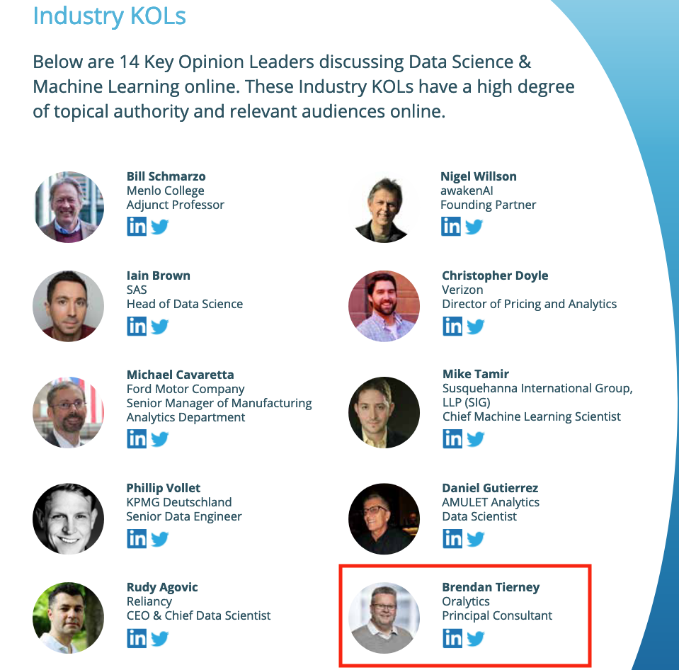
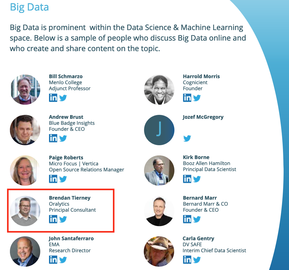
This is what Onalytica says about their report and how the list for each category was put together. “The influential experts are selected using Onalytica’s 4 Rs methodology (Reach, Resonance, Relevance and Reference). Quantitative data is pulled through LinkedIn, Twitter, Personal Blogs, YouTube, Podcast, and Forbes channels, and our qualitative data is pulled by our insights and analytics team, capturing offline influenc”. “All the influential experts featured are categorised by influencer persona, the sector they work in, their role within that sector, and more from our curated database of 1m+ influencers”. “Our Who’s Who lists are created using the Onalytica platform which has a curated database of over 1 million influencers. Our platform allows you to discover, validate and categorise influencers quickly and easily via keyword searches. Our lists are made using carefully created Boolean queries which then rank influencers by resonance, relevance, reach and reference, meaning influencers are not only ranked by themselves, but also by how much other influencers are referring to them. The lists are then validated, and filters are used to split the influencers up into the categories that are seen in the list.”
Check out the full report on “Who’s Who in Data Science & Machine Learning?“
AutoML, what is it good for? It Depends!
Automated Machine Learning (AutoML) seems to be everywhere and every Analytics product and SaaS offering seems to have some element of AutoML built into them. Part of the reason for this is because most of the market analysts, such as Gartner etc., have been rating Machine Learning (ML) products and services based on them having an AutoML feature.

Some of the benefits of AutoML is it will automatically generate a ML model for you without you having to worry about any of the technical details and the various statistical tests to measure if the model is useful. This kind of message has resulted is lots and lots of articles talking about the death of the Data Scientist, as they are no longer needed. We must remember ML is only one of the tools and skills of the data scientist.
This can all sound great. No need to hire these expensive data scientists, I can just use this AutoML software to create a ML model, for my data, and life will be good with all these wonderful predictions. Just think of the money I’ll be making and saving!
Where the fun comes into all of this is when someone issues legal proceedings based on what one of these AutoML models has predicted. The AutoML has made an incorrect prediction. The problem you now face, probably in court, is trying to justify the prediction by saying the machine/computer/algorithm made it, and you have no idea how or what it is doing to make the prediction. Good luck in a court explaining that to a judge and/or jury. Be prepared to hand over lots of money
What is missing is the human in the loop, and in most cases this will be the data scientist or machine learning engineer (or someone else with a really cool job title). Part of their job is to evaluate lots of difference models for you data (remember they will create lots and lots of models and not just one!), determine (from experimentation) what algorithms work best with your data and problem, optimize these models and assess the impact of changing hyperparameters, look at how these ML models are behaving, are there any biases in the model or data, use a wide variety of statistic tests to assess the models, examine how the model works with different sub-parts of the data (customers), look at any potential legal and legislative issues not just in one geographic but across many disparate regions all of which have different legal requirements, etc.
As you can see there are many additional tasks beyond the ML steps needed to create, verify and select a ML to use. All of this is before you look at how it can be deployed in your production systems/architecture and building out you MLOps.
One importing characteristic of having the human in the loop is Explainability. Explainability of the process followed, what models were produced, the effect of tuning and opimizing, possible biases and mitigating steps, etc etc The list goes on and on. This the role of the data scientist and now it might look like a good idea to hire a good data scientist who understands all of this.

Taking a little step back, AutoML is kind of good cool feature/tool. A lot of the main steps of creating all those ML models, tuning them and evaluating them, etc can be very boring work. You do same steps for each model and do it all over again for the next, and so on for the tens or hundreds of models you will be creating. Most data scientists will have scripts in their toolbox (based from their experience) to automatically perform all of these steps and output the results. I mentioned the word experience in the last sentence. It can take a bit of time to build up to this. The AutoML products will do all of this automatically for you hence you don’t have to hire a data scientist to do it (see what I said above about this).
I mentioned above some of the challenges and the need to keep a human in the loop. AutoML can be seen as another tool to assist the data scientist and not to replace them. AutoML can be used to to help the data scientist work towards identifying what ML models to use. But this can be a bit of a challenge to do. It depends on what product or library you use. Some AutoML solutions act as a black box. Kind of like the image at the top of this post. These are simple to use but the draw back is there is not explainability or ability of the data scientist to really assess what is happening at each step. There are AutoML products/solutions that allow you to inspect and monitor what is happening at each step within AutoML. The diagram given able is one example of this. This allows for the human in the loop and allows for explainability. If the data scientist sees some unusual direction being taken by AutoML they can see where and why this is happening and can take corrective action. AutoML isn’t a black box in this scenario.
I mentioned above, AutoML can be another tool for the data scientist to use. Look on AutoML as quick way to see what might be possible. Using the information from each step of AutoML, the data scientist can use this information to guide them towards creating a more suitable and usable ML model, and do so in perhaps a slightly shorter space of time.
Going back to the title of the post ‘AutoML, what is it good for?’, the answer really is ‘It Depends!’, but if you do use it, be careful how you use the models and results beyond doing some simple investigation. And be careful of product offerings saying you don’t need anything else.
2020 Books on Data Science and Machine Learning
2020 has been an interesting year. Not for the obvious topic, but for new books on Data Science and Machine Learning. The list below are some of my favorite books from 2020. Making the selection was difficult. Some months had a large number of releases and some were a bit quieter. The books below are listed based on their release date and are not ranked in any way. I’ve included links to these books on Amazon (.com, .uk and .de).
 |
 |
 |
|
| January
Everyone wants to work in Data Science, but where and how do you start. Aimed at beginners with guidance without the technical. High level, not for everyone. |
February
Taking ML to the next stage creating AI application. How to do it with examples across a number of areas. |
March
A guide for those wary of impact of technology’s and for those who are enthusiastic about where AI is taking us. |
|
 |
 |
 |
|
| April
AI Ethics was one of the topic topics for 2020. Covers the philosophical aspects along with the technical one.s |
May
Covering the life-cyle of building ML application, showing all that it entails and how ML plays a small part in the overall solution |
June
From covering the basics of NLP, it builds on this to include in application, how to use in different industries and within project teams. |
|
 |
 |
 |
|
| July
With by Thomas Davenport and others, and is a good addition to his other books. Consisting of interviews, research and analysis on how to win with ML & AI. |
August
I was invited to contribute a couple of chapters to this book, along with well known names in areas of DS, ML & AI |
September
Building upon the success of their 1st edition, the 2nd edition comes with more example and extra chapters. |
|
 |
 |
 |
|
| October
ML & AI is not perfect. Lots can go wrong. Not just with the project but also with the implementation of the applications. Lots to thing about and consider. |
November
No one really builds ML algorithms. We build ML solutions and applications. But whats the best way to do this, from technical, organizational and ethical aspects. |
December
It was difficult to pick a book for this month. Lots of new releases and I haven’t received all my orders, at time of this post. Here is a book from July, and is related to an Automated Trading App I’ve been working on (and earning) for a couple of years. |

And to finish off the list I’m including this additional book. It wasn’t released this year. It was released in April 2018. It was a best seller on Amazon in 2018 and 2019! This was really exciting for us and we still amazed at how it it is still selling in 2020. It is currently, as of December 2020, listed in 8th place on the MIT Press Best Sellers list. It won’t be making any best seller list in 2020, but is still proving popular with many readers. To all of you who have bought this book, I’d like to say Thank You and wishing you all the best with 2021 and beyond.
Adding Text Processing to Classification Machine Learning in Oracle Machine Learning
One of the typical machine learning functions is Classification. This is in widespread use across most domains and geographic regions. I’ve written several blog posts on this topic over many years (and going back many, many year) on how to do this using Oracle Machine Learning (OML) (formally known as Oracle Advanced Analytic and in the Oracle Data Miner tool in SQL Developer). Just do a quick search of my blog to find some of these posts.
When it comes to Classification problems, typically the data set will be contain your typical categorical and numerical variables/features. The Automatic Data Preparation (ADP) feature of OML where it automatically pre-processes and transforms these variable for input to the machine learning algorithm. This greatly reduces the boring work of the data scientist and increases their productivity.
But sometimes data sets come with text descriptions. These will contain production descriptions, free format text, and other descriptive data, for example product reviews. But how can this information be included as part of the input data set to the machine learning algorithms. Oracle allows this kind of input data, and a letting bit of setup is needed to tell Oracle how to process the data set. This uses the in-database feature of Oracle Text.
The following example walks through an example of the steps needed to pre-process and include the text processing as part of the machine learning algorithm.
The data set: The data used to illustrate this and to show the steps needed, is a data set from Kaggle webiste. This data set contains 130K Wine Reviews. This data set contain descriptive information of the wine with attributes about each wine including country, region, number of points, price, etc as well as a text description contain a review of the wine.
The following are 2 files containing the DDL (to create the table) and then Import the data set (using sql script with insert statements). These can be run in your schema (in order listed below).
I’ll leave the Data Exploration to you to do and to discover some early insights.
The ML Question
I want to be able to predict if a wine is a good quality wine, based on the prices and different characteristics of the wine?
Data Preparation
To be able to answer this question the first thing needed is to define a target variable to identify good and bad wines. To do this create a new attribute/feature called POINTS_BIN and populate it based on the number of points a wine has. If it has >90 points it is a good wine, if <90 points it is a bad wine.
ALTER TABLE WineReviews130K_bin ADD POINTS_BIN VARCHAR2(15);

UPDATE WineReviews130K_bin
SET POINTS_BIN = 'GT_90_Points'
WHERE winereviews130k_bin.POINTS >= 90;

UPDATE WineReviews130K_bin
SET POINTS_BIN = 'LT_90_Points'
WHERE winereviews130k_bin.POINTS < 90;

alter table WineReviews130K_bin DROP COLUMN POINTS;
The DESCRIPTION column data type needs to be changed to CLOB. This is to allow the Text Mining feature to work correctly.
-- add a new column of data type CLOB
ALTER TABLE WineReviews130K_bin ADD (DESCRIPTION_NEW CLOB);

-- update new column with data from the DESCRIPTION attribute
UPDATE WineReviews130K_bin SET DESCRIPTION_NEW = DESCRIPTION;

-- drop the DESCRIPTION attribute from table
ALTER TABLE WineReviews130K_bin DROP COLUMN DESCRIPTION;

-- rename the new attribute to replace DESCRIPTION
ALTER TABLE WineReviews130K_bin RENAME COLUMN DESCRIPTION_NEW TO DESCRIPTION;
Text Mining Configuration
There are a number of things we need to define for the Text Mining to work, these include a Lexer, Stop Word list and preferences.
First define the Lexer to use. In this case we will use a basic one and basic settings
BEGIN
   ctx_ddl.create_preference('mylex', 'BASIC_LEXER');
   ctx_ddl.set_attribute('mylex', 'printjoins', '_-');
   ctx_ddl.set_attribute ( 'mylex', 'index_themes', 'NO');
   ctx_ddl.set_attribute ( 'mylex', 'index_text', 'YES');
END;
Next we can define a Stop Word List. Oracle Text comes with a predefined set of Stop Word lists for most of the common languages. You can add to one of those list or create your own. Depending on the domain you are working in it might be easier to create your own and it is very straight forward to do. For example:
DECLARE
   v_stoplist_name varchar2(100);
BEGIN
   v_stoplist_name := 'mystop';
   ctx_ddl.create_stoplist(v_stoplist_name, 'BASIC_STOPLIST');
   ctx_ddl.add_stopword(v_stoplist_name, 'nonetheless');
   ctx_ddl.add_stopword(v_stoplist_name, 'Mr');
   ctx_ddl.add_stopword(v_stoplist_name, 'Mrs');
   ctx_ddl.add_stopword(v_stoplist_name, 'Ms');
   ctx_ddl.add_stopword(v_stoplist_name, 'a');
   ctx_ddl.add_stopword(v_stoplist_name, 'all');
   ctx_ddl.add_stopword(v_stoplist_name, 'almost');
   ctx_ddl.add_stopword(v_stoplist_name, 'also');
   ctx_ddl.add_stopword(v_stoplist_name, 'although');
   ctx_ddl.add_stopword(v_stoplist_name, 'an');
   ctx_ddl.add_stopword(v_stoplist_name, 'and');
   ctx_ddl.add_stopword(v_stoplist_name, 'any');
   ctx_ddl.add_stopword(v_stoplist_name, 'are');
   ctx_ddl.add_stopword(v_stoplist_name, 'as');
   ctx_ddl.add_stopword(v_stoplist_name, 'at');
   ctx_ddl.add_stopword(v_stoplist_name, 'be');
   ctx_ddl.add_stopword(v_stoplist_name, 'because');
   ctx_ddl.add_stopword(v_stoplist_name, 'been');
   ctx_ddl.add_stopword(v_stoplist_name, 'both');
   ctx_ddl.add_stopword(v_stoplist_name, 'but');
   ctx_ddl.add_stopword(v_stoplist_name, 'by');
   ctx_ddl.add_stopword(v_stoplist_name, 'can');
   ctx_ddl.add_stopword(v_stoplist_name, 'could');
   ctx_ddl.add_stopword(v_stoplist_name, 'd');
   ctx_ddl.add_stopword(v_stoplist_name, 'did');
   ctx_ddl.add_stopword(v_stoplist_name, 'do');
   ctx_ddl.add_stopword(v_stoplist_name, 'does');
   ctx_ddl.add_stopword(v_stoplist_name, 'either');
   ctx_ddl.add_stopword(v_stoplist_name, 'for');
   ctx_ddl.add_stopword(v_stoplist_name, 'from');
   ctx_ddl.add_stopword(v_stoplist_name, 'had');
   ctx_ddl.add_stopword(v_stoplist_name, 'has');
   ctx_ddl.add_stopword(v_stoplist_name, 'have');
   ctx_ddl.add_stopword(v_stoplist_name, 'having');
   ctx_ddl.add_stopword(v_stoplist_name, 'he');
   ctx_ddl.add_stopword(v_stoplist_name, 'her');
   ctx_ddl.add_stopword(v_stoplist_name, 'here');
   ctx_ddl.add_stopword(v_stoplist_name, 'hers');
   ctx_ddl.add_stopword(v_stoplist_name, 'him');
   ctx_ddl.add_stopword(v_stoplist_name, 'his');
   ctx_ddl.add_stopword(v_stoplist_name, 'how');
   ctx_ddl.add_stopword(v_stoplist_name, 'however');
   ctx_ddl.add_stopword(v_stoplist_name, 'i');
   ctx_ddl.add_stopword(v_stoplist_name, 'if');
   ctx_ddl.add_stopword(v_stoplist_name, 'in');
   ctx_ddl.add_stopword(v_stoplist_name, 'into');
   ctx_ddl.add_stopword(v_stoplist_name, 'is');
   ctx_ddl.add_stopword(v_stoplist_name, 'it');
   ctx_ddl.add_stopword(v_stoplist_name, 'its');
   ctx_ddl.add_stopword(v_stoplist_name, 'just');
   ctx_ddl.add_stopword(v_stoplist_name, 'll');
   ctx_ddl.add_stopword(v_stoplist_name, 'me');
   ctx_ddl.add_stopword(v_stoplist_name, 'might');
   ctx_ddl.add_stopword(v_stoplist_name, 'my');
   ctx_ddl.add_stopword(v_stoplist_name, 'no');
   ctx_ddl.add_stopword(v_stoplist_name, 'non');
   ctx_ddl.add_stopword(v_stoplist_name, 'nor');
   ctx_ddl.add_stopword(v_stoplist_name, 'not');
   ctx_ddl.add_stopword(v_stoplist_name, 'of');
   ctx_ddl.add_stopword(v_stoplist_name, 'on');
   ctx_ddl.add_stopword(v_stoplist_name, 'one');
   ctx_ddl.add_stopword(v_stoplist_name, 'only');
   ctx_ddl.add_stopword(v_stoplist_name, 'onto');
   ctx_ddl.add_stopword(v_stoplist_name, 'or');
   ctx_ddl.add_stopword(v_stoplist_name, 'our');
   ctx_ddl.add_stopword(v_stoplist_name, 'ours');
   ctx_ddl.add_stopword(v_stoplist_name, 's');
   ctx_ddl.add_stopword(v_stoplist_name, 'shall');
   ctx_ddl.add_stopword(v_stoplist_name, 'she');
   ctx_ddl.add_stopword(v_stoplist_name, 'should');
   ctx_ddl.add_stopword(v_stoplist_name, 'since');
   ctx_ddl.add_stopword(v_stoplist_name, 'so');
   ctx_ddl.add_stopword(v_stoplist_name, 'some');
   ctx_ddl.add_stopword(v_stoplist_name, 'still');
   ctx_ddl.add_stopword(v_stoplist_name, 'such');
   ctx_ddl.add_stopword(v_stoplist_name, 't');
   ctx_ddl.add_stopword(v_stoplist_name, 'than');
   ctx_ddl.add_stopword(v_stoplist_name, 'that');
   ctx_ddl.add_stopword(v_stoplist_name, 'the');
   ctx_ddl.add_stopword(v_stoplist_name, 'their');
   ctx_ddl.add_stopword(v_stoplist_name, 'them');
   ctx_ddl.add_stopword(v_stoplist_name, 'then');
   ctx_ddl.add_stopword(v_stoplist_name, 'there');
   ctx_ddl.add_stopword(v_stoplist_name, 'therefore');
   ctx_ddl.add_stopword(v_stoplist_name, 'these');
   ctx_ddl.add_stopword(v_stoplist_name, 'they');
   ctx_ddl.add_stopword(v_stoplist_name, 'this');
   ctx_ddl.add_stopword(v_stoplist_name, 'those');
   ctx_ddl.add_stopword(v_stoplist_name, 'though');
   ctx_ddl.add_stopword(v_stoplist_name, 'through');
   ctx_ddl.add_stopword(v_stoplist_name, 'thus');
   ctx_ddl.add_stopword(v_stoplist_name, 'to');
   ctx_ddl.add_stopword(v_stoplist_name, 'too');
   ctx_ddl.add_stopword(v_stoplist_name, 'until');
   ctx_ddl.add_stopword(v_stoplist_name, 've');
   ctx_ddl.add_stopword(v_stoplist_name, 'very');
   ctx_ddl.add_stopword(v_stoplist_name, 'was');
   ctx_ddl.add_stopword(v_stoplist_name, 'we');
   ctx_ddl.add_stopword(v_stoplist_name, 'were');
   ctx_ddl.add_stopword(v_stoplist_name, 'what');
   ctx_ddl.add_stopword(v_stoplist_name, 'when');
   ctx_ddl.add_stopword(v_stoplist_name, 'where');
   ctx_ddl.add_stopword(v_stoplist_name, 'whether');
   ctx_ddl.add_stopword(v_stoplist_name, 'which');
   ctx_ddl.add_stopword(v_stoplist_name, 'while');
   ctx_ddl.add_stopword(v_stoplist_name, 'who');
   ctx_ddl.add_stopword(v_stoplist_name, 'whose');
   ctx_ddl.add_stopword(v_stoplist_name, 'why');
   ctx_ddl.add_stopword(v_stoplist_name, 'will');
   ctx_ddl.add_stopword(v_stoplist_name, 'with');
   ctx_ddl.add_stopword(v_stoplist_name, 'would');
   ctx_ddl.add_stopword(v_stoplist_name, 'yet');
   ctx_ddl.add_stopword(v_stoplist_name, 'you');
   ctx_ddl.add_stopword(v_stoplist_name, 'your');
   ctx_ddl.add_stopword(v_stoplist_name, 'yours');
   ctx_ddl.add_stopword(v_stoplist_name, 'drink');
   ctx_ddl.add_stopword(v_stoplist_name, 'flavors');
   ctx_ddl.add_stopword(v_stoplist_name, '2020');
   ctx_ddl.add_stopword(v_stoplist_name, 'now');
END;
Next define the preferences for processing the Text, for example what Stop Word list to use, if Fuzzy match is to be used and what language to use for this, number of tokens/words to process and if stemming is to be used.
BEGIN
   ctx_ddl.create_preference('mywordlist', 'BASIC_WORDLIST');
   ctx_ddl.set_attribute('mywordlist','FUZZY_MATCH','ENGLISH');
   ctx_ddl.set_attribute('mywordlist','FUZZY_SCORE','1');
   ctx_ddl.set_attribute('mywordlist','FUZZY_NUMRESULTS','5000');
   ctx_ddl.set_attribute('mywordlist','SUBSTRING_INDEX','TRUE');
   ctx_ddl.set_attribute('mywordlist','STEMMER','ENGLISH');
END;
And the final step is to piece it all together by defining a new Text policy
BEGIN
   ctx_ddl.create_policy('my_policy', NULL, NULL, 'mylex', 'mystop', 'mywordlist');
END;
Define Settings for OML Model
We will create two models. An Attribute Importance model and a Classification model. The following defines the model parameters for each of these.
CREATE TABLE att_import_model_settings (setting_name varchar2(30), setting_value varchar2(30));
INSERT INTO att_import_model_settings (setting_name, setting_value)
VALUES (''ALGO_NAME'', ''ALGO_AI_MDL'');
INSERT INTO att_import_model_settings (setting_name, setting_value)
VALUES (''PREP_AUTO'', ''ON'');
INSERT INTO att_import_model_settings (setting_name, setting_value)
VALUES (''ODMS_TEXT_POLICY_NAME'', ''my_policy'');
INSERT INTO att_import_model_settings (setting_name, setting_value)
VALUES (''ODMS_TEXT_MAX_FEATURES'', ''3000'')';
CREATE TABLE wine_model_settings (setting_name varchar2(30), setting_value varchar2(30));
INSERT INTO wine_model_settings (setting_name, setting_value)
VALUES (''ALGO_NAME'', ''ALGO_RANDOM_FOREST'');
INSERT INTO wine_model_settings (setting_name, setting_value)
VALUES (''PREP_AUTO'', ''ON'');
INSERT INTO wine_model_settings (setting_name, setting_value)
VALUES (''ODMS_TEXT_POLICY_NAME'', ''my_policy'');
INSERT INTO wine_model_settings (setting_name, setting_value)
VALUES (''ODMS_TEXT_MAX_FEATURES'', ''3000'')';
Create the Training and Test data sets.
CREATE TABLE wine_train_data
AS SELECT id, country, description, designation, points_bin, price, province, region_1, region_2, taster_name, variety, title
FROM winereviews130k_bin
SAMPLE (60) SEED (1);
CREATE TABLE wine_test_data
AS SELECT id, country, description, designation, points_bin, price, province, region_1, region_2, taster_name, variety, title
FROM winereviews130k_bin
WHERE id NOT IN (SELECT id FROM wine_train_data);
All the set up is done, we can move onto the creating the machine learning models.
Create the OML Model (Attribute Importance & Classification)
We are going to create two models. The first is an Attribute Important model. This will look at the data set and will determine what attributes contribute most towards determining the target variable. As we are incorporting Texting Mining we will see what words/tokens from the DESCRIPTION attribute also contribute towards the target variable.
BEGIN
   DBMS_DATA_MINING.CREATE_MODEL(
      model_name          => 'GOOD_WINE_AI',
      mining_function     => DBMS_DATA_MINING.ATTRIBUTE_IMPORTANCE,
      data_table_name     => 'winereviews130k_bin',
      case_id_column_name => 'ID',
      target_column_name  => 'POINTS_BIN',
      settings_table_name => 'att_import_mode_settings');
END;
We can query the system views for Oracle ML to find out what are the important variables.
SELECT * FROM dm$vagood_wine_ai
ORDER BY attribute_rank;
Here is the listing of the top 15 most important attributes. We can see from the first 15 rows and looking under column ATTRIBUTE_SUBNAME, the words from the DESCRIPTION attribute that seem to be important and contribute towards determining the value in the target attribute.

At this point you might determine, based on domain knowledge, some of these words should be excluded as they are generic for the domain. In this case, go back to the Stop Word List and recreate it with any additional words. This can be repeated until you are happy with the list. In this example, WINE could be excluded by including it in the Stop Word List.
Run the following to create the Classification model. It is very similar to what we ran above with minor changes to the name of the model, the data mining function and the name of the settings table.
BEGIN
   DBMS_DATA_MINING.CREATE_MODEL(
      model_name          => 'GOOD_WINE_MODEL',
      mining_function     => DBMS_DATA_MINING.CLASSIFICATION,
      data_table_name     => 'winereviews130k_bin',
      case_id_column_name => 'ID',
      target_column_name  => 'POINTS_BIN',
      settings_table_name => 'wine_model_settings');
END;
Apply OML Model
The model can be applied in similar ways to any other ML model created using OML. For example the following displays the wine details along with the predicted points bin values (good or bad) and the probability score (<=1) of the prediction.
SELECT id, price, country, designation, province, variety, points_bin,
       PREDICTION(good_wine_mode USING *) pred_points_bin,
       PREDICTION_PROBABILITY(good_wine_mode USING *) prob_points_bin
FROM wine_test_data;

You must be logged in to post a comment.