
OAC
CAO Points 2022 – Grade inflation, deflation or in-line
Last week I wrote a blog post analysing the Leaving Cert results over the past 3-8 years. Part of that post also looked at the claim from the Dept of Education saying the results in 2022 would be “in-line on aggregate” with the results from 2021. The outcome of the analysis was grade deflation was very evident in many subjects, but when analysed and profiled at a very high level, they did look similar.
I didn’t go into how that might impact on the CAO (Central Applications Office) Points. If there was deflation in some of the core and most popular subjects, then you might conclude there could be some changes in the profile of CAO Points being awarded, and that in turn would have a small change on the CAO Points needed for a lot of University courses. But not all of them, as we saw last week, the increased number of students who get grades in the H4-H7 range. This could mean a small decrease in points for courses in the 520+ range, and a small increase in points needed in the 300-500-ish range.
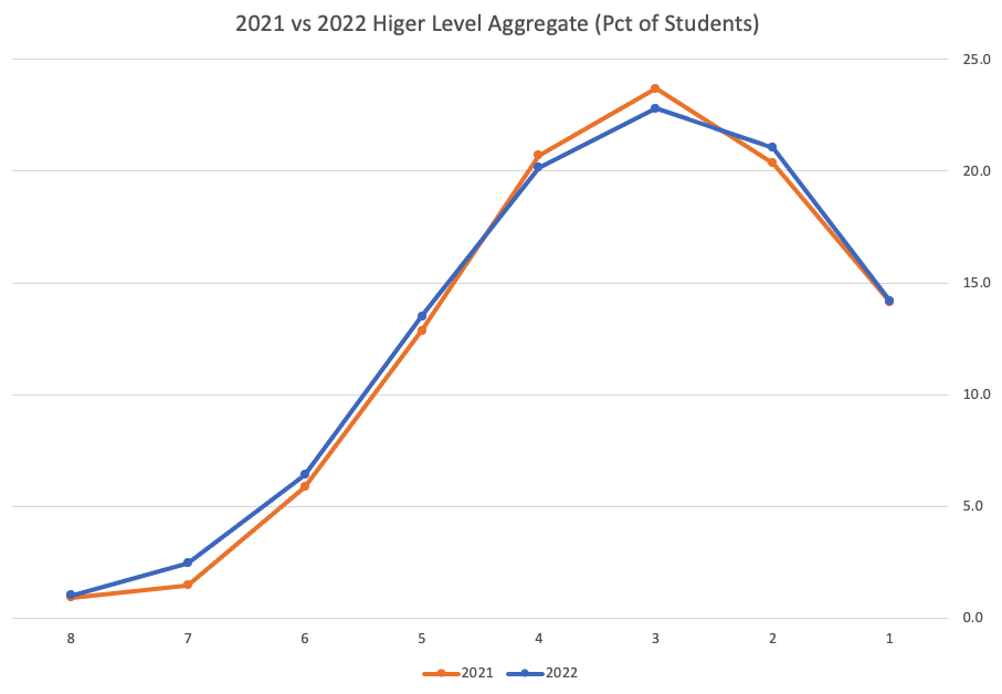
The CAO have published the number of students of each 10 point range. I’ve compared the 2022 data, with each year going back to 2015. The following table is a high level summary of the results in 50 point ranges.
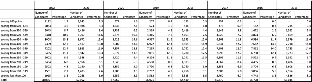
An initial look at these numbers and percentages might look like points are similar to last year and even 2020. But for 2015-2019 the similarity is closer. Again looking back at the previous blog post, we can see the results profiles for 20215-2019 are broadly similar and does indicate some normalisation might have been happening each year. The following chart illustrate the percentage of students who achieved points in each range.
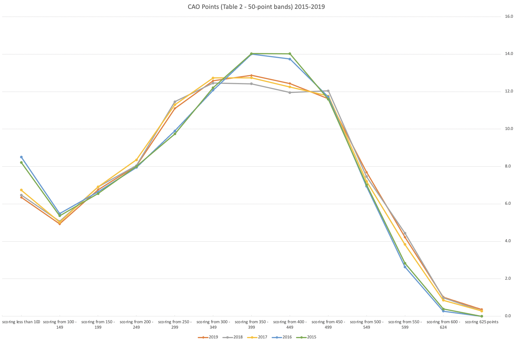
From the above we can see the profile is similar across 2015-2019, although there does seem to be a flattening of the curve between 2015-2016!
Let’s now have a look at 2019 (the last pre-coivd year), 2021 and 2022. This will allow use to compare the “inflated” years to the last “normal” year.
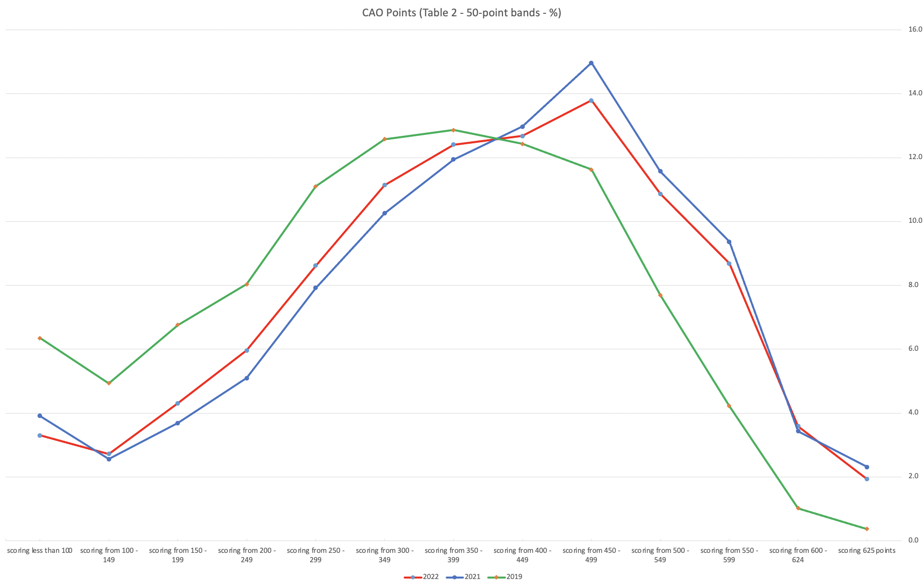
This chart clearly shows a shifting of the profile to the left for the red line which represents 2022. This also supports my blog post last week, and that the Dept of Education has started the process of deflating marks.
Based on this shifting/deflating of marks, we could see the grade/CAO Points profiles reverting back to almost 2019 profile by 2025. For students sitting the Leaving Cert in 2023, there will be another shift to the left, and with another similar shift in 2024. In 2024, the students will be the last group to sit the Leaving Cert who were badly affected during the Covid years. Many of them lost large chunks on school and many didn’t sit the Junior Cert. I’d predict 2025 will see the first time the marks/points profiles will match pre-covid years.
For this analysis I’ve used a variety of tools including Excel, Python and Oracle Analytics.
The Dataset used can be found under Dataset menu, and listed as ‘CAO Points Profiles 2015-2022’. Also, check out the Leaving Certificate 2015-2022 dataset.
Leaving Cert 2022 Results – Inflation, deflation or in-line!
The Leaving Certificate 2022 results are out. Up and down the country there are people who are delighted with their results, while others are disappointed, and lots of other emotions.
The Leaving Certificate is the terminal examination for secondary education in Ireland, with most students being examined in seven subjects, with their best six grades counting towards their “points”, which in turn determines what university course they might get. Check out this link for learn more about the Leaving Certificate.
The Dept of Education has been saying, for several months, this results this year (2022) will be “in-line on aggregate” with the results from 2021. There has been some concerns about grade inflation in 2021 and the impact it will have on the students in 2022 and future years. At some point the Dept of Education needs to address this grade inflation and look to revert back to the normal profile of grades pre-Covid.
Let’s have a look to see if this is true, and if it is true when we look a little deeper. Do the aggregate results hide grade deflation in some subjects.
For the analysis presented in this blog post, I’ve just looked at results at Higher Level across all subjects, and for the deeper dive I’ll look at some of the most popular subjects.
Firstly let’s have a quick look at the distribution of grades by subject for 2022 and 2021.
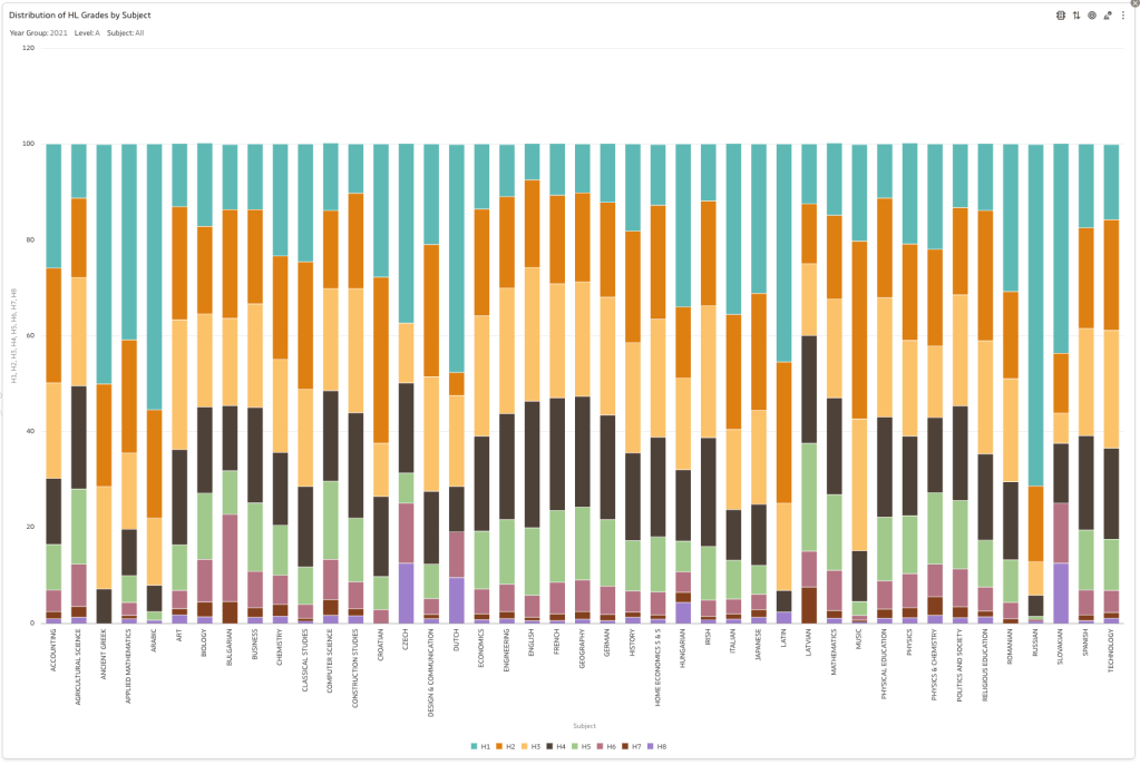
Remember the Dept of Education said the 2022 results should be in-line with the results of 2021. This required them to apply some adjustments, after marking the exam scripts, to give an updated profile. The following chart shows this comparison between the two years. On initial inspection we can see it is broadly similar. This is good, right? It kind of is and at a high level things look broadly in-line and maybe we can believe the Dept of Education. Looking a little closer we can see a small decrease in the H2-H4 range, and a slight increase in the H5-H8.
Let’s dive a little deeper. When we look at the grade profile of students in 2021 and 2022, How many subjects increased the number of students at each grade vs How many subjects decreased grades vs How many approximately stated the same. The table below shows the results and only counts a change if it is greater than 1% (to allow for minor variations between years).
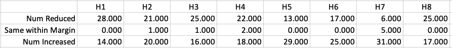
This table in very interesting in that more subjects decreased their H1s, with some variation for the H2-H4s, while for the lower range of H5-H7 we can see there has been an increase in grades. If I increased the margin to 3% we get a slightly different results, but only minor changes.
“in-line on aggregate” might be holding true, although it appears a slight increase on the numbers getting the lower grades. This might indicate either more of an adjustment to weaker students and/or a bit of a down shifting of grades from the H2-H4 range. But at the higher end, more subjects reduced than increase. The overall (aggregate) numbers are potentially masking movements in grade profiles.
Let’s now have a look at some of the core subjects of English, Irish and Mathematics.
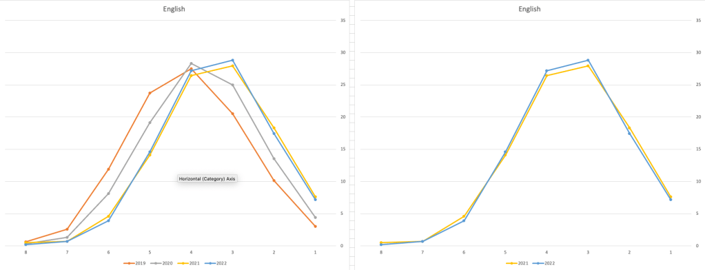
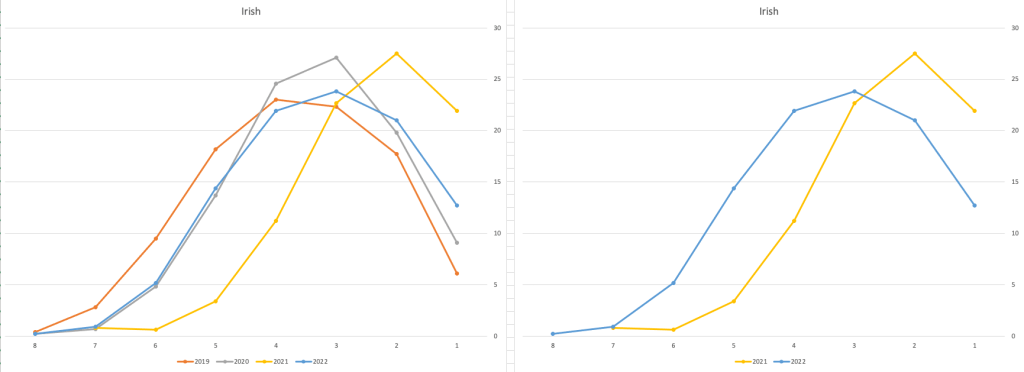
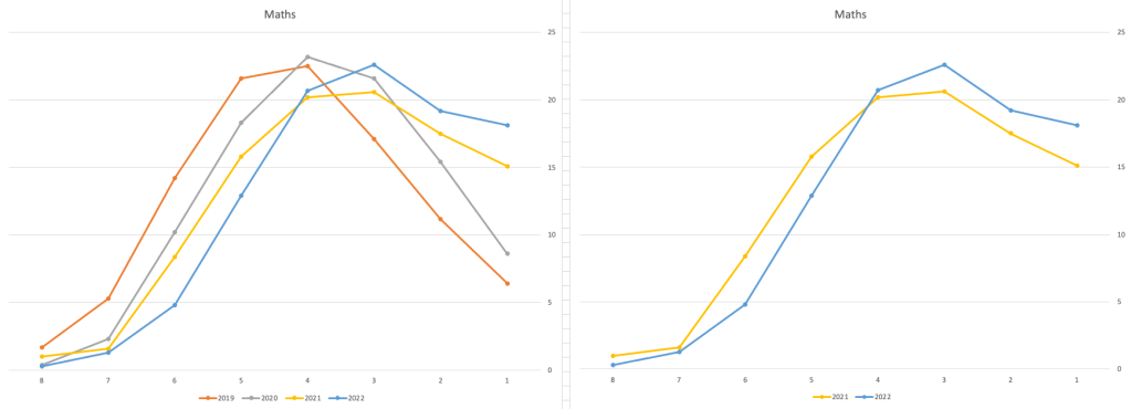
For English, it looks like they fitted to the curve perfectly! keeping grades in-line between the two years. Mathematics is a little different with a slight increase in grades. But when you look at Irish we can see there was definite grade deflation. For each of these subjects, the chart on the left contains four years of data including 2019 when the last “normal” leaving certificate occurred. With Irish the grade profile has been adjusted (deflated) significantly and is closer to 2019 profile than it is to 2021. There was been lots and lots of discussions nationally about how and when grades will revert to normal profile. The 2022 profile for Irish seems to show this has started to happen in this subject, which raises the question if this is occurring in any other subjects, and is hidden/masked by the “in-line on aggregate” figures.
This blog post would become just too long if I was to present the results profile for each of the 42+ subjects.
Let’s have a look as two of the most common foreign languages, French and Spanish.
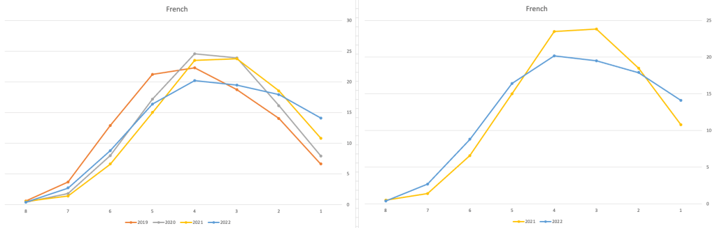
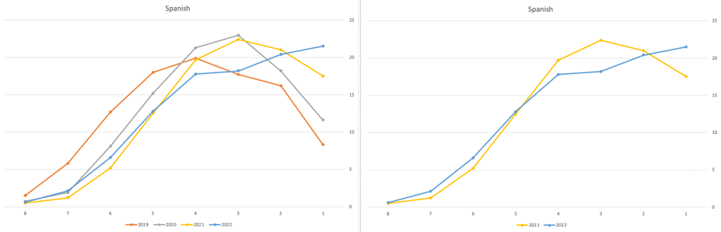
Again we can see some grade deflation, although not to be same extent as Irish. For both French and Spanish, we have reduced numbers for the H2-H4 range and a slight increase for H5-H7, and shift to the left in the profile. A slight exception is for those getting a H1 for both subjects. The adjustment in the results profile is more pronounced for French, and could indicate some deflation adjustments.
Next we’ll look at some of the science subjects of Physics, Chemistry and Biology.
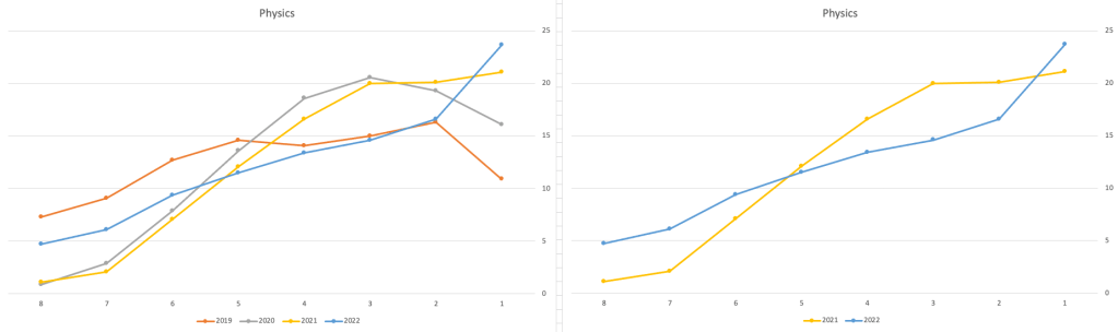
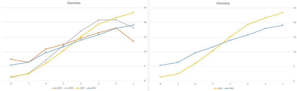
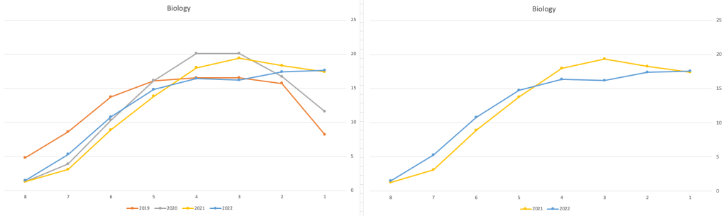
These three subjects also indicate some adjusts back towards the pre-Covid profile, with exception of H1 grades. We can see the 2022 profile almost reflect the 2019 profile (excluding H1s) and for Biology appears to be at a half way point between 2019 and 2022 (excluding H1s)
Just one more example of grade deflation, and this with Design, Communication and Graphics (or DCG)
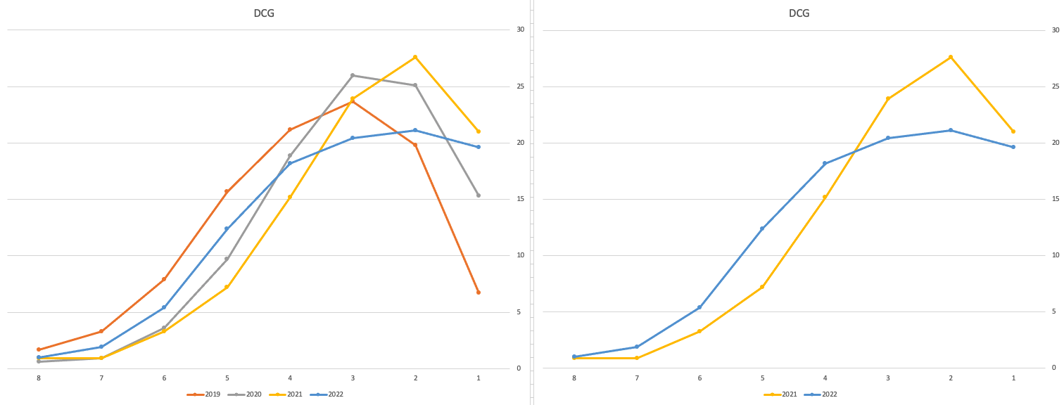
Yes there is obvious grade deflation and almost back to 2019 profile, with the exception of H1s again.
I’ve mentioned some possible grade deflation in various subjects, but there are also subjects where the profile very closely matches the 2021 profile. We have seen above English is one of those. Others include Technology, Art and Computer Science.
I’ve analyzed many more subjects and similar shifting of the profile is evident in those. Has the Dept of Education and State Examinations Commission taken steps to start deflating grades from the highs of 2021? I’d said the answer lies in the data, and the data I’ve looked at shows they have started the deflation process. This might take another couple of years to work out of the system and we will be back to “normal” pre-covid profiles. Which raises another interesting question, Was the grade profile for subjects, pre-covid, fitted to the curve? For the core set of subjects and for many of the more popular subjects, the data seems to indicate this. Maybe the “normal” distribution of marks is down to the “normal” distribution of abilities of the student population each year, or have grades been normalised in some way each year, for years, even decades?
For this analysis I’ve used a variety of tools including Excel, Python and Oracle Analytics.
The Dataset used can be found under Dataset menu, and listed as ‘Leaving Certificate 2015-2022’. An additional Dataset, I’ll be adding soon, will be for CAO Points Profiles 2015-2022.
Applying a Machine Learning Model in OAC
There are a number of different tools and languages available for machine learning projects. One such tool is Oracle Analytics Cloud (OAC). Check out my article for Oracle Magazine that takes you through the steps of using OAC to create a Machine Learning workflow/dataflow.

Oracle Analytics Cloud provides a single unified solution for analyzing data and delivering analytics solutions to businesses. Additionally, it provides functionality for processing data, allowing for data transformations, data cleaning, and data integration. Oracle Analytics Cloud also enables you to build a machine learning workflow, from loading, cleaning, and transforming data and creating a machine learning model to evaluating the model and applying it to new data—without the need to write a line of code. My Oracle Magazine article takes you through the various tasks for using Oracle Analytics Cloud to build a machine learning workflow.
That article covers the various steps with creating a machine learning model. This post will bring you through the steps of using that model to score/label new data.
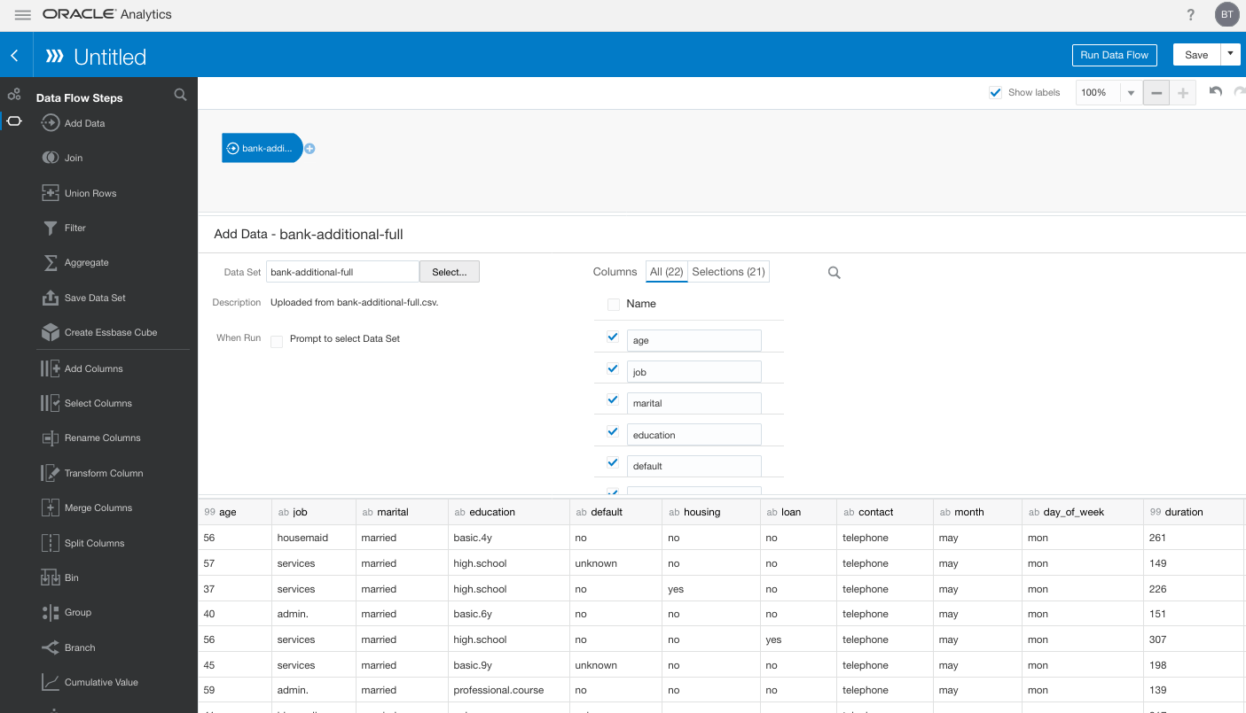
In the Data Flows screen (accessed via Data->Data Flows) click on Create. We are going to create a new Data Flow to process the scoring/labeling of new data.

Select Data Flow from the pop-up menu. The ‘Add Data Set’ window will open listing your available data sets. In my example, I’m going to use the same data set that I used in the Oracle Magazine article to build the model. Click on the data set and then click on the Add button.

The initial Data Flow will be created with the node for the Data Set. The screen will display all the attributes for the data set and from this you can select what attributes to include or remove. For example, if you want a subset of the attributes to be used as input to the machine learning model, you can select these attributes at this stage. These can be adjusted at a later stages, but the data flow will need to be re-run to pick up these changes.
Next step is to create the Apply Model node. To add this to the data flow click on the small plus symbol to the right of the Data Node. This will pop open a window from which you will need to select the Apply Model.
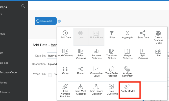
A pop-up window will appear listing the various machine learning models that exist in your OAC environment. Select the model you want to use and click the Ok button.

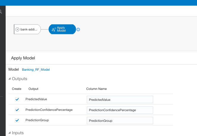
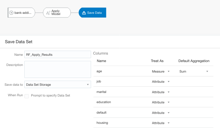
The next node to add to the data flow is to save the results/outputs from the Apply Model node. Click on the small plus icon to the right of the Apply Model node and select Save Results from the popup window.
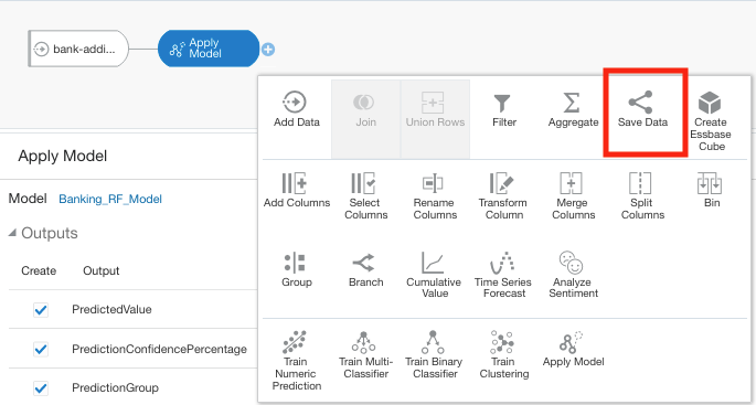
We now have a completed data flow. But before you finish edit the Save Data node to give a name for the Save Data Set, and you can edit what attributes/features you want in the result set.
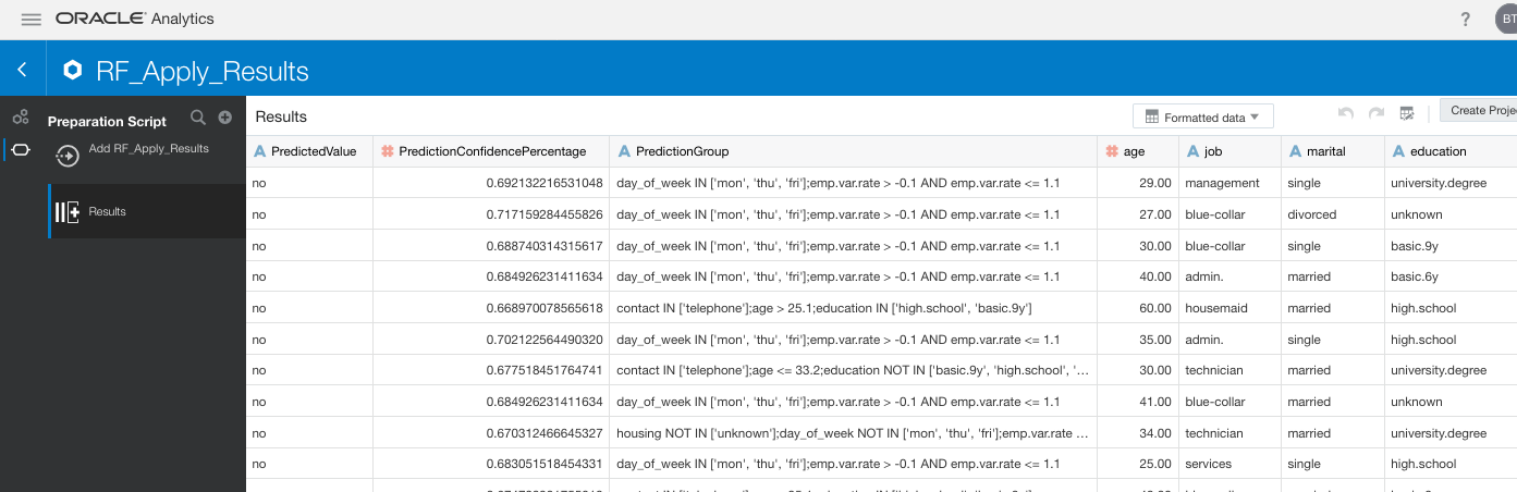
You can now save and run the Data Flow, and view the outputs from applying the machine learning model. The saved data set results can be viewed in the Data menu.

You must be logged in to post a comment.