
Analytics
Exploring Apache Iceberg using PyIceberg – Part 2
Apache Iceberg, an open-source table format that has become the industry standard for data sharing in modern data architectures. In my previous posts on Apache Iceberg I explored the core features of Iceberg Tables and gave examples of using Python code to create, store, add data, read a table and apply filters to an Iceberg Table. In this post I’ll explore some of the more advanced features of interacting with an Iceberg Table, how to add partitioning and how to moved data to a DuckDB database.
Check out the link at the bottom of this post to download the Notebook containing all the PyIceberg code in this post. I had a similar notebook for all the code examples in my previous post. You should check that our first as the examples in the post and notebook are an extension of those.
This post will cover:
- Partitioning an Iceberg Table
- Schema Evolution
- Row Level Operations
- Advanced Scanning & Query Patterns
- DuckDB and Iceberg Tables
Setup & Conguaration
Before we can start on the core aspects of this post, we need to do some basic setup like importing the necessary Python packages, defining the location of the warehouse and catalog and checking the namespace exists. These were created created in the previous post.
import os, pandas as pd, pyarrow as pafrom datetime import datefrom pyiceberg.catalog.sql import SqlCatalogfrom pyiceberg.schema import Schemafrom pyiceberg.types import ( NestedField, LongType, StringType, DoubleType, DateType)from pyiceberg.partitioning import PartitionSpec, PartitionFieldfrom pyiceberg.transforms import ( MonthTransform, IdentityTransform, BucketTransform)WAREHOUSE = "/Users/brendan.tierney/Dropbox/Iceberg-Demo"os.makedirs(WAREHOUSE, exist_ok=True)catalog = SqlCatalog("local", **{ "uri": f"sqlite:///{WAREHOUSE}/catalog.db", "warehouse": f"file://{WAREHOUSE}",})for ns in ["sales_db"]: if ns not in [n[0] for n in catalog.list_namespaces()]: catalog.create_namespace(ns)
Partitioning an Iceberg Table
Partitioning is how Iceberg physically organises data files on disk to enable partition pruning. Partitioning pruning will automactically skip directorys and files that don’t contain the data you are searching for. This can have a significant improvement of query response times.
The following will create a partition table based on the combination of the fiels order_date and region.
# ── Explicit Iceberg schema (gives us full control over field IDs) ─────schema = Schema( NestedField(field_id=1, name="order_id", field_type=LongType(), required=False), NestedField(field_id=2, name="customer", field_type=StringType(), required=False), NestedField(field_id=3, name="product", field_type=StringType(), required=False), NestedField(field_id=4, name="region", field_type=StringType(), required=False), NestedField(field_id=5, name="order_date", field_type=DateType(), required=False), NestedField(field_id=6, name="revenue", field_type=DoubleType(), required=False),)# ── Partition spec: partition by month(order_date) AND identity(region) ─partition_spec = PartitionSpec( PartitionField( source_id=5, # order_date field_id field_id=1000, transform=MonthTransform(), name="order_date_month", ), PartitionField( source_id=4, # region field_id field_id=1001, transform=IdentityTransform(), name="region", ),)tname = ("sales_db", "orders_partitioned")if catalog.table_exists(tname): catalog.drop_table(tname)
Now we can create the table and inspect the details
table = catalog.create_table( tname, schema=schema, partition_spec=partition_spec,)print("Partition spec:", table.spec())Partition spec: [ 1000: order_date_month: month(5) 1001: region: identity(4)]
We can now add data to the partitioned table.
# Write data — Iceberg routes each row to the correct partition directorydf = pd.DataFrame({ "order_id": [1001, 1002, 1003, 1004, 1005, 1006], "customer": ["Alice", "Bob", "Carol", "Dave", "Eve", "Frank"], "product": ["Laptop", "Phone", "Tablet", "Monitor", "Keyboard", "Webcam"], "region": ["EU", "US", "EU", "APAC", "US", "EU"], "order_date": [date(2024,1,15), date(2024,1,20), date(2024,2,3), date(2024,2,20), date(2024,3,5), date(2024,3,12)], "revenue": [1299.99, 1798.00, 549.50, 1197.00, 399.95, 258.00],})table.append(pa.Table.from_pandas(df))
We can inspect the directories and files created. I’ve only include a partical listing below but it should be enough for you to get and idea of what Iceberg as done.
# Verify partition directories were created!find {WAREHOUSE}/sales_db/orders_partitioned/data -type f/Users/brendan.tierney/Dropbox/Iceberg-Demo/sales_db/orders_partitioned/data/region=APAC/order_date_day=2024-04-05/00000-4-0542db6c-f67f-4a26-9012-59d8267b5005.parquet/Users/brendan.tierney/Dropbox/Iceberg-Demo/sales_db/orders_partitioned/data/region=APAC/order_date_day=2024-02-20/00000-2-0542db6c-f67f-4a26-9012-59d8267b5005.parquet/Users/brendan.tierney/Dropbox/Iceberg-Demo/sales_db/orders_partitioned/data/order_date_month=2024-01/region=EU/00000-0-e9ad65a0-c088-46fc-a537-12a6b60b38c5.parquet/Users/brendan.tierney/Dropbox/Iceberg-Demo/sales_db/orders_partitioned/data/order_date_month=2024-01/region=EU/00000-0-1f976101-f836-4db3-bf4a-c0e0cf7dd4c6.parquet/Users/brendan.tierney/Dropbox/Iceberg-Demo/sales_db/orders_partitioned/data/order_date_month=2024-01/region=EU/00000-0-4233dad6-ef48-4ad5-95c9-5842e641fc0f.parquet/Users/brendan.tierney/Dropbox/Iceberg-Demo/sales_db/orders_partitioned/data/order_date_month=2024-01/region=EU/00000-0-b0a10298-d2a6-45b4-a541-9a459e478496.parquet/Users/brendan.tierney/Dropbox/Iceberg-Demo/sales_db/orders_partitioned/data/order_date_month=2024-01/region=US/00000-1-b0a10298-d2a6-45b4-a541-9a459e478496.parquet/Users/brendan.tierney/Dropbox/Iceberg-Demo/sales_db/orders_partitioned/data/order_date_month=2024-01/region=US/00000-1-4233dad6-ef48-4ad5-95c9-5842e641fc0f.parquet/Users/brendan.tierney/Dropbox/Iceberg-Demo/sales_db/orders_partitioned/data/order_date_month=2024-01/region=US/00000-1-1f976101-f836-4db3-bf4a-c0e0cf7dd4c6.parquet/Users/brendan.tierney/Dropbox/Iceberg-Demo/sales_db/orders_partitioned/data/order_date_month=2024-01/region=US/00000-1-e9ad65a0-c088-46fc-a537-12a6b60b38c5.parquet/Users/brendan.tierney/Dropbox/Iceberg-Demo/sales_db/orders_partitioned/data/region=EU/order_date_day=2024-02-03/00000-1-0542db6c-f67f-4a26-9012-59d8267b5005.parquet/Users/brendan.tierney/Dropbox/Iceberg-Demo/sales_db/orders_partitioned/data/region=EU/order_date_day=2024-01-15/00000-0-0542db6c-f67f-4a26-9012-59d8267b5005.parquet/Users/brendan.tierney/Dropbox/Iceberg-Demo/sales_db/orders_partitioned/data/region=EU/order_date_day=2024-04-01/00000-3-0542db6c-f67f-4a26-9012-59d8267b5005.parquet/Users/brendan.tierney/Dropbox/Iceberg-Demo/sales_db/orders_partitioned/data/order_date_month=2024-02/region=APAC/00000-3-b0a10298-d2a6-45b4-a541-9a459e478496.parquet/Users/brendan.tierney/Dropbox/Iceberg-Demo/sales_db/orders_partitioned/data/order_date_month=2024-02/region=APAC/00000-3-e9ad65a0-c088-46fc-a537-12a6b60b38c5.parquet/Users/brendan.tierney/Dropbox/Iceberg-Demo/sales_db/orders_partitioned/data/order_date_month=2024-02/region=APAC/00000-3-4233dad6-ef48-4ad5-95c9-5842e641fc0f.parquet/Users/brendan.tierney/Dropbox/Iceberg-Demo/sales_db/orders_partitioned/data/order_date_month=2024-02/region=APAC/00000-3-1f976101-f836-4db3-bf4a-c0e0cf7dd4c6.parquet
We can change the partictioning specification without rearranging or reorganising the data
from pyiceberg.transforms import DayTransform# Iceberg can change the partition spec without rewriting old data.# Old files keep their original partitioning; new files use the new spec.with table.update_spec() as update: # Upgrade month → day granularity for more recent data update.remove_field("order_date_month") update.add_field( source_column_name="order_date", transform=DayTransform(), partition_field_name="order_date_day", )print("Updated spec:", table.spec())
I’ll leave you to explore the additional directories, files and meta-data files.
#find all files starting from this directory!find {WAREHOUSE}/sales_db/orders_partitioned/data -type f
Schema Evolution
Iceberg tracks every schema version with a numeric ID and never silently breaks existing readers. You can add, rename, and drop columns, change types (safely), and reorder fields, all with zero data rewriting.
#Add new columnsfrom pyiceberg.types import FloatType, BooleanType, TimestampTypeprint("Before:", table.schema())with table.update_schema() as upd: # Add optional columns — old files return NULL for these upd.add_column("discount_pct", FloatType(), "Discount percentage applied") upd.add_column("is_returned", BooleanType(), "True if the order was returned") upd.add_column("updated_at", TimestampType())print("After:", table.schema())Before: table { 1: order_id: optional long 2: customer: optional string 3: product: optional string 4: region: optional string 5: order_date: optional date 6: revenue: optional double}After: table { 1: order_id: optional long 2: customer: optional string 3: product: optional string 4: region: optional string 5: order_date: optional date 6: revenue: optional double 7: discount_pct: optional float (Discount percentage applied) 8: is_returned: optional boolean (True if the order was returned) 9: updated_at: optional timestamp}
We can rename columns. A column rename is a meta-data only change. The Parquet files are untouched. Older readers will still see the previous versions of the column name, whicl new readers will see the new column name.
#rename a columnwith table.update_schema() as upd: upd.rename_column("discount_pct", "discount_percent")print("Updated:", table.schema())Updated: table { 1: order_id: optional long 2: customer: optional string 3: product: optional string 4: region: optional string 5: order_date: optional date 6: revenue: optional double 7: discount_percent: optional float (Discount percentage applied) 8: is_returned: optional boolean (True if the order was returned) 9: updated_at: optional timestamp}
Similarly when dropping a column, it is a meta-data change
#drop a columnwith table.update_schema() as upd: upd.delete_column("updated_at")print("Updated:", table.schema())Updated: table { 1: order_id: optional long 2: customer: optional string 3: product: optional string 4: region: optional string 5: order_date: optional date 6: revenue: optional double 7: discount_percent: optional float (Discount percentage applied) 8: is_returned: optional boolean (True if the order was returned)}
We can see all the different changes or versions of the Iceberg Table schema.
import json, globmeta_files = sorted(glob.glob( f"{WAREHOUSE}/sales_db/orders_partitioned/metadata/*.metadata.json"))with open(meta_files[-1]) as f: meta = json.load(f)print(f"Total schema versions: {len(meta['schemas'])}")for s in meta["schemas"]: print(f" schema-id={s['schema-id']} fields={[f['name'] for f in s['fields']]}")Total schema versions: 4 schema-id=0 fields=['order_id', 'customer', 'product', 'region', 'order_date', 'revenue'] schema-id=1 fields=['order_id', 'customer', 'product', 'region', 'order_date', 'revenue', 'discount_pct', 'is_returned', 'updated_at'] schema-id=2 fields=['order_id', 'customer', 'product', 'region', 'order_date', 'revenue', 'discount_percent', 'is_returned', 'updated_at'] schema-id=3 fields=['order_id', 'customer', 'product', 'region', 'order_date', 'revenue', 'discount_percent', 'is_returned']
Agian if you inspect the directories and files in the warehouse, you’ll see the impact of these changes at the file system level.
#find all files starting from this directory!find {WAREHOUSE}/sales_db/orders_partitioned/data -type f
Row Level Operations
Iceberg v2 introduces two delete file formats that enable row-level mutations without rewriting entire data files immediately — writes stay fast, and reads merge deletes on the fly.
Operations Iceberg Mechanism Write cost Read cost Append New data files only Low Low Delete rows Position or equality delete files Low Medium Update rows Delete + new data file Medium Medium (copy-on-write or merge-on-read) Overwrite Atomic swap of data files Medium Low (replace partition).
from pyiceberg.expressions import EqualTo, In# Delete all orders from the APAC regiontable.delete(EqualTo("region", "APAC"))print(table.scan().to_pandas()) order_id customer product region order_date revenue discount_percent \0 1001 Alice Laptop EU 2024-01-15 1299.99 NaN 1 1002 Bob Phone US 2024-01-20 1798.00 NaN 2 1003 Carol Tablet EU 2024-02-03 549.50 NaN 3 1005 Eve Keyboard US 2024-03-05 399.95 NaN 4 1006 Frank Webcam EU 2024-03-12 258.00 NaN is_returned 0 None 1 None 2 None 3 None 4 None
Also
# Delete specific order IDstable.delete(In("order_id", [1001, 1003]))# Verify — deleted rows are gone from the logical viewdf_after = table.scan().to_pandas()print(f"Rows after delete: {len(df_after)}")print(df_after[["order_id", "customer", "region"]])Rows after delete: 3 order_id customer region0 1002 Bob US1 1005 Eve US2 1006 Frank EU
We can see partiton pruning in action with a scan EqualTo(“region”, “EU”) will skip all data files in region=US/ and region=APAC/ directories entirely — zero bytes read from those files.
Advanced Scanning & Query Processing
The full expression API (And, Or, Not, In, NotIn, StartsWith, IsNull), time travel by snapshot ID, incremental reads between two snapshots for CDC pipelines, and streaming via Arrow RecordBatchReader for out-of-memory processing.
PyIceberg’s scan API supports rich predicate pushdown, snapshot-based time travel, incremental reads between snapshots, and streaming via Arrow record batches.
Let’s start by adding some data back into the table.
df3 = pd.DataFrame({ "order_id": [1001, 1003, 1004, 1006, 1007], "customer": ["Alice", "Carol", "Dave", "Frank", "Grace"], "product": ["Laptop", "Tablet", "Monitor", "Headphones", "Webcam"], "order_date": [ date(2024, 1, 15), date(2024, 2, 3), date(2024, 2, 20), date(2024, 4, 1), date(2024, 4, 5)], "region": ["EU", "EU", "APAC", "EU", "APAC"], "revenue": [1299.99, 549.50, 1197, 498.00, 129.00]})#Add the datatable.append(pa.Table.from_pandas(df3))
Let’s try a query with several predicates.
from pyiceberg.expressions import ( And, Or, Not, EqualTo, NotEqualTo, GreaterThan, GreaterThanOrEqual, LessThan, LessThanOrEqual, In, NotIn, IsNull, IsNaN, StartsWith,)# EU or US orders, revenue > 500, product is not "Keyboard"df_complex = table.scan( row_filter=And( Or( EqualTo("region", "EU"), EqualTo("region", "US"), ), GreaterThan("revenue", 500.0), NotEqualTo("product", "Keyboard"), ), selected_fields=("order_id", "customer", "product", "region", "revenue"),).to_pandas()print(df_complex) order_id customer product region revenue0 1001 Alice Laptop EU 1299.991 1003 Carol Tablet EU 549.502 1002 Bob Phone US 1798.00
Now let’s try a NOT predicate
df_not_in = table.scan( row_filter=Not(In("region", ["US", "APAC"]))).to_pandas()print(df_not_in) order_id customer product region order_date revenue \0 1001 Alice Laptop EU 2024-01-15 1299.99 1 1003 Carol Tablet EU 2024-02-03 549.50 2 1006 Frank Headphones EU 2024-04-01 498.00 3 1006 Frank Webcam EU 2024-03-12 258.00 discount_percent is_returned 0 NaN None 1 NaN None 2 NaN None 3 NaN None
Now filter data with data starting with certain values.
df_starts = table.scan( row_filter=StartsWith("product", "Lap") # matches "Laptop", "Laptop Pro").to_pandas()print(df_starts) order_id customer product region order_date revenue discount_percent \0 1001 Alice Laptop EU 2024-01-15 1299.99 NaN is_returned 0 None
Using the LIMIT function.
df_sample = table.scan(limit=3).to_pandas()print(df_sample) order_id customer product region order_date revenue discount_percent \0 1001 Alice Laptop EU 2024-01-15 1299.99 NaN 1 1003 Carol Tablet EU 2024-02-03 549.50 NaN 2 1004 Dave Monitor APAC 2024-02-20 1197.00 NaN is_returned 0 None 1 None 2 None
We can also perform data streaming.
# Process very large tables without loading everything into memory at oncescan = table.scan(selected_fields=("order_id", "revenue"))total_revenue = 0.0total_rows = 0# to_arrow_batch_reader() returns an Arrow RecordBatchReaderfor batch in scan.to_arrow_batch_reader(): df_chunk = batch.to_pandas() total_revenue += df_chunk["revenue"].sum() total_rows += len(df_chunk)print(f"Total rows: {total_rows}")print(f"Total revenue: ${total_revenue:,.2f}")Total rows: 8Total revenue: $6,129.44
DuckDB and Iceberg Tables
We can register an Iceberg scan plan as a DuckDB virtual table. PyIceberg handles metadata; DuckDB reads the Parquet files.
conn = duckdb.connect()# Expose the scan plan as an Arrow dataset DuckDB can queryscan = table.scan()arrow_dataset = scan.to_arrow() # or to_arrow_batch_reader()conn.register("orders", arrow_dataset)# Full SQL on the tableresult = conn.execute(""" SELECT region, COUNT(*) AS order_count, ROUND(SUM(revenue), 2) AS total_revenue, ROUND(AVG(revenue), 2) AS avg_revenue, ROUND(MAX(revenue) - MIN(revenue), 2) AS revenue_range FROM orders GROUP BY region ORDER BY total_revenue DESC""").df()print(result) region order_count total_revenue avg_revenue revenue_range0 EU 4 2605.49 651.37 1041.991 US 2 2197.95 1098.97 1398.052 APAC 2 1326.00 663.00 1068.00
DuckDB has a native Iceberg extension that reads Parquet files directly.
import duckdb, globconn = duckdb.connect()conn.execute("INSTALL iceberg; LOAD iceberg;")# Enable version guessing for Iceberg tablesconn.execute("SET unsafe_enable_version_guessing = true;")# Point DuckDB at the Iceberg table root directorytable_path = f"{WAREHOUSE}/sales_db/orders_partitioned"df_duck = conn.execute(f""" SELECT * FROM iceberg_scan('{table_path}', allow_moved_paths = true) WHERE revenue > 500 ORDER BY revenue DESC""").df()print(df_duck) order_id customer product region order_date revenue discount_percent \0 1002 Bob Phone US 2024-01-20 1798.00 NaN 1 1001 Alice Laptop EU 2024-01-15 1299.99 NaN 2 1004 Dave Monitor APAC 2024-02-20 1197.00 NaN 3 1003 Carol Tablet EU 2024-02-03 549.50 NaN is_returned 0 <NA> 1 <NA> 2 <NA> 3 <NA>
We can access the data using the time travel Iceberg feature.
# Time travel via DuckDBsnap_id = table.history()[0].snapshot_iddf_tt = conn.execute(f""" SELECT * FROM iceberg_scan( '{table_path}', snapshot_from_id = {snap_id}, allow_moved_paths = true )""").df()print(f"Time travel rows: {len(df_tt)}")Time travel rows: 6
Exploring Apache Iceberg using PyIceberg – Part 1
Apache Iceberg, an open-source table format that has become the industry standard for data sharing in modern data architectures. In a previous post I explored the core feature of Apache Iceberg and compared it with related technologies such as Apache Hudi and Delta Lake.
In this post we’ll look at some of the inital steps to setup and explore Iceberg tables using Python. I’ll have follow-on posts which will explore more advanced features of Apache Iceberg, again using Python. In this post, we’ll explore the following:
- Environmental setup
- Create an Iceberg Table from a Pandas dataframae
- Explore the Iceberg Table and file system
- Appending data and Time Travel
- Read an Iceberg Table into a Pandas dataframe
- Filtered scans with push-down predicates
Check out the link at the bottom of this post to download the Notebook containing all the PyIceberg code.
Environmental setup
Before we can get started with Apache Iceberg, we need to install it in our environment. I’m going with using Python for these blog posts and that means we need to install PyIceberg. In addition to this package, we also need to install pyiceberg-core. This is needed for some additional feature and optimisations of Iceberg.
pip install "pyiceberg[pyiceberg-core]"
This is a very quick install.
Next we need to do some environmental setup, like importing various packages used in the example code, setuping up some directories on the OS where the Iceberg files will be stored, creating a Catalog and a Namespace.
# Import other packages for this Demo Notebookimport pyarrow as paimport pandas as pdfrom datetime import dateimport osfrom pyiceberg.catalog.sql import SqlCatalog#define location for the WAREHOUSE, where the Iceberg files will be locatedWAREHOUSE = "/Users/brendan.tierney/Dropbox/Iceberg-Demo"#create the directory, True = if already exists, then don't report an erroros.makedirs(WAREHOUSE, exist_ok=True)#create a local Catalogcatalog = SqlCatalog( "local", **{ "uri": f"sqlite:///{WAREHOUSE}/catalog.db", "warehouse": f"file://{WAREHOUSE}", })#create a namespace (a bit like a database schema)NAMESPACE = "sales_db"if NAMESPACE not in [ns[0] for ns in catalog.list_namespaces()]: catalog.create_namespace(NAMESPACE)
That’s the initial setup complete.
Create an Iceberg Table from a Pandas dataframe
We can not start creating tables in Iceberg. To do this, the following code examples will initially create a Pandas dataframe, will convert it from table to columnar format (as the data will be stored in Parquet format in the Iceberg table), and then create and populate the Iceberg table.
#create a Pandas DF with some basic data# Create a sample sales DataFramedf = pd.DataFrame({ "order_id": [1001, 1002, 1003, 1004, 1005], "customer": ["Alice", "Bob", "Carol", "Dave", "Eve"], "product": ["Laptop", "Phone", "Tablet", "Monitor", "Keyboard"], "quantity": [1, 2, 1, 3, 5], "unit_price": [1299.99, 899.00, 549.50, 399.00, 79.99], "order_date": [ date(2024, 1, 15), date(2024, 1, 16), date(2024, 2, 3), date(2024, 2, 20), date(2024, 3, 5)], "region": ["EU", "US", "EU", "APAC", "US"]})# Compute total revenue per orderdf["revenue"] = df["quantity"] * df["unit_price"]print(df)print(df.dtypes) order_id customer product quantity unit_price order_date region \0 1001 Alice Laptop 1 1299.99 2024-01-15 EU 1 1002 Bob Phone 2 899.00 2024-01-16 US 2 1003 Carol Tablet 1 549.50 2024-02-03 EU 3 1004 Dave Monitor 3 399.00 2024-02-20 APAC 4 1005 Eve Keyboard 5 79.99 2024-03-05 US revenue 0 1299.99 1 1798.00 2 549.50 3 1197.00 4 399.95 order_id int64customer objectproduct objectquantity int64unit_price float64order_date objectregion objectrevenue float64dtype: object
That’s the Pandas dataframe created. Now we can convert it to columnar format using PyArrow.
#Convert pandas DataFrame → PyArrow Table # PyIceberg writes via Arrow (columnar format), so this step is requiredarrow_table = pa.Table.from_pandas(df)print("Arrow schema:")print(arrow_table.schema)Arrow schema:order_id: int64customer: stringproduct: stringquantity: int64unit_price: doubleorder_date: date32[day]region: stringrevenue: double-- schema metadata --pandas: '{"index_columns": [{"kind": "range", "name": null, "start": 0, "' + 1180
Now we can define the Iceberg table along with the namespace for it.
#Create an Iceberg table from the Arrow schemaTABLE_NAME = (NAMESPACE, "orders")table = catalog.create_table( TABLE_NAME, schema=arrow_table.schema,)tableorders( 1: order_id: optional long, 2: customer: optional string, 3: product: optional string, 4: quantity: optional long, 5: unit_price: optional double, 6: order_date: optional date, 7: region: optional string, 8: revenue: optional double),partition by: [],sort order: [],snapshot: null
The table has been defined in Iceberg and we can see there are no partitions, snapshots, etc. The Iceberg table doesn’t have any data. We can Append the Arrow table data to the Iceberg table.
#add the data to the tabletable.append(arrow_table)#table.append() adds new data files without overwriting existing ones. #Use table.overwrite() to replace all data in a single atomic operation.
We can look at the file system to see what has beeb written.
print(f"Table written to: {WAREHOUSE}/sales_db/orders/")print(f"Snapshot ID: {table.current_snapshot().snapshot_id}")Table written to: /Users/brendan.tierney/Dropbox/Iceberg-Demo/sales_db/orders/Snapshot ID: 3939796261890602539
Explore the Iceberg Table and File System
And Iceberg Table is just a collection of files on the file system, organised into a set of folders. You can look at these using your file system app, or use a terminal window, or in the examples below are from exploring those directories and files from a Jupyter Notebook.
Let’s start at the Warehouse level. This is the topic level that was declared back when the Environment was being setup. Check that out above in the first section.
!ls -l {WAREHOUSE}-rw-r--r--@ 1 brendan.tierney staff 20480 28 Feb 15:26 catalog.dbdrwxr-xr-x@ 3 brendan.tierney staff 96 28 Feb 12:59 sales_db
We can see the catalog file and a directiory for our ‘sales_db’ namespace. When you explore the contents of this file you will find two directorys. These contain the ‘metadata’ and the ‘data’ files. The following list the files found in the ‘data’ directory containing the data and these are stored in parquet format.
!ls -l {WAREHOUSE}/sales_db/orders/data-rw-r--r--@ 1 brendan.tierney staff 3179 28 Feb 15:22 00000-0-357c029e-b420-459b-8248-b1caf3c030ce.parquet-rw-r--r--@ 1 brendan.tierney staff 3307 28 Feb 15:23 00000-0-3fae55d7-1229-448c-9ffb-ae33c77003a3.parquet-rw-r--r--@ 1 brendan.tierney staff 3179 28 Feb 15:03 00000-0-4ec1ef74-cd24-412e-a35f-bcf3d745bf42.parquet-rw-r--r--@ 1 brendan.tierney staff 3179 28 Feb 15:23 00000-0-984ed6d2-4067-43c4-8c11-5f5a96febd24.parquet-rw-r--r-- 1 brendan.tierney staff 3307 28 Feb 15:26 00000-0-a61264e8-b361-490e-90f7-105a33f20dec.parquet-rw-r--r--@ 1 brendan.tierney staff 3307 28 Feb 15:22 00000-0-ac913dfe-548c-4cb3-99aa-4f1332e02248.parquet-rw-r--r--@ 1 brendan.tierney staff 3307 28 Feb 13:00 00000-0-b3fa23ec-79c6-48da-ba81-ba35f25aa7ad.parquet-rw-r--r--@ 1 brendan.tierney staff 3179 28 Feb 15:25 00000-0-d534a298-adab-4744-baa1-198395cc93bd.parquet-rw-r--r--@ 1 brendan.tierney staff 3307 28 Feb 15:21 00000-0-ef5dd6d8-84c0-4860-828e-86e4e175a9eb.parquet-rw-r--r--@ 1 brendan.tierney staff 3179 28 Feb 15:21 00000-0-f108db1c-39f9-4e2b-b825-3e580cccc808.parquet
I’ll leave you to explore the ‘metadata’ directory.
Read the Iceberg Table back into our Environment
To load an Iceberg table into your environment, you’ll need to load the Catalog and then load the table. We have already have the Catalog setup from a previous step, but tht might not be the case in your typical scenario. The following sets up the Catalog and loads the Iceberg table.
#Re-load the catalog and table (as you would in a new session)catalog = SqlCatalog( "local", **{ "uri": f"sqlite:///{WAREHOUSE}/catalog.db", "warehouse": f"file://{WAREHOUSE}", })table2 = catalog.load_table(("sales_db", "orders"))
When we inspect the structure of the Iceberg table we get the names of the columns and the datatypes.
print("--- Iceberg Schema ---")print(table2.schema())--- Iceberg Schema ---table { 1: order_id: optional long 2: customer: optional string 3: product: optional string 4: quantity: optional long 5: unit_price: optional double 6: order_date: optional date 7: region: optional string 8: revenue: optional double}
An Iceberg table can have many snapshots for version control. As we have only added data to the Iceberg table, we should only have one snapshot.
#Snapshot history print("--- Snapshot History ---")for snap in table2.history(): print(snap)--- Snapshot History ---snapshot_id=3939796261890602539 timestamp_ms=1772292384231
We can also inspect the details of the snapshot.
#Current snapshot metadata snap = table2.current_snapshot()print("--- Current Snapshot ---")print(f" ID: {snap.snapshot_id}")print(f" Operation: {snap.summary.operation}")print(f" Records: {snap.summary.get('total-records')}")print(f" Data files: {snap.summary.get('total-data-files')}")print(f" Size bytes: {snap.summary.get('total-files-size')}")--- Current Snapshot --- ID: 3939796261890602539 Operation: Operation.APPEND Records: 5 Data files: 1 Size bytes: 3307
The above shows use there was 5 records added using an Append operation.
An Iceberg table can be partitioned. When we created this table we didn’t specify a partition key, but in an example in another post I’ll give an example of partitioning this table
#Partition spec & sort order print("--- Partition Spec ---")print(table.spec()) # unpartitioned by default--- Partition Spec ---[]
We can also list the files that contain the data for our Iceberg table.
#List physical data files via scanprint("--- Data Files ---")for task in table.scan().plan_files(): print(f" {task.file.file_path}") print(f" record_count={task.file.record_count}, " f"file_size={task.file.file_size_in_bytes} bytes")--- Data Files --- file:///Users/brendan.tierney/Dropbox/Iceberg-Demo/sales_db/orders/data/00000-0-a61264e8-b361-490e-90f7-105a33f20dec.parquet record_count=5, file_size=3307 bytes
Appending Data and Time Travel
Iceberg tables facilitates changes to the schema and data, and to be able to view the data at different points in time. This is refered to as Time Travel. Let’s have a look at an example of this by adding some additional data to the Iceberg table.
# Get and Save the first snapshot id before writing moresnap_v1 = table.current_snapshot().snapshot_id# New batch of orders - 2 new ordersdf2 = pd.DataFrame({ "order_id": [1006, 1007], "customer": ["Frank", "Grace"], "product": ["Headphones", "Webcam"], "quantity": [2, 1], "unit_price": [249.00, 129.00], "order_date": [date(2024, 4, 1), date(2024, 4, 5)], "region": ["EU", "APAC"], "revenue": [498.00, 129.00],})#Add the datatable.append(pa.Table.from_pandas(df2))
We can list the snapshots.
#Get the new snapshot id and check if different to previoussnap_v2 = table.current_snapshot().snapshot_idprint(f"v1 snapshot: {snap_v1}")print(f"v2 snapshot: {snap_v2}")v1 snapshot: 3939796261890602539v2 snapshot: 8666063993760292894
and we can see how see how many records are in each Snapshot, using Time Travel.
#Time travel: read the ORIGINAL 5-row tabledf_v1 = table.scan(snapshot_id=snap_v1).to_pandas()print(f"Snapshot v1 — {len(df_v1)} rows")#Current snapshot has all 7 rowsdf_v2 = table.scan().to_pandas()print(f"Snapshot v2 — {len(df_v2)} rows")Snapshot v1 — 5 rowsSnapshot v2 — 7 rows
If you inspect the file system, in the data and metadata dirctories, you will notices some additional files.
!ls -l {WAREHOUSE}/sales_db/orders/data!ls -l {WAREHOUSE}/sales_db/orders/metadata
Read an Iceberg Table into a Pandas dataframe
To load the Iceberg table into a Pandas dataframe we can
pd_df = table2.scan().to_pandas()
or we can use the Pandas package fuction
df = pd.read_iceberg("orders", "catalog")
Filtered scans with push-down predicates
PyIceberg provides a fluent scan API. You can read the full table or push down filters, column projections, and row limits — all evaluated at the file level.
Filtered Scan with Push Down Predicates
from pyiceberg.expressions import ( EqualTo, GreaterThanOrEqual, And)# Only EU orders with revenue above €1000df_filtered = ( table2.scan( row_filter=And( EqualTo("region", "EU"), GreaterThanOrEqual("revenue", 1000.0), ) ).to_pandas() )print(df_filtered) order_id customer product quantity unit_price order_date region revenue0 1001 Alice Laptop 1 1299.99 2024-01-15 EU 1299.99
Column Projection – select specific columns
# Only fetch the columns you need — saves I/Odf_slim = ( table2.scan(selected_fields=("order_id", "customer", "revenue")) .to_pandas() )print(df_slim) order_id customer revenue0 1001 Alice 1299.991 1002 Bob 1798.002 1003 Carol 549.503 1004 Dave 1197.004 1005 Eve 399.95
We can also use Arrow for more control.
arrow_result = table2.scan().to_arrow()print(arrow_result.schema)df_from_arrow = arrow_result.to_pandas(timestamp_as_object=True)print(df_from_arrow.head())
order_id: int64
customer: string
product: string
quantity: int64
unit_price: double
order_date: date32[day]
region: string
revenue: double
   order_id customer   product  quantity  unit_price  order_date region  \
0      1001    Alice    Laptop         1     1299.99  2024-01-15     EU
1      1002      Bob     Phone         2      899.00  2024-01-16     US
2      1003    Carol    Tablet         1      549.50  2024-02-03     EU
3      1004     Dave   Monitor         3      399.00  2024-02-20   APAC
4      1005      Eve  Keyboard         5       79.99  2024-03-05     US

   revenue
0  1299.99
1  1798.00
2   549.50
3  1197.00
4   399.95
I’ve put all of the above into a Juputer Notebook. You can download this from here, and you can use it for your explorations of Apache Iceberg.
Check out my next post of Apache Iceberg to see my Python code on explore some additional, and advanced features of Apache Iceberg.
CAO Points 2023 – Slight Deflation
There have been lots of talk and news articles written about Grade Inflation over the past few years (the Covid years) and this year was no different. Most of the discussion this year began a couple of days before the Leaving Cert results were released last week and continued right up to the CAO publishing the points needed for each course. Yes, something needs to be done about the grading profiles and to revert back to pre-Covid levels. There are many reasons why this is necessary. Perhaps the most important of which is to bring back some stability to the Leaving Cert results and corresponding CAOs Points for entry to University courses. Last year, we saw there was some minor stepping back or deflating of results. But this didn’t have much of an impact on points needed for University courses. But in 2023 we have seen a slight step back in the points needed. I mentioned this possibility in my post on the Leaving Cert profile of marks. I also mentioned the subject with the biggest step back in marks/grades was Maths, and it looks like this has had an impact on the CAO point needed.
In 2023, we have seen a drop in points for 60% of University courses. In most years (pre and post-Covid) there would always be some fluctuation of points but the fluctuations would be minor. In 2023, some courses have changed by 20+ points.
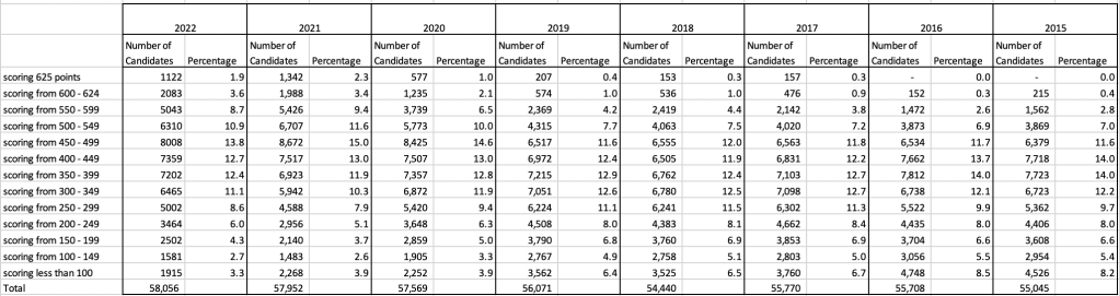
The following table and chart illustrate the profile of CAO points and the percentage of students who achieved this in ranges of 50 points.
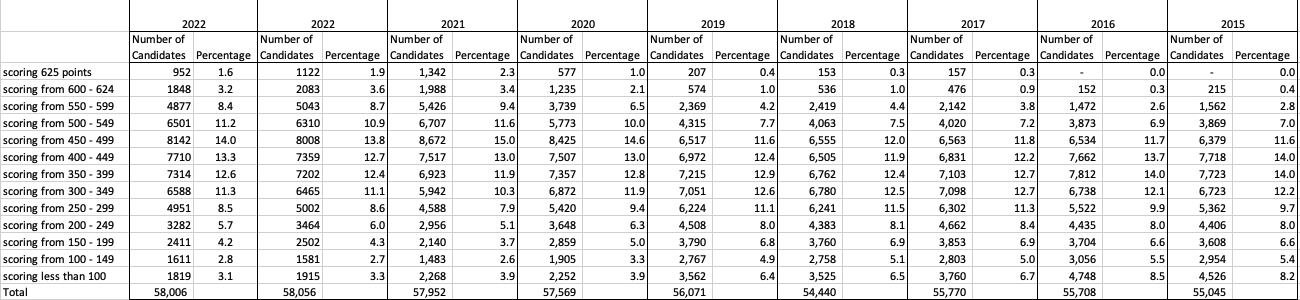

An initial look at the data and the chart it appears the 2023 CAO points profile is very similar to that of 2022. But when you look a little closer a few things stand out. At the upper end of CAO points we see a small reduction in the percentage of students. This is reflected when you look at the range of University courses in this range. The points for these have reduced slightly in 2023 and we have fewer courses using random selection. If you now look at the 300-500 range, we see a slight increase in the percentage of students attaining these marks. But this doesn’t seem to reflect an increase in the points needed to gain entry to a course in that range. This could be due to additional places that Universities have made available across the board. Although there are some courses where there is an increase.
In 2023, we have seen a change in the geographic spread of interest in University courses, with more demand/interest in Universities outside of the Dublin region. The lack of accommodation and their costs in Dublin is a major issue, and students have been looking elsewhere to study and to locations they can easily commute to. Although demand for Trinity and UCD remains strong, there was a drop in the number for TU Dublin. There are many reported factors for this which include the accommodation issue and for those who might have considered commuting, the positioning of the Grangegorman campus in Dublin does not make this easy, unlike Trinity, UCD and DCU.
I’ve the Leaving Cert grades by subject and CAO Points datasets in a Database (Oracle). This allows me to easily analyse the data annually and to compare them to previous years, using a variety of tools.
Automated Data Visualizations in Python
Creating data visualizations in Python can be a challenge. For some it an be easy, but for most (and particularly new people to the language) they always have to search for the commands in the documentation or using some search engine. Over the past few years we have seem more and more libraries coming available to assist with many of the routine and tedious steps in most data science and machine learning projects. I’ve written previously about some data profiling libraries in Python. These are good up to a point, but additional work/code is needed to explore the data to suit your needs. One of these Python libraries, designed to make your initial work on a new data set easier is called AutoViz. It’s good to see there is continued development work on this library, which can be really help for creating initial sets of charts for all the variables in your data set, plus it has some additional features which help to make it very useful and cuts down on some of the additional code you might need to write.
The outputs from AutoViz are very extensive, and are just too long to show in this post. The images below will give you an indication of what if typically generated. I’d encourage you to install the library and run it on one of your data sets to see the full extent of what it can do. For this post, I’ll concentrate on some of the commands/parameters/settings to get the most out of AutoViz.
Firstly there is the install via pip command or install using Anaconda.
pip3 install autovizFor comparison purposes I’m going to use the same data set as I’ve used in the data profiling post (see above). Here’s a quick snippet from that post to load the data and perform the data profiling (see post for output)
import pandas as pd
import pandas_profiling as pp

#load the data into a pandas dataframe
df = pd.read_csv("/Users/brendan.tierney/Downloads/Video_Games_Sales_as_at_22_Dec_2016.csv")
We can not skip to using AutoViz. It supports the loading and analzying of data sets direct from a file or from a pandas dataframe. In the following example I’m going to use the dataframe (df) created above.
from autoviz import AutoViz_Class

AV = AutoViz_Class()
df2 = AV.AutoViz(filename="", dfte=df)  #for a file, fill in the filename and remove dfte parameter
This will analyze the data and create lots and lots of charts for you. Some are should in the following image. One the helpful features is the ‘data cleaning improvements’ section where it has performed a data quality assessment and makes some suggestions to improve the data, maybe as part of the data preparation/cleaning step.

There is also an option for creating different types of out put with perhaps the Bokeh charts being particularly useful.
chart_format='bokeh': interactive Bokeh dashboards are plotted in Jupyter Notebooks.chart_format='server', dashboards will pop up for each kind of chart on your web browser.chart_format='html', interactive Bokeh charts will be silently saved as Dynamic HTML files underAutoViz_Plotsdirectory
df2 = AV.AutoViz(filename="", dfte=df, chart_format='bokeh')
The next example allows for the report and charts to be focused on a particular dependent or target variable, particular in scenarios where classification will be used.
df2 = AV.AutoViz(filename="", dfte=df, depVar="Platform")
A little warning when using this library. It can take a little bit of time for it to run and create all the different charts. On the flip side, it save you from having to write lots and lots of code!
CAO Points 2022 – Grade inflation, deflation or in-line
Last week I wrote a blog post analysing the Leaving Cert results over the past 3-8 years. Part of that post also looked at the claim from the Dept of Education saying the results in 2022 would be “in-line on aggregate” with the results from 2021. The outcome of the analysis was grade deflation was very evident in many subjects, but when analysed and profiled at a very high level, they did look similar.
I didn’t go into how that might impact on the CAO (Central Applications Office) Points. If there was deflation in some of the core and most popular subjects, then you might conclude there could be some changes in the profile of CAO Points being awarded, and that in turn would have a small change on the CAO Points needed for a lot of University courses. But not all of them, as we saw last week, the increased number of students who get grades in the H4-H7 range. This could mean a small decrease in points for courses in the 520+ range, and a small increase in points needed in the 300-500-ish range.
The CAO have published the number of students of each 10 point range. I’ve compared the 2022 data, with each year going back to 2015. The following table is a high level summary of the results in 50 point ranges.
An initial look at these numbers and percentages might look like points are similar to last year and even 2020. But for 2015-2019 the similarity is closer. Again looking back at the previous blog post, we can see the results profiles for 20215-2019 are broadly similar and does indicate some normalisation might have been happening each year. The following chart illustrate the percentage of students who achieved points in each range.
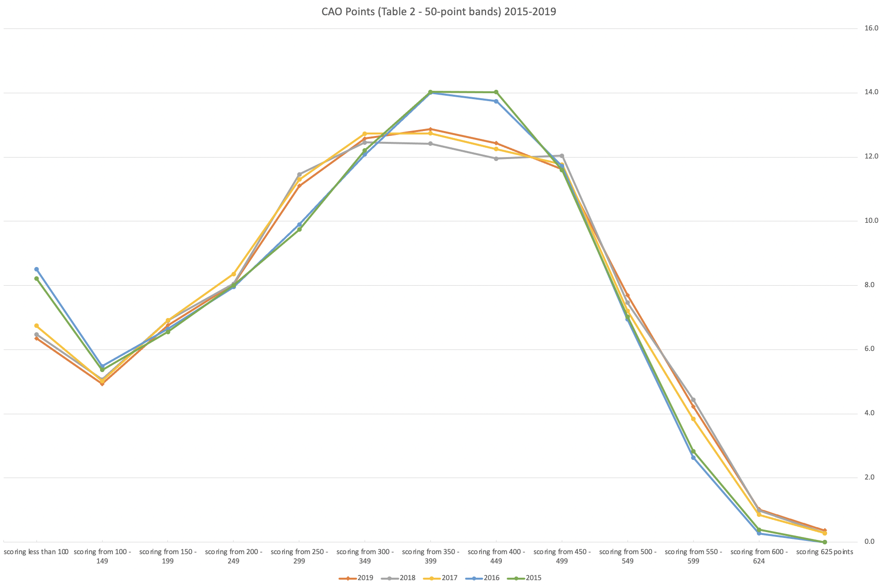
From the above we can see the profile is similar across 2015-2019, although there does seem to be a flattening of the curve between 2015-2016!
Let’s now have a look at 2019 (the last pre-coivd year), 2021 and 2022. This will allow use to compare the “inflated” years to the last “normal” year.
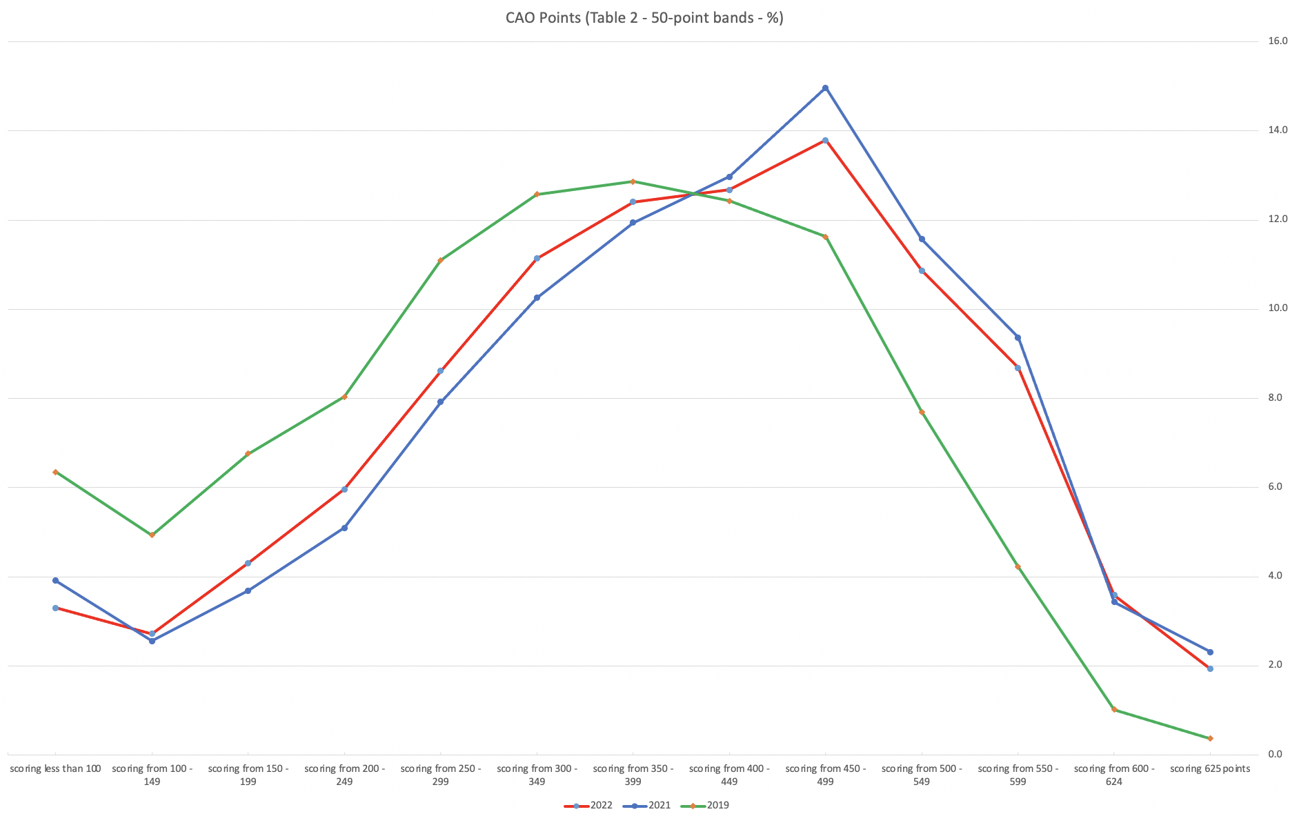
This chart clearly shows a shifting of the profile to the left for the red line which represents 2022. This also supports my blog post last week, and that the Dept of Education has started the process of deflating marks.
Based on this shifting/deflating of marks, we could see the grade/CAO Points profiles reverting back to almost 2019 profile by 2025. For students sitting the Leaving Cert in 2023, there will be another shift to the left, and with another similar shift in 2024. In 2024, the students will be the last group to sit the Leaving Cert who were badly affected during the Covid years. Many of them lost large chunks on school and many didn’t sit the Junior Cert. I’d predict 2025 will see the first time the marks/points profiles will match pre-covid years.
For this analysis I’ve used a variety of tools including Excel, Python and Oracle Analytics.
The Dataset used can be found under Dataset menu, and listed as ‘CAO Points Profiles 2015-2022’. Also, check out the Leaving Certificate 2015-2022 dataset.
Leaving Cert 2022 Results – Inflation, deflation or in-line!
The Leaving Certificate 2022 results are out. Up and down the country there are people who are delighted with their results, while others are disappointed, and lots of other emotions.
The Leaving Certificate is the terminal examination for secondary education in Ireland, with most students being examined in seven subjects, with their best six grades counting towards their “points”, which in turn determines what university course they might get. Check out this link for learn more about the Leaving Certificate.
The Dept of Education has been saying, for several months, this results this year (2022) will be “in-line on aggregate” with the results from 2021. There has been some concerns about grade inflation in 2021 and the impact it will have on the students in 2022 and future years. At some point the Dept of Education needs to address this grade inflation and look to revert back to the normal profile of grades pre-Covid.
Let’s have a look to see if this is true, and if it is true when we look a little deeper. Do the aggregate results hide grade deflation in some subjects.
For the analysis presented in this blog post, I’ve just looked at results at Higher Level across all subjects, and for the deeper dive I’ll look at some of the most popular subjects.
Firstly let’s have a quick look at the distribution of grades by subject for 2022 and 2021.
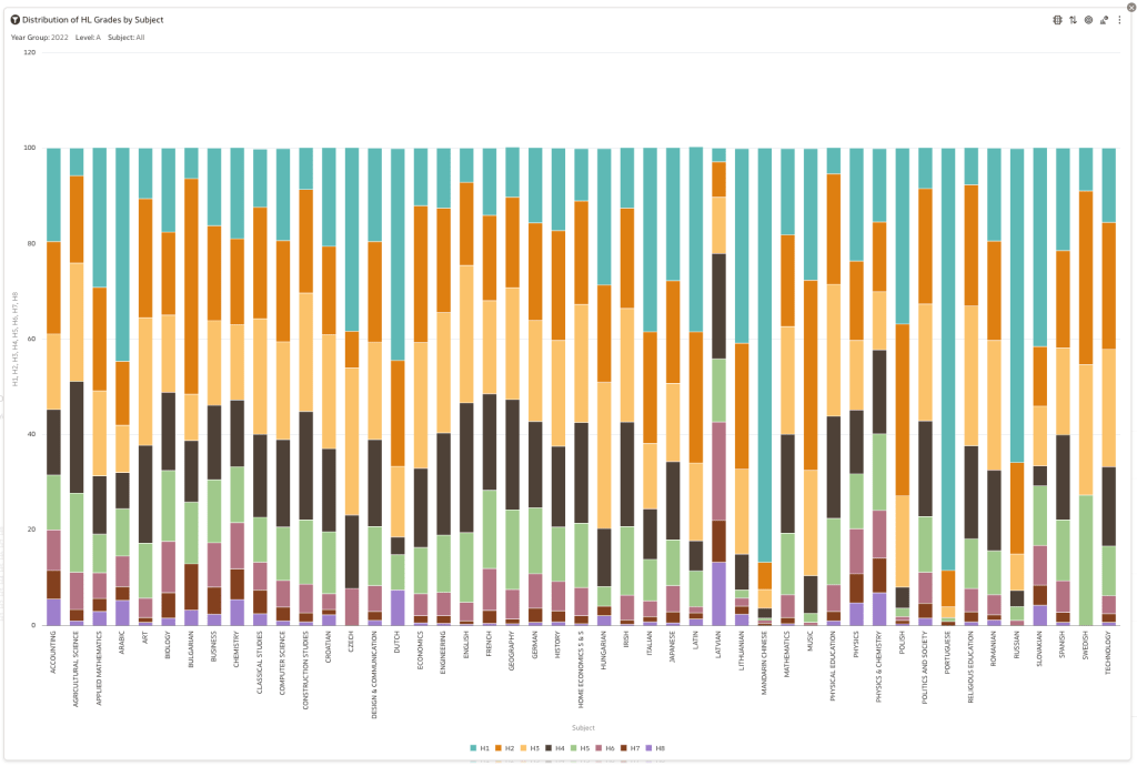
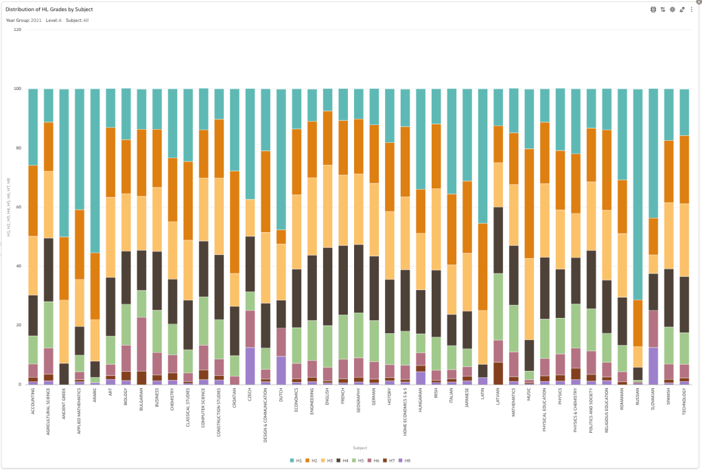
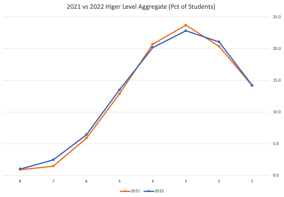
Remember the Dept of Education said the 2022 results should be in-line with the results of 2021. This required them to apply some adjustments, after marking the exam scripts, to give an updated profile. The following chart shows this comparison between the two years. On initial inspection we can see it is broadly similar. This is good, right? It kind of is and at a high level things look broadly in-line and maybe we can believe the Dept of Education. Looking a little closer we can see a small decrease in the H2-H4 range, and a slight increase in the H5-H8.
Let’s dive a little deeper. When we look at the grade profile of students in 2021 and 2022, How many subjects increased the number of students at each grade vs How many subjects decreased grades vs How many approximately stated the same. The table below shows the results and only counts a change if it is greater than 1% (to allow for minor variations between years).
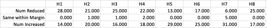
This table in very interesting in that more subjects decreased their H1s, with some variation for the H2-H4s, while for the lower range of H5-H7 we can see there has been an increase in grades. If I increased the margin to 3% we get a slightly different results, but only minor changes.
“in-line on aggregate” might be holding true, although it appears a slight increase on the numbers getting the lower grades. This might indicate either more of an adjustment to weaker students and/or a bit of a down shifting of grades from the H2-H4 range. But at the higher end, more subjects reduced than increase. The overall (aggregate) numbers are potentially masking movements in grade profiles.
Let’s now have a look at some of the core subjects of English, Irish and Mathematics.
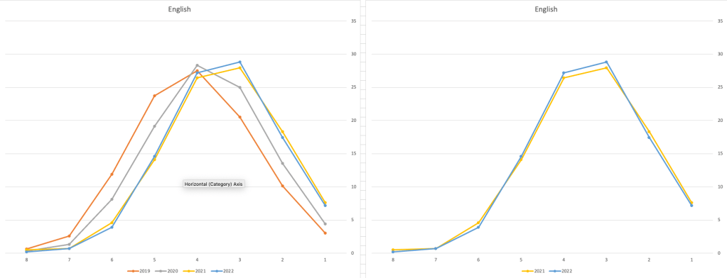
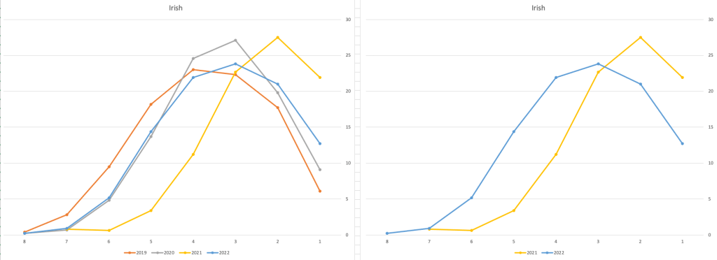
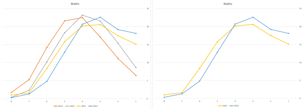
For English, it looks like they fitted to the curve perfectly! keeping grades in-line between the two years. Mathematics is a little different with a slight increase in grades. But when you look at Irish we can see there was definite grade deflation. For each of these subjects, the chart on the left contains four years of data including 2019 when the last “normal” leaving certificate occurred. With Irish the grade profile has been adjusted (deflated) significantly and is closer to 2019 profile than it is to 2021. There was been lots and lots of discussions nationally about how and when grades will revert to normal profile. The 2022 profile for Irish seems to show this has started to happen in this subject, which raises the question if this is occurring in any other subjects, and is hidden/masked by the “in-line on aggregate” figures.
This blog post would become just too long if I was to present the results profile for each of the 42+ subjects.
Let’s have a look as two of the most common foreign languages, French and Spanish.
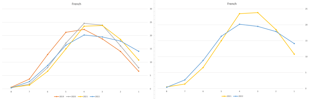
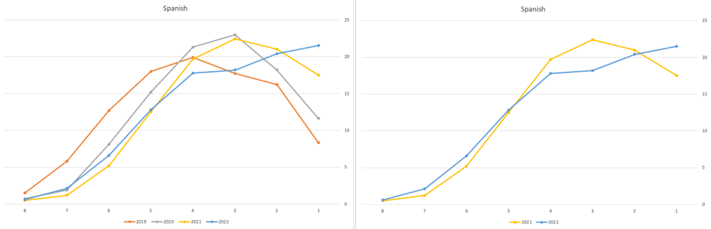
Again we can see some grade deflation, although not to be same extent as Irish. For both French and Spanish, we have reduced numbers for the H2-H4 range and a slight increase for H5-H7, and shift to the left in the profile. A slight exception is for those getting a H1 for both subjects. The adjustment in the results profile is more pronounced for French, and could indicate some deflation adjustments.
Next we’ll look at some of the science subjects of Physics, Chemistry and Biology.
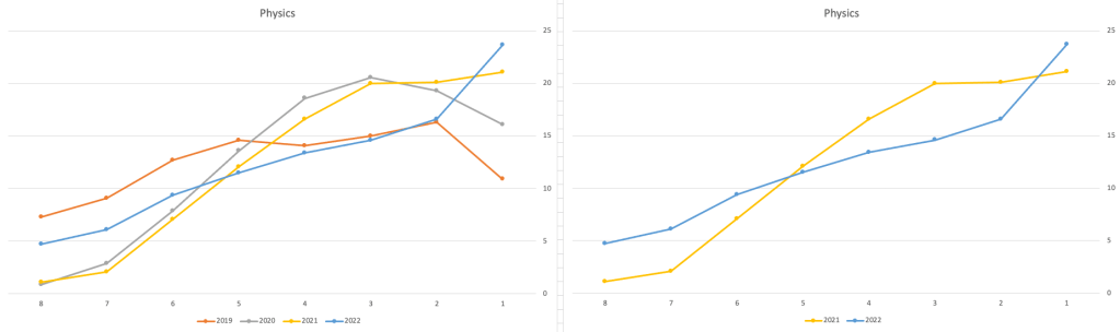
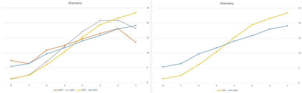
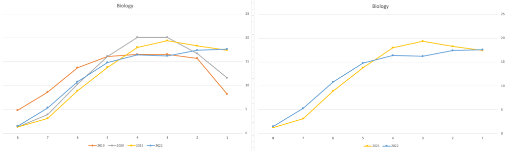
These three subjects also indicate some adjusts back towards the pre-Covid profile, with exception of H1 grades. We can see the 2022 profile almost reflect the 2019 profile (excluding H1s) and for Biology appears to be at a half way point between 2019 and 2022 (excluding H1s)
Just one more example of grade deflation, and this with Design, Communication and Graphics (or DCG)
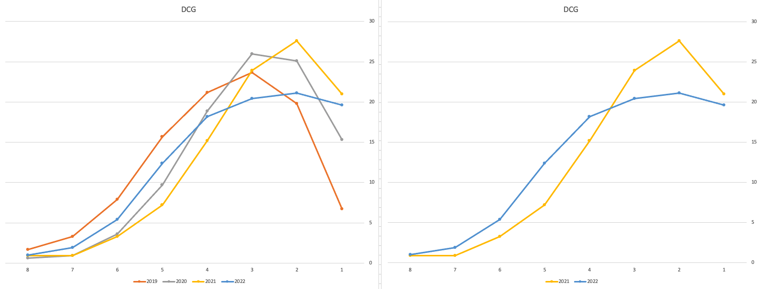
Yes there is obvious grade deflation and almost back to 2019 profile, with the exception of H1s again.
I’ve mentioned some possible grade deflation in various subjects, but there are also subjects where the profile very closely matches the 2021 profile. We have seen above English is one of those. Others include Technology, Art and Computer Science.
I’ve analyzed many more subjects and similar shifting of the profile is evident in those. Has the Dept of Education and State Examinations Commission taken steps to start deflating grades from the highs of 2021? I’d said the answer lies in the data, and the data I’ve looked at shows they have started the deflation process. This might take another couple of years to work out of the system and we will be back to “normal” pre-covid profiles. Which raises another interesting question, Was the grade profile for subjects, pre-covid, fitted to the curve? For the core set of subjects and for many of the more popular subjects, the data seems to indicate this. Maybe the “normal” distribution of marks is down to the “normal” distribution of abilities of the student population each year, or have grades been normalised in some way each year, for years, even decades?
For this analysis I’ve used a variety of tools including Excel, Python and Oracle Analytics.
The Dataset used can be found under Dataset menu, and listed as ‘Leaving Certificate 2015-2022’. An additional Dataset, I’ll be adding soon, will be for CAO Points Profiles 2015-2022.
Data Science (The MIT Press Essential Knowledge series) – available in English, Korean and Chinese
Back in the middle of 2018 MIT Press published my Data Science book, co-written with John Kelleher. It book was published as part of their Essentials Series.
During the few months it was available in 2018 it became a best seller on Amazon, and one of the top best selling books for MIT Press. This happened again in 2019. Yes, two years running it has been a best seller!
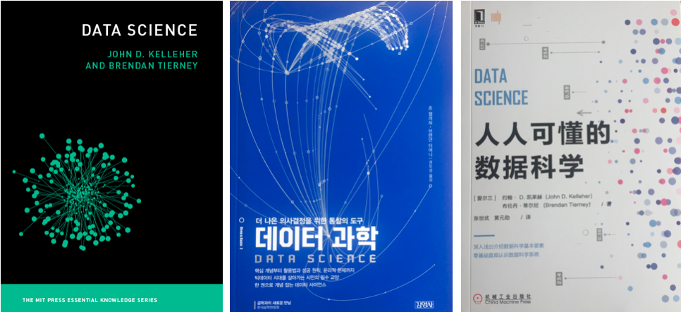
2020 kicks off with the book being translated into Korean and Chinese. Here are the covers of these translated books.


The Japanese and Turkish translations will be available in a few months!
Go get the English version of the book on Amazon in print, Kindle and Audio formats.
This book gives a concise introduction to the emerging field of data science, explaining its evolution, relation to machine learning, current uses, data infrastructure issues and ethical challenge the goal of data science is to improve decision making through the analysis of data. Today data science determines the ads we see online, the books and movies that are recommended to us online, which emails are filtered into our spam folders, even how much we pay for health insurance.
Go check it out.
Data Profiling in Python
With every data analytics and data science project, one of the first tasks to that everyone needs to do is to profile the data sets. Data profiling allows you to get an initial picture of the data set, see data distributions and relationships. Additionally it allows us to see what kind of data cleaning and data transformations are necessary.
Most data analytics tools and languages have some functionality available to help you. Particular the various data science/machine learning products have this functionality built-in them and can do a lot of the data profiling automatically for you. But if you don’t use these tools/products, then you are probably using R and/or Python to profile your data.
With Python you will be working with the data set loaded into a Pandas data frame. From there you will be using various statistical functions and graphing functions (and libraries) to create a data profile. From there you will probably create a data profile report.
But one of the challenges with doing this in Python is having different coding for handling numeric and character based attributes/features. The describe function in Python (similar to the summary function in R) gives some statistical summaries for numeric attributes/features. A different set of functions are needed for character based attributes. The Python Library repository (https://pypi.org/) contains over 200K projects. But which ones are really useful and will help with your data science projects. Especially with new projects and libraries being released on a continual basis? This is a major challenge to know what is new and useful.
For example the followings shows loading the titanic data set into a Pandas data frame, creating a subset and using the describe function in Python.
import pandas as pd

df = pd.read_csv("/Users/brendan.tierney/Dropbox/4-Datasets/titanic/train.csv")

df.head(5)

df2 = df.iloc[:,[1,2,4,5,6,7,8,10,11]]
df2.head(5)

df2.describe()

You will notice the describe function has only looked at the numeric attributes.
One of those 200+k Python libraries is one called pandas_profiling. This will create a data audit report for both numeric and character based attributes. This most be good, Right? Let’s take a look at what it does.
For each column the following statistics – if relevant for the column type – are presented in an interactive HTML report:
- Essentials: type, unique values, missing values
- Quantile statistics like minimum value, Q1, median, Q3, maximum, range, interquartile range
- Descriptive statistics like mean, mode, standard deviation, sum, median absolute deviation, coefficient of variation, kurtosis, skewness
- Most frequent values
- Histogram
- Correlations highlighting of highly correlated variables, Spearman, Pearson and Kendall matrices
- Missing values matrix, count, heatmap and dendrogram of missing values
The first step is to install the pandas_profiling library.
pandas-profiling package naming was changed. To continue profiling data use ydata-profiling instead!
pip3 install pandas_profiling
Now run the pandas_profiling report for same data frame created and used, see above.
import pandas_profiling as pp

df2.profile_report()
The following images show screen shots of each part of the report. Click and zoom into these to see more details.


Managing imbalanced Data Sets with SMOTE in Python
When working with data sets for machine learning, lots of these data sets and examples we see have approximately the same number of case records for each of the possible predicted values. In this kind of scenario we are trying to perform some kind of classification, where the machine learning model looks to build a model based on the input data set against a target variable. It is this target variable that contains the value to be predicted. In most cases this target variable (or feature) will contain binary values or equivalent in categorical form such as Yes and No, or A and B, etc or may contain a small number of other possible values (e.g. A, B, C, D).
For the classification algorithm to perform optimally and be able to predict the possible value for a new case record, it will need to see enough case records for each of the possible values. What this means, it would be good to have approximately the same number of records for each value (there are many ways to overcome this and these are outside the score of this post). But most data sets, and those that you will encounter in real life work scenarios, are never balanced, as in having a 50-50 split. What we typically encounter might be a 90-10, 98-2, etc type of split. These data sets are said to be imbalanced.

The image above gives examples of two approaches for creating a balanced data set. The first is under-sampling. This involves reducing the class that contains the majority of the case records and reducing it to match the number of case records in the minor class. The problems with this include, the resulting data set is too small to be meaningful, the case records removed could contain important records and scenarios that the model will need to know about.
The second example is creating a balanced data set by increasing the number of records in the minority class. There are a few approaches to creating this. The first approach is to create duplicate records, from the minor class, until such time as the number of case records are approximately the same for each class. This is the simplest approach. The second approach is to create synthetic records that are statistically equivalent of the original data set. A commonly technique used for this is called SMOTE, Synthetic Minority Oversampling Technique. SMOTE uses a nearest neighbors algorithm to generate new and synthetic data we can use for training our model. But one of the issues with SMOTE is that it will not create sample records outside the bounds of the original data set. As you can image this would be very difficult to do.
The following examples will illustrate how to perform Under-Sampling and Over-Sampling (duplication and using SMOTE) in Python using functions from Pandas, Imbalanced-Learn and Sci-Kit Learn libraries.
NOTE: The Imbalanced-Learn library (e.g. SMOTE)requires the data to be in numeric format, as it statistical calculations are performed on these. The python function get_dummies was used as a quick and simple to generate the numeric values. Although this is perhaps not the best method to use in a real project. With the other sampling functions can process data sets with a sting and numeric.
Data Set: Is the Portuaguese Banking data set and is available on the UCI Data Set Repository, and many other sites. Here are some basics with that data set.
import warnings
import pandas as pd
import numpy as np
import matplotlib.pyplot as plt
get_ipython().magic('matplotlib inline')
bank_file = ".../bank-additional-full.csv"
# import dataset
df = pd.read_csv(bank_file, sep=';',)
# get basic details of df (num records, num features)
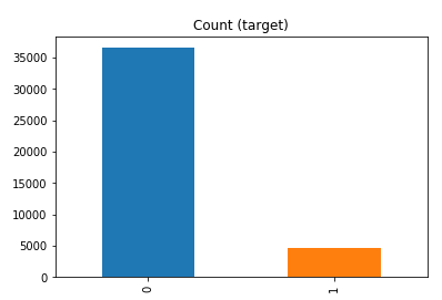
df.shape
df['y'].value_counts() # dataset is imbalanced with majority of class label as "no".
no     36548
yes     4640
Name: y, dtype: int64
#print bar chart
df.y.value_counts().plot(kind='bar', title='Count (target)');
Example 1a – Down/Under sampling the majority class y=1 (using random sampling)
count_class_0, count_class_1 = df.y.value_counts()

# Divide by class
df_class_0 = df[df['y'] == 0] #majority class
df_class_1 = df[df['y'] == 1] #minority class

# Sample Majority class (y=0, to have same number of records as minority calls (y=1)
df_class_0_under = df_class_0.sample(count_class_1)
# join the dataframes containing y=1 and y=0
df_test_under = pd.concat([df_class_0_under, df_class_1])

print('Random under-sampling:')
print(df_test_under.y.value_counts())
print("Num records = ", df_test_under.shape[0])

df_test_under.y.value_counts().plot(kind='bar', title='Count (target)');

Example 1b – Down/Under sampling the majority class y=1 using imblearn
from imblearn.under_sampling import RandomUnderSampler

X = df_new.drop('y', axis=1)
Y = df_new['y']

rus = RandomUnderSampler(random_state=42, replacement=True)
X_rus, Y_rus = rus.fit_resample(X, Y)

df_rus = pd.concat([pd.DataFrame(X_rus), pd.DataFrame(Y_rus, columns=['y'])], axis=1)

print('imblearn over-sampling:')
print(df_rus.y.value_counts())
print("Num records = ", df_rus.shape[0])

df_rus.y.value_counts().plot(kind='bar', title='Count (target)');
[same results as Example 1a]
Example 1c – Down/Under sampling the majority class y=1 using Sci-Kit Learn
from sklearn.utils import resample

print("Original Data distribution")
print(df['y'].value_counts())

# Down Sample Majority class
down_sample = resample(df[df['y']==0],
replace = True, # sample with replacement
n_samples = df[df['y']==1].shape[0], # to match minority class
random_state=42) # reproducible results

# Combine majority class with upsampled minority class
train_downsample = pd.concat([df[df['y']==1], down_sample])

# Display new class counts
print('Sci-Kit Learn : resample : Down Sampled data set')
print(train_downsample['y'].value_counts())
print("Num records = ", train_downsample.shape[0])
train_downsample.y.value_counts().plot(kind='bar', title='Count (target)');
[same results as Example 1a]
Example 2 a – Over sampling the minority call y=0 (using random sampling)
df_class_1_over = df_class_1.sample(count_class_0, replace=True)
df_test_over = pd.concat([df_class_0, df_class_1_over], axis=0)

print('Random over-sampling:')
print(df_test_over.y.value_counts())

df_test_over.y.value_counts().plot(kind='bar', title='Count (target)');
Random over-sampling:
1    36548
0    36548
Name: y, dtype: int64

Example 2b – Over sampling the minority call y=0 using SMOTE
from imblearn.over_sampling import SMOTE

print(df_new.y.value_counts())
X = df_new.drop('y', axis=1)
Y = df_new['y']

sm = SMOTE(random_state=42)
X_res, Y_res = sm.fit_resample(X, Y)

df_smote_over = pd.concat([pd.DataFrame(X_res), pd.DataFrame(Y_res, columns=['y'])], axis=1)

print('SMOTE over-sampling:')
print(df_smote_over.y.value_counts())

df_smote_over.y.value_counts().plot(kind='bar', title='Count (target)');
[same results as Example 2a]
Example 2c – Over sampling the minority call y=0 using Sci-Kit Learn
from sklearn.utils import resample

print("Original Data distribution")
print(df['y'].value_counts())

# Upsample minority class
train_positive_upsample = resample(df[df['y']==1],
replace = True, # sample with replacement
n_samples = train_zero.shape[0], # to match majority class
random_state=42) # reproducible results

# Combine majority class with upsampled minority class
train_upsample = pd.concat([train_negative, train_positive_upsample])

# Display new class counts
print('Sci-Kit Learn : resample : Up Sampled data set')
print(train_upsample['y'].value_counts())
train_upsample.y.value_counts().plot(kind='bar', title='Count (target)');
[same results as Example 2a]

You must be logged in to post a comment.