
Month: October 2021
Comparing Cluster Algorithms on Density Data
In a previous posted I gave a detailed description of using DBScan to create clusters for a dataset containing different density based data. This “manufactured” dataset was created to illustrate how and why DBScan can be used.
But taking the previous post in isolation is perhaps not recommended. As a Data Scientist you will need to use many Clustering algorithms to determine which algorithm can best identify the patterns in your data, and this can be determined by the type of data distributions within the dataset.
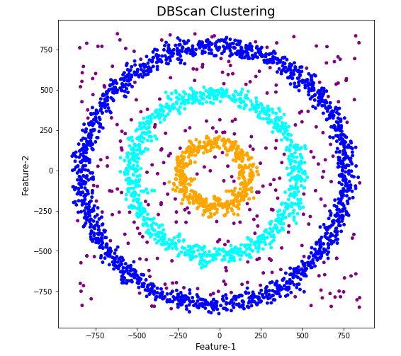
The DBScan post created the following diagrams. The diagram on the left is a plot of the dataset where we can easily identify different groupings/clusters. The diagram on the right illustrates the clusters identified by DBScan. As you can see it did a good job.
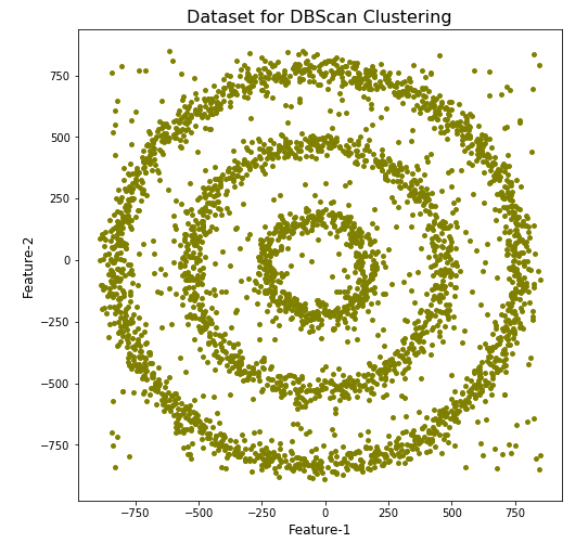
We can see the three clusters and the noisy data point which were added to the dataset.
But what about other Clustering algorithms? What about k-Means and Hierarchical Clustering algorithms? How would they perform on this dataset?
Here is the code for k-Means with three clusters. Three clusters was selected as we have three clear clusters in the dataset.
#k-Means with 3 clusters
from sklearn.cluster import KMeans
k_means=KMeans(n_clusters=3,random_state=42)
k_means.fit(df[[0,1]])

df['KMeans_labels']=k_means.labels_

# Plotting resulting clusters
colors=['purple','red','blue','green']
plt.figure(figsize=(10,10))
plt.scatter(df[0],df[1],c=df['KMeans_labels'],cmap=matplotlib.colors.ListedColormap(colors),s=15)
plt.title('K-Means Clustering',fontsize=18)
plt.xlabel('Feature-1',fontsize=12)
plt.ylabel('Feature-2',fontsize=12)
plt.show()
Here is the code for Hierarchical Clustering, again three clusters was selected.
from sklearn.cluster import AgglomerativeClustering
model = AgglomerativeClustering(n_clusters=3, affinity='euclidean')
model.fit(df[[0,1]])

df['HR_labels']=model.labels_

# Plotting resulting clusters
plt.figure(figsize=(10,10))
plt.scatter(df[0],df[1],c=df['HR_labels'],cmap=matplotlib.colors.ListedColormap(colors),s=15)
plt.title('Hierarchical Clustering',fontsize=20)
plt.xlabel('Feature-1',fontsize=14)
plt.ylabel('Feature-2',fontsize=14)
plt.show()
The diagrams from both of these are shown below.
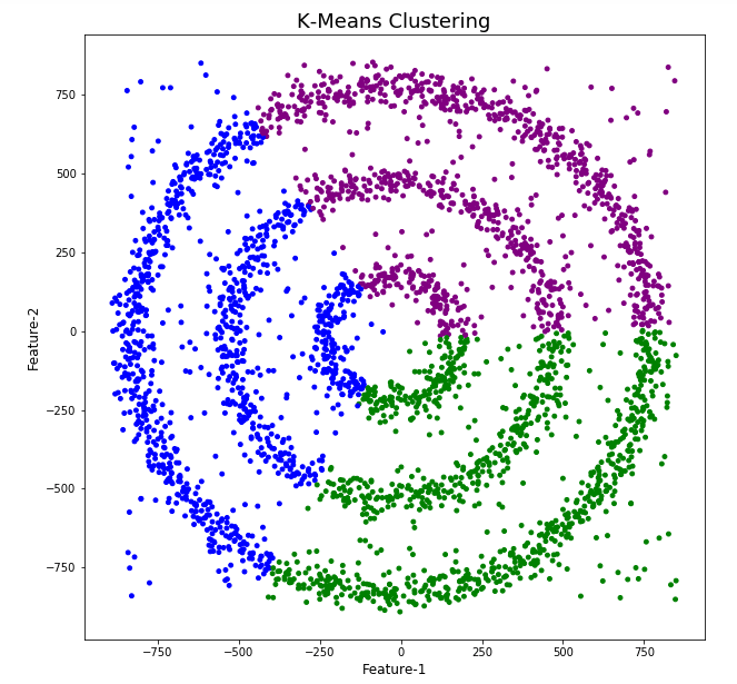
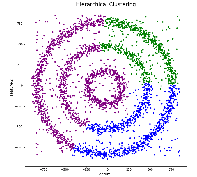
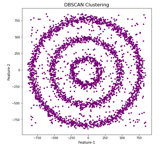
As you can see the results generated by these alternative Clustering algorithms produce very different results to what was produced by DBScan (see image at top of post) and we can easily see which algorithm best fits the dataset used.
Make sure you check out the post on DBScan.
DBScan Clustering in Python
Unsupervised Learning is a common approach for discovering patterns in datasets. The main algorithmic approach in Unsupervised Learning is Clustering, where the data is searched to discover groupings, or clusters, of data. Each of these clusters contain data points which have some set of characteristics in common with each other, and each cluster is distinct and different. There are many challenges with clustering which include trying to interpret the meaning of each cluster and how it is related to the domain in question, what is the “best” number of clusters to use or have, the shape of each cluster can be different (not like the nice clean examples we see in the text books), clusters can be overlapping with a data point belonging to many different clusters, and the difficulty with trying to decide which clustering algorithm to use.
The last point above about which clustering algorithm to use is similar to most problems in Data Science and Machine Learning. The simple answer is we just don’t know, and this is where the phases of “No free lunch” and “All models are wrong, but some models are model that others”, apply. This is where we need to apply the various algorithms to our data, and through a deep process of investigation the outputs, of each algorithm, need to be investigated to determine what algorithm, the parameters, etc work best for our dataset, specific problem being investigated and the domain. This involve the needs for lots of experiments and analysis. This work can take some/a lot of time to complete.
The k-Means clustering algorithm gets a lot of attention and focus for Clustering. It’s easy to understand what it does and to interpret the outputs. But it isn’t perfect and may not describe your data, as it can have different characteristics including shape, densities, sparseness, etc. k-Means focuses on a distance measure, while algorithms like DBScan can look at the relative densities of data. These two different approaches can produce by different results. Careful analysis of the data and the results/outcomes of these algorithms needs some care.
Let’s illustrate the use of DBScan (Density Based Spatial Clustering of Applications with Noise), using the scikit-learn Python package, for a “manufactured” dataset. This example will illustrate how this density based algorithm works (See my other blog post which compares different Clustering algorithms for this same dataset). DBSCAN is better suited for datasets that have disproportional cluster sizes (or densities), and whose data can be separated in a non-linear fashion.
There are two key parameters of DBScan:
- eps: The distance that specifies the neighborhoods. Two points are considered to be neighbors if the distance between them are less than or equal to eps.
- minPts: Minimum number of data points to define a cluster.
Based on these two parameters, points are classified as core point, border point, or outlier:
- Core point: A point is a core point if there are at least minPts number of points (including the point itself) in its surrounding area with radius eps.
- Border point: A point is a border point if it is reachable from a core point and there are less than minPts number of points within its surrounding area.
- Outlier: A point is an outlier if it is not a core point and not reachable from any core points.
The algorithm works by randomly selecting a starting point and it’s neighborhood area is determined using radius eps. If there are at least minPts number of points in the neighborhood, the point is marked as core point and a cluster formation starts. If not, the point is marked as noise. Once a cluster formation starts (let’s say cluster A), all the points within the neighborhood of initial point become a part of cluster A. If these new points are also core points, the points that are in the neighborhood of them are also added to cluster A. Next step is to randomly choose another point among the points that have not been visited in the previous steps. Then same procedure applies. This process finishes when all points are visited.
Let’s setup our data set and visualize it.
import numpy as np
import pandas as pd
import math
import matplotlib.pyplot as plt
import matplotlib

#initialize the random seed
np.random.seed(42) #it is the answer to everything!

#Create a function to create our data points in a circular format
#We will call this function below, to create our dataframe
def CreateDataPoints(r, n):
    return [(math.cos(2*math.pi/n*x)*r+np.random.normal(-30,30),math.sin(2*math.pi/n*x)*r+np.random.normal(-30,30)) for x in range(1,n+1)]

#Use the function to create different sets of data, each having a circular format
df=pd.DataFrame(CreateDataPoints(800,1500))  #500, 1000
df=df.append(CreateDataPoints(500,850))      #300, 700
df=df.append(CreateDataPoints(200,450))      #100, 300

# Adding noise to the dataset
df=df.append([(np.random.randint(-850,850),np.random.randint(-850,850)) for i in range(450)])

plt.figure(figsize=(8,8))
plt.scatter(df[0],df[1],s=15,color='olive')
plt.title('Dataset for DBScan Clustering',fontsize=16)
plt.xlabel('Feature-1',fontsize=12)
plt.ylabel('Feature-2',fontsize=12)
plt.show()

We can see the dataset we’ve just created has three distinct circular patterns of data. We also added some noisy data too, which can be see as the points between and outside of the circular patterns.
Let’s use the DBScan algorithm, using the default setting, to see what it discovers.
from sklearn.cluster import DBSCAN
#DBSCAN without any parameter optimization and see the results.
dbscan=DBSCAN()
dbscan.fit(df[[0,1]])

df['DBSCAN_labels']=dbscan.labels_

# Plotting resulting clusters
colors=['purple','red','blue','green']
plt.figure(figsize=(8,8))
plt.scatter(df[0],df[1],c=df['DBSCAN_labels'],cmap=matplotlib.colors.ListedColormap(colors),s=15)
plt.title('DBSCAN Clustering',fontsize=16)
plt.xlabel('Feature-1',fontsize=12)
plt.ylabel('Feature-2',fontsize=12)
plt.show()
#Not very useful !
#Everything belongs to one cluster.
Everything is the one color! which means all data points below to the same cluster. This isn’t very useful and can at first seem like this algorithm doesn’t work for our dataset. But we know it should work given the visual representation of the data. The reason for this occurrence is because the value for epsilon is very small. We need to explore a better value for this. One approach is to use KNN (K-Nearest Neighbors) to calculate the k-distance for the data points and based on this graph we can determine a possible value for epsilon.
#Let's explore the data and work out a better setting
from sklearn.neighbors import NearestNeighbors
neigh = NearestNeighbors(n_neighbors=2)
nbrs = neigh.fit(df[[0,1]])
distances, indices = nbrs.kneighbors(df[[0,1]])

# Plotting K-distance Graph
distances = np.sort(distances, axis=0)
distances = distances[:,1]
plt.figure(figsize=(14,8))
plt.plot(distances)
plt.title('K-Distance - Check where it bends',fontsize=16)
plt.xlabel('Data Points - sorted by Distance',fontsize=12)
plt.ylabel('Epsilon',fontsize=12)
plt.show()
#Let’s plot our K-distance graph and find the value of epsilon

Look at the graph above we can see the main curvature is between 20 and 40. Taking 30 at the mid-point of this we can now use this value for epsilon. The value for the number of samples needs some experimentation to see what gives the best fit.
Let’s now run DBScan to see what we get now.
from sklearn.cluster import DBSCAN
dbscan_opt=DBSCAN(eps=30,min_samples=3)
dbscan_opt.fit(df[[0,1]])

df['DBSCAN_opt_labels']=dbscan_opt.labels_
df['DBSCAN_opt_labels'].value_counts()

# Plotting the resulting clusters
colors=['purple','red','blue','green', 'olive', 'pink', 'cyan', 'orange', 'brown' ]
plt.figure(figsize=(8,8))
plt.scatter(df[0],df[1],c=df['DBSCAN_opt_labels'],cmap=matplotlib.colors.ListedColormap(colors),s=15)
plt.title('DBScan Clustering',fontsize=18)
plt.xlabel('Feature-1',fontsize=12)
plt.ylabel('Feature-2',fontsize=12)
plt.show()

When we look at the dataframe we can see it create many different cluster, beyond the three that we might have been expecting. Most of these clusters contain small numbers of data points. These could be considered outliers and alternative view of this results is presented below, with this removed.
df['DBSCAN_opt_labels']=dbscan_opt.labels_
df['DBSCAN_opt_labels'].value_counts()

 0     1559
 2      898
 3      470
-1      282
 8        6
 5        5
 4        4
 10       4
 11       4
 6        3
 12       3
 1        3
 7        3
 9        3
 13       3
Name: DBSCAN_opt_labels, dtype: int64
The cluster labeled with -1 contains the outliers. Let’s clean this up a little.
df2 = df[df['DBSCAN_opt_labels'].isin([-1,0,2,3])]
df2['DBSCAN_opt_labels'].value_counts()
 0    1559
 2     898
 3     470
-1     282
Name: DBSCAN_opt_labels, dtype: int64

# Plotting the resulting clusters
colors=['purple','red','blue','green', 'olive', 'pink', 'cyan', 'orange']
plt.figure(figsize=(8,8))
plt.scatter(df2[0],df2[1],c=df2['DBSCAN_opt_labels'],cmap=matplotlib.colors.ListedColormap(colors),s=15)
plt.title('DBScan Clustering',fontsize=18)
plt.xlabel('Feature-1',fontsize=12)
plt.ylabel('Feature-2',fontsize=12)
plt.show()

See my other blog post which compares different Clustering algorithms for this same dataset.
Biases in Data
We work with data in a variety of different ways throughout our organisation. Some people are consumers of data and in particular data that is the output of various data analytics, machine learning or artificial intelligence applications. Being a consumer of data from these applications we (easily) made the assumption that the data used is correct and the results being presented to us (in various forms) is correct.
But all too often we hear about some adjustments being made to the data or the processing to correct “something” that was discovered. One the these “something” can be classified as a Data Bias. This kind of problem has been increasing in importance over the past couple of years. Some of this importance has been led by the people involved in creating and process this data discovering certain issues or “something” in the data. Some has been identified by the consumer when the discover “something” odd or unusual about the data. This list could get very long, but another aspect is with the introduction of EU GDPR, there is now a legal aspect to ensuring no data biases exist. Part of the problem with EU GDPR, in this aspect, is it is very vague on what is required. This in turn has caused some confusion on what is required of organisations and their staff. But with the arrival of the EU AI Regulations there is a renewed focus on identifying and addressing Data Bias. With the EU AI Regulations there is a requirement that Data Bias is addressed at each step when data is collected, processed and generated.
The following list outlines some of the typical Data Bias scenarios you or you organisation may encounter.
- Definition bias: Occurs when someone words or phrases a problem or description of data based on their own requirements, rather than based on the organisational or domain definitions. This can lead to misleading results or when commencing an analytics project can lead the project is a specific (biased) direction
- Sample bias: This occurs when the dataset created for input to the analytics or machine learning does not reflect the data from the original data sources. The sampling method used fails to attain true randomness before selection This can result in models having lower accuracy with certain sub-groups of the data (i.e. Customers) which might not have been included or under-represented in the sampled dataset. Sometimes this type of bias is referred to as selection bias.
- Measurement bias: This occurs when data collected for training differs from that collected in the original data sources. It can also occur when incorrect measurements or calculations are applied to the data. An example of this bias occurs with inconsistent annotation labeling and/or with re-coding of data to give incorrect or misleading meaning.
- Selection bias: This occurs when the dataset created for analytics is not large enough or representative enough to include all possible data combinations. This can occur due to human or algorithmic data processing biases. Sample bias plays a sub-role within Selection bias. This can happen at both record and attribute/feature selection levels. Selection bias is sometimes referred to as Exclusion bias, as certain data is excluded by the whoever is creating the dataset.
- Recall bias: This bias arises when labels (target feature) are inconsistently given based on subjective observations. This results in lower accuracy.
- Observer bias: This is the effect of seeing what you expect to see or want to see in data. The observers have subjective thoughts about their study, either conscious or unconscious. This leads to incorrectly labelled or recorded data. For example, two data scientist give different labels for an event. Their labeling is based on the subjective thoughts rather than following provided guidelines or seeking verification for their decisions. Sometimes this type of bias is referred to as Confirmation bias.
- Racial & Gender bias & Similar: Racial bias occurs when data skews in favor of particular demographics. Similar scenarios can occur for gender and other similar types of data. For example, facial recognition fails to recognize people of color as these have been under represented in the training datasets.
- Minority bias: This is similar to the previous Racial and Gender bias. This occurs when a minority group(s) are excluded from the dataset.
- Association bias: This occurs when the data reinforces or multiplies a cultural bias. Your dataset may have a collection of jobs in which all men have job X and all women have job Y. A machine learning model built using this data will preclude women from job X and men from job Y. Association bias is known for creating gender bias.
- Algorithmic bias: Occurs when the algorithm is selective on what data it uses to create a model for the data and problem. Extra validation checks and testing is needed to ensure no additional biases have been created and no biases (based on the previous types above) have been amplified by the algorithm.
- Reporting bias: Occurs when only a selection of results or outcomes are present. The person preparing the data is selective on what information they share with others. This typically leads to under reporting of certain, and somethings important, information.
- Confirmation bias: Occurs when the data/results are interpreted favoring information that confirms previously existing beliefs.
- Response / Non-Response bias: Occurs when results from surveys can be considered misleading based on the questions asked and subset of population who responded to the survey. If 95% of respondents said they link surveys, then is misleading. The quality and accuracy of the data will be poor in such situations
Working with External Data on Oracle DB Docker
With multi-modal databases (such as Oracle and many more) you will typically work with data in different formats and for different purposes. One such data format is with data located external to the database. The data will exist in files on the operating systems on the DB server or on some connected storage device.
The following demonstrates how to move data to an Oracle Database Docker image and access this data using External Tables. (This based on an example from Oracle-base.com with a few additional commands).
For this example, I’ll be using an Oracle 21c Docker image setup previously. Similarly the same steps can be followed for the 18c XE Docker image, by changing the Contain Id from 21cFull to 18XE.
Step 1 – Connect to OS in the Docker Container & Create Directory
The first step involves connecting the the OS of the container. As the container is setup for default user ‘oracle’, that is who we will connect as, and it is this Linux user who owns all the Oracle installation and associated files and directories
docker exec -it 21cFull /bin/bash
When connected we are in the Home directory for the Oracle user.
The Home directory contains lots of directories which contain all the files necessary for running the Oracle Database.
Next we need to create a directory which will story the files.
mkdir ext_data
As we are logged in as the oracle Linux user, we don’t have to make any permissions changes, as Oracle Database requires read and write access to this directory.
Step 3 – Upload files to Directory on Docker container
Open another terminal window on your computer (desktop/laptop). You should have two such terminal windows open. One you opened for Step 1 above, and this one. This will allow you to easily switch between files on your computer and the files in the Docker container.
Download the two Countries files, to your computer, which are listed on Oracle-base.com. Countries1.txt and Countries2.txt.
Now you need to upload those files to the Docker container.
docker cp Countries1.txt 21cFull:/opt/oracle/ext_data/Countries1.txt
docker cp Countries2.txt 21cFull:/opt/oracle/ext_data/Countries2.txt
Step 4 – Connect to System (DBA) schema, Create User, Create Directory, Grant access to Directory
If you a new to the Database container, you don’t have any general users/schemas created. You should create one, as you shouldn’t use the System (or DBA) user for any development work. To create a new database user connect to System.
sqlplus system/SysPassword1@//localhost/XEPDB1
To use sqlplus command line tool you will need to install Oracle Instant Client and then SQLPlus (which is a separate download from the same directory for your OS)
To create a new user/schema in the database you can run the following (change the username and password to something more sensible).
create user brendan identified by BtPassword1
default tablespace users
temporary tablespace temp;
grant connect, resource to brendan;
alter user brendan
quota unlimited on users;
Now create the Directory object in the database, which points to the directory on the Docker OS we created in the Step 1 above. Grant ‘brendan’ user/schema read and write access to this Directory
CREATE OR REPLACE DIRECTORY ext_tab_data AS '/opt/oracle/ext_data';
grant read, write on directory ext_tab_data to brendan;
Now, connect to the brendan user/schema.
Step 5 – Create external table and test
To connect to brendan user/schema, you can run the following if you are still using SQLPlus
SQL> connect brendan/BtPassword1@//localhost/XEPDB1
or if you exited it, just run this from the command line
sqlplus system/SysPassword1@//localhost/XEPDB1
Create the External Table (same code from oracle-base.com)
CREATE TABLE countries_ext (
  country_code      VARCHAR2(5),
  country_name      VARCHAR2(50),
  country_language  VARCHAR2(50)
)
ORGANIZATION EXTERNAL (
  TYPE ORACLE_LOADER
  DEFAULT DIRECTORY ext_tab_data
  ACCESS PARAMETERS (
    RECORDS DELIMITED BY NEWLINE
    FIELDS TERMINATED BY ','
    MISSING FIELD VALUES ARE NULL
    (
      country_code      CHAR(5),
      country_name      CHAR(50),
      country_language  CHAR(50)
    )
  )
  LOCATION ('Countries1.txt','Countries2.txt')
)
PARALLEL 5
REJECT LIMIT UNLIMITED;
It should create for you. If not and you get an error then if will be down to a typo on directory name or the files are not in the directory or something like that.
We can now query the External Table as if it is a Table in the database.
SQL> set linesize 120
SQL> select * from countries_ext order by country_name;
COUNT COUNTRY_NAME                         COUNTRY_LANGUAGE
----- ------------------------------------ ------------------------------
ENG   England                              English
FRA   France                               French
GER   Germany                              German
IRE   Ireland                              English
SCO   Scotland                             English
USA   Unites States of America             English
WAL   Wales                                Welsh

7 rows selected.
All done!
Oracle 21c XE Database and Docker setup
You know when you are waiting for the 39 bus for ages, and then two of them turn up at the same time. It’s a bit like this with Oracle 21c XE Database Docker image being released a few days after the 18XE Docker image!
Again we have Gerald Venzi to thank for putting these together and making them available.
23c Database – If you want to use the 23c Database, Check out this post for the command to install
Are you running an Apple M1 chip Laptop? If so, follow these instructions (and ignore the rest of this post)
If you want to install Oracle 21c XE yourself then go to the download page and within a few minutes you are ready to go. Remember 21c XE is a fully featured version of their main Enterprise Database, with a few limitations, basically on size of deployment. You’d be surprised how many organisations who’s data would easily fit within these limitations/restrictions. The resource limits of Oracle Database 21 XE include:
- 2 CPU threads
- 2 GB of RAM
- 12GB of user data (Compression is included so you can store way way more than 12G)
- 3 pluggable Databases
It is important to note, there are some additional restrictions on feature availability, for example Parallel Query is not possible, etc.
Remember the 39 bus scenario I mentioned above. A couple of weeks ago the Oracle 18c XE Docker image was released. This is a full installation of the database and all you need to do is to download it and run it. Nothing else is required. Check out my previous post on this.
To download, install and run Oracle 21c XE Docker image, just run the following commands.
docker pull gvenzl/oracle-xe:21-full

docker run -d -p 1521:1521 -e ORACLE_PASSWORD=SysPassword1 -v oracle-volume:/opt/oracle/XE21CFULL/oradata gvenzl/oracle-xe:21-full

docker rename da37a77bb436 21cFull

sqlplus system/SysPassword1@//localhost/XEPDB1
It’s a good idea to create a new schema for your work. Here is an example to create a schema called ‘demo’. First log into system using sqlplus, as shown above, and then run these commands.
create user demo identified by demo quota unlimited on users;
grant connect, resource to demo;
To check that schema was created you can connect to it using sqlplus.
connect demo/demo@//localhost/XEPDB1
Then to stop the image from running and to restart it, just run the following
docker stop 21cFull
docker start 21cFull
Check out my previous post on Oracle 18c XE setup for a few more commands.
SQL Developer Connection Setup
An alternative way to connect to the Database is to use SQL Developer. The following image shows and example of connecting to a schema called DEMO, which I created above. See the connection details in this image. They are the same as what is shown above when connecting using sqlplus.


You must be logged in to post a comment.